Themes
Customize the look and feel of your editor UI by selecting themes, modifying styles, and personalizing icons to match your brand's identity.
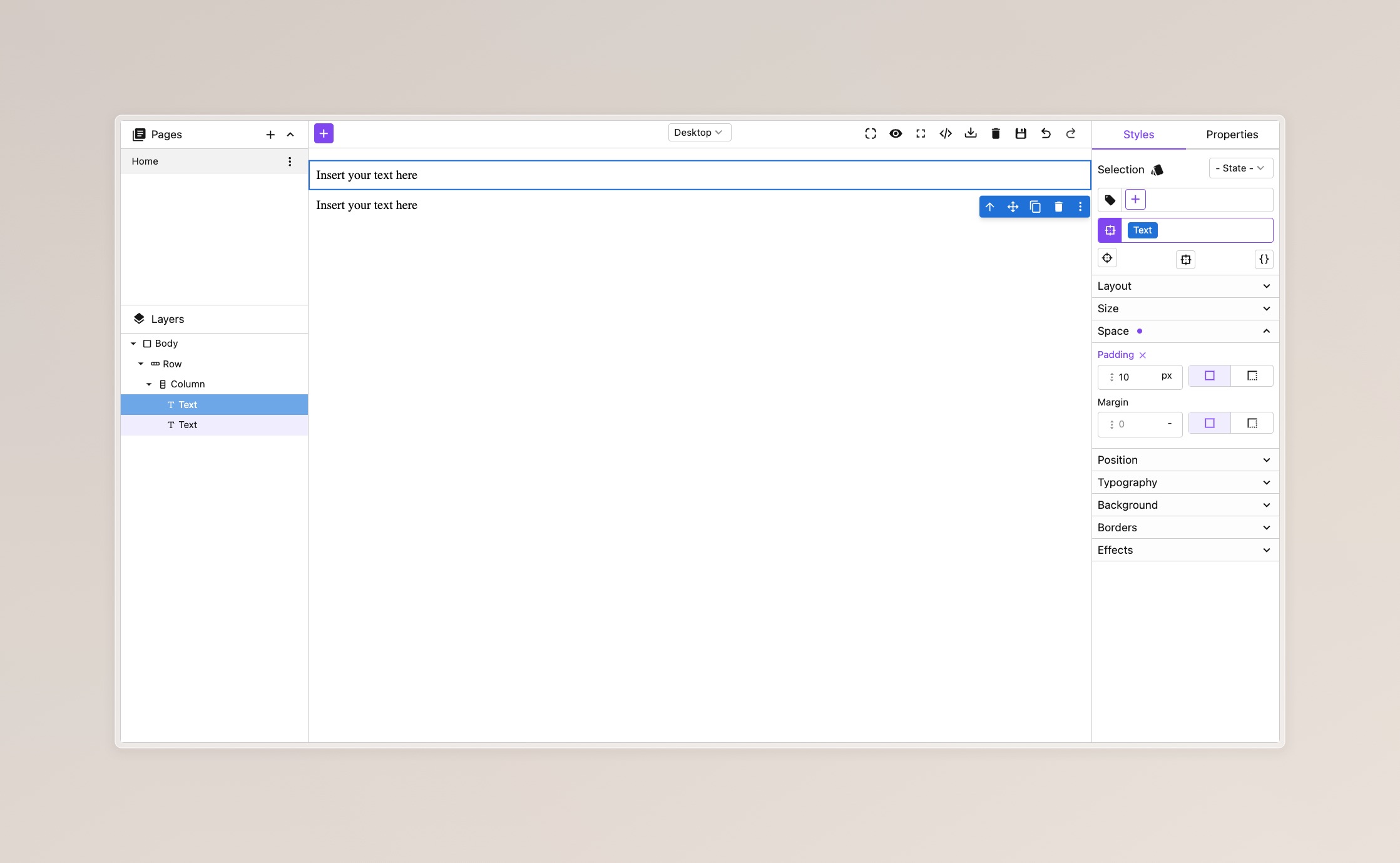
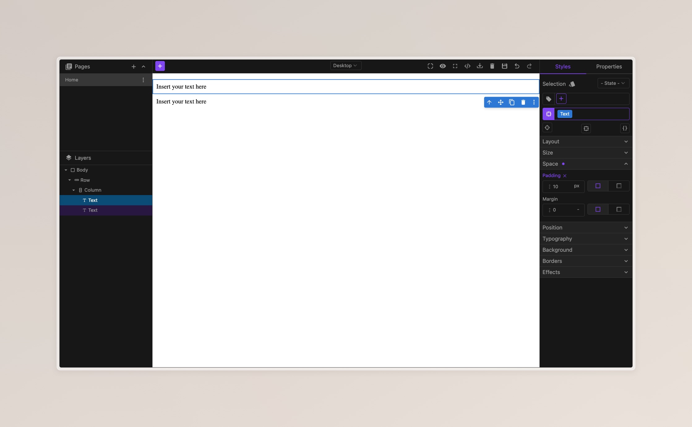
Table of Contents
Base Themes
The editor includes two base themes: light and dark. You can select a base theme and further customize it to match your brand's style.
Light
- React
- JS
- 🍇 Demo
import StudioEditor from '@grapesjs/studio-sdk/react';
import '@grapesjs/studio-sdk/style';

// ...
<StudioEditor
  options={{
    // ...
    theme: 'light'
  }}
/>
import createStudioEditor from '@grapesjs/studio-sdk';
import '@grapesjs/studio-sdk/style';

// ...
createStudioEditor({
  // ...
  theme: 'light'
})
Dark
- React
- JS
- 🍇 Demo
import StudioEditor from '@grapesjs/studio-sdk/react';
import '@grapesjs/studio-sdk/style';

// ...
<StudioEditor
  options={{
    // ...
    theme: 'dark'
  }}
/>
import createStudioEditor from '@grapesjs/studio-sdk';
import '@grapesjs/studio-sdk/style';

// ...
createStudioEditor({
  // ...
  theme: 'dark'
})
Custom Themes
You can overrides the base theme by using the customTheme option.
- React
- JS
- 🍇 Demo
import StudioEditor from '@grapesjs/studio-sdk/react';
import '@grapesjs/studio-sdk/style';

// ...
<StudioEditor
  options={{
    // ...
    theme: 'light',
    customTheme: {
      default: {
        colors: {
          global: {
            // Make the global text color red
            text: '#ff0000'
          }
        }
      }
    }
  }}
/>
import createStudioEditor from '@grapesjs/studio-sdk';
import '@grapesjs/studio-sdk/style';

// ...
createStudioEditor({
  // ...
  theme: 'light',
  customTheme: {
    default: {
      colors: {
        global: {
          // Make the global text color red
          text: '#ff0000'
        }
      }
    }
  }
})
Custom Theme Colors
The default theme has five main color categories:
globalprimarycomponentsymbolselector
Each of these categories has 5 colors you can tweak with any CSS color:
background1(higher emphasis)background2(medium emphasis)background3(lower emphasis)backgroundHovertext
Examples
Light configuration
Below is the full configuration for the light theme.
- React
- JS
- 🍇 Demo
import StudioEditor from '@grapesjs/studio-sdk/react';
import '@grapesjs/studio-sdk/style';

// ...
<StudioEditor
  options={{
    // ...
    customTheme: {
      default: {
        colors: {
          global: {
            background1: '#f4f4f4',
            background2: '#fdfdfd',
            background3: '#ffffff',
            backgroundHover: '#f4f4f4',
            text: '#181818',
            border: '#d2d2d2',
            focus: 'hsl(252 95% 85% / 80%)',
            placeholder: '#a3a3a3'
          },
          primary: {
            background1: 'hsl(258 90% 66%)',
            background2: 'hsl(250 95% 92%)',
            background3: 'hsl(250 100% 97%)',
            backgroundHover: 'hsl(263 69% 42%)',
            text: '#ffffff'
          },
          component: {
            background1: 'hsl(210 75% 50%)',
            background2: 'hsl(210 75% 70%)',
            background3: 'hsl(210 75% 90%)',
            backgroundHover: 'hsl(210 75% 60%)',
            text: '#ffffff'
          },
          selector: {
            background1: 'hsl(336 69% 30%)',
            background2: 'hsl(336 84% 90%)',
            background3: 'hsl(336 84% 97%)',
            backgroundHover: 'hsl(336 84% 80%)',
            text: '#ffffff'
          },
          symbol: {
            background1: 'hsl(258 90% 66%)',
            background2: 'hsl(250 95% 92%)',
            background3: 'hsl(250 100% 97%)',
            backgroundHover: 'hsl(263 69% 42%)',
            text: '#ffffff'
          }
        }
      }
    }
  }}
/>
import createStudioEditor from '@grapesjs/studio-sdk';
import '@grapesjs/studio-sdk/style';

// ...
createStudioEditor({
  // ...
  customTheme: {
    default: {
      colors: {
        global: {
          background1: '#f4f4f4',
          background2: '#fdfdfd',
          background3: '#ffffff',
          backgroundHover: '#f4f4f4',
          text: '#181818',
          border: '#d2d2d2',
          focus: 'hsl(252 95% 85% / 80%)',
          placeholder: '#a3a3a3'
        },
        primary: {
          background1: 'hsl(258 90% 66%)',
          background2: 'hsl(250 95% 92%)',
          background3: 'hsl(250 100% 97%)',
          backgroundHover: 'hsl(263 69% 42%)',
          text: '#ffffff'
        },
        component: {
          background1: 'hsl(210 75% 50%)',
          background2: 'hsl(210 75% 70%)',
          background3: 'hsl(210 75% 90%)',
          backgroundHover: 'hsl(210 75% 60%)',
          text: '#ffffff'
        },
        selector: {
          background1: 'hsl(336 69% 30%)',
          background2: 'hsl(336 84% 90%)',
          background3: 'hsl(336 84% 97%)',
          backgroundHover: 'hsl(336 84% 80%)',
          text: '#ffffff'
        },
        symbol: {
          background1: 'hsl(258 90% 66%)',
          background2: 'hsl(250 95% 92%)',
          background3: 'hsl(250 100% 97%)',
          backgroundHover: 'hsl(263 69% 42%)',
          text: '#ffffff'
        }
      }
    }
  }
})
Dark configuration
Below is the full configuration for the dark theme.
- React
- JS
- 🍇 Demo
import StudioEditor from '@grapesjs/studio-sdk/react';
import '@grapesjs/studio-sdk/style';

// ...
<StudioEditor
  options={{
    // ...
    customTheme: {
      default: {
        colors: {
          global: {
            background1: '#3f3f3f',
            background2: '#272727',
            background3: '#181818',
            backgroundHover: '#373737',
            text: '#a3a3a3',
            border: '#3f3f3f',
            focus: 'hsl(252 95% 85% / 80%)',
            placeholder: '#a3a3a3'
          },
          primary: {
            background1: 'hsl(258 90% 66%)',
            background2: 'hsl(250 95% 92%)',
            background3: '#272727',
            backgroundHover: 'hsl(263 69% 42%)',
            text: '#ffffff'
          },
          component: {
            background1: 'hsl(210 71% 53%)',
            background2: 'hsl(201 90% 27%)',
            background3: 'hsl(215 28% 17%)',
            backgroundHover: 'hsl(210 75% 60%)',
            text: '#ffffff'
          },
          selector: {
            background1: 'hsl(336 69% 30%)',
            background2: 'hsl(336 84% 90%)',
            background3: 'hsl(336 84% 97%)',
            backgroundHover: 'hsl(336 84% 80%)',
            text: '#ffffff'
          },
          symbol: {
            background1: 'hsl(258 90% 66%)',
            background2: 'hsl(263 69% 42%)',
            background3: 'hsl(262 47% 20%)',
            backgroundHover: 'hsl(263 69% 42%)',
            text: '#ffffff'
          }
        }
      }
    }
  }}
/>
import createStudioEditor from '@grapesjs/studio-sdk';
import '@grapesjs/studio-sdk/style';

// ...
createStudioEditor({
  // ...
  customTheme: {
    default: {
      colors: {
        global: {
          background1: '#3f3f3f',
          background2: '#272727',
          background3: '#181818',
          backgroundHover: '#373737',
          text: '#a3a3a3',
          border: '#3f3f3f',
          focus: 'hsl(252 95% 85% / 80%)',
          placeholder: '#a3a3a3'
        },
        primary: {
          background1: 'hsl(258 90% 66%)',
          background2: 'hsl(250 95% 92%)',
          background3: '#272727',
          backgroundHover: 'hsl(263 69% 42%)',
          text: '#ffffff'
        },
        component: {
          background1: 'hsl(210 71% 53%)',
          background2: 'hsl(201 90% 27%)',
          background3: 'hsl(215 28% 17%)',
          backgroundHover: 'hsl(210 75% 60%)',
          text: '#ffffff'
        },
        selector: {
          background1: 'hsl(336 69% 30%)',
          background2: 'hsl(336 84% 90%)',
          background3: 'hsl(336 84% 97%)',
          backgroundHover: 'hsl(336 84% 80%)',
          text: '#ffffff'
        },
        symbol: {
          background1: 'hsl(258 90% 66%)',
          background2: 'hsl(263 69% 42%)',
          background3: 'hsl(262 47% 20%)',
          backgroundHover: 'hsl(263 69% 42%)',
          text: '#ffffff'
        }
      }
    }
  }
})
Light extended
Colors exaggerated for visibility.
- React
- JS
- 🍇 Demo
import StudioEditor from '@grapesjs/studio-sdk/react';
import '@grapesjs/studio-sdk/style';

// ...
<StudioEditor
  options={{
    // ...
    customTheme: {
      default: {
        colors: {
          global: {
            background1: '#bbb',
            background2: '#ddd',
            background3: '#fff',
            backgroundHover: '#999',
            text: '#f00',
            border: '#0ff',
            focus: 'hsl(200 100% 50% / 75)',
            placeholder: '#888'
          },
          primary: {
            background1: 'hsl(100 91% 50%)',
            background2: 'hsl(100 91% 70%)',
            background3: 'hsl(100 91% 90%)',
            backgroundHover: 'hsl(100 91% 60%)',
            text: 'hsl(0 100% 100%)'
          },
          component: {
            background1: 'hsl(30 75% 50%)',
            background2: 'hsl(30 75% 70%)',
            background3: 'hsl(30 75% 90%)',
            backgroundHover: 'hsl(30 75% 60%)',
            text: 'hsl(0 100% 100%)'
          },
          selector: {
            background1: 'hsl(200 84% 50%)',
            background2: 'hsl(200 84% 90%)',
            background3: 'hsl(200 84% 97%)',
            backgroundHover: 'hsl(200 84% 60%)',
            text: 'hsl(0 100% 100%)'
          },
          symbol: {
            background1: 'hsl(160 91% 50%)',
            background2: 'hsl(160 91% 70%)',
            background3: 'hsl(160 91% 90%)',
            backgroundHover: 'hsl(160 91% 60%)',
            text: 'hsl(0 100% 100%)'
          }
        }
      }
    }
  }}
/>
import createStudioEditor from '@grapesjs/studio-sdk';
import '@grapesjs/studio-sdk/style';

// ...
createStudioEditor({
  // ...
  customTheme: {
    default: {
      colors: {
        global: {
          background1: '#bbb',
          background2: '#ddd',
          background3: '#fff',
          backgroundHover: '#999',
          text: '#f00',
          border: '#0ff',
          focus: 'hsl(200 100% 50% / 75)',
          placeholder: '#888'
        },
        primary: {
          background1: 'hsl(100 91% 50%)',
          background2: 'hsl(100 91% 70%)',
          background3: 'hsl(100 91% 90%)',
          backgroundHover: 'hsl(100 91% 60%)',
          text: 'hsl(0 100% 100%)'
        },
        component: {
          background1: 'hsl(30 75% 50%)',
          background2: 'hsl(30 75% 70%)',
          background3: 'hsl(30 75% 90%)',
          backgroundHover: 'hsl(30 75% 60%)',
          text: 'hsl(0 100% 100%)'
        },
        selector: {
          background1: 'hsl(200 84% 50%)',
          background2: 'hsl(200 84% 90%)',
          background3: 'hsl(200 84% 97%)',
          backgroundHover: 'hsl(200 84% 60%)',
          text: 'hsl(0 100% 100%)'
        },
        symbol: {
          background1: 'hsl(160 91% 50%)',
          background2: 'hsl(160 91% 70%)',
          background3: 'hsl(160 91% 90%)',
          backgroundHover: 'hsl(160 91% 60%)',
          text: 'hsl(0 100% 100%)'
        }
      }
    }
  }
})
Dark extended
Colors exaggerated for visibility.
- React
- JS
- 🍇 Demo
import StudioEditor from '@grapesjs/studio-sdk/react';
import '@grapesjs/studio-sdk/style';

// ...
<StudioEditor
  options={{
    // ...
    customTheme: {
      default: {
        colors: {
          global: {
            background1: '#444',
            background2: '#222',
            background3: '#000',
            backgroundHover: '#666',
            text: '#f00',
            border: '#0ff',
            focus: 'hsl(200 100% 50% / 75)',
            placeholder: '#777'
          },
          primary: {
            background1: 'hsl(100 100% 50%)',
            background2: 'hsl(100 100% 30%)',
            background3: 'hsl(100 100% 10%)',
            backgroundHover: 'hsl(100 100% 40%)',
            text: 'hsl(0 100% 100%)'
          },
          component: {
            background1: 'hsl(30 100% 50%)',
            background2: 'hsl(30 100% 30%)',
            background3: 'hsl(30 100% 10%)',
            backgroundHover: 'hsl(30 100% 40%)',
            text: 'hsl(0 100% 100%)'
          },
          selector: {
            background1: 'hsl(200 100% 50%)',
            background2: 'hsl(200 100% 90%)',
            background3: 'hsl(200 100% 97%)',
            backgroundHover: 'hsl(200 100% 40%)',
            text: 'hsl(0 100% 100%)'
          },
          symbol: {
            background1: 'hsl(160 100% 50%)',
            background2: 'hsl(160 100% 30%)',
            background3: 'hsl(160 100% 10%)',
            backgroundHover: 'hsl(160 100% 40%)',
            text: 'hsl(0 100% 100%)'
          }
        }
      }
    }
  }}
/>
import createStudioEditor from '@grapesjs/studio-sdk';
import '@grapesjs/studio-sdk/style';

// ...
createStudioEditor({
  // ...
  customTheme: {
    default: {
      colors: {
        global: {
          background1: '#444',
          background2: '#222',
          background3: '#000',
          backgroundHover: '#666',
          text: '#f00',
          border: '#0ff',
          focus: 'hsl(200 100% 50% / 75)',
          placeholder: '#777'
        },
        primary: {
          background1: 'hsl(100 100% 50%)',
          background2: 'hsl(100 100% 30%)',
          background3: 'hsl(100 100% 10%)',
          backgroundHover: 'hsl(100 100% 40%)',
          text: 'hsl(0 100% 100%)'
        },
        component: {
          background1: 'hsl(30 100% 50%)',
          background2: 'hsl(30 100% 30%)',
          background3: 'hsl(30 100% 10%)',
          backgroundHover: 'hsl(30 100% 40%)',
          text: 'hsl(0 100% 100%)'
        },
        selector: {
          background1: 'hsl(200 100% 50%)',
          background2: 'hsl(200 100% 90%)',
          background3: 'hsl(200 100% 97%)',
          backgroundHover: 'hsl(200 100% 40%)',
          text: 'hsl(0 100% 100%)'
        },
        symbol: {
          background1: 'hsl(160 100% 50%)',
          background2: 'hsl(160 100% 30%)',
          background3: 'hsl(160 100% 10%)',
          backgroundHover: 'hsl(160 100% 40%)',
          text: 'hsl(0 100% 100%)'
        }
      }
    }
  }
})
Theme Builder
You can generate the theme configuration visually with our Editor Configurator in the SDK License Dashboard.
Here we pick the light theme as base, and change the global text color to red.
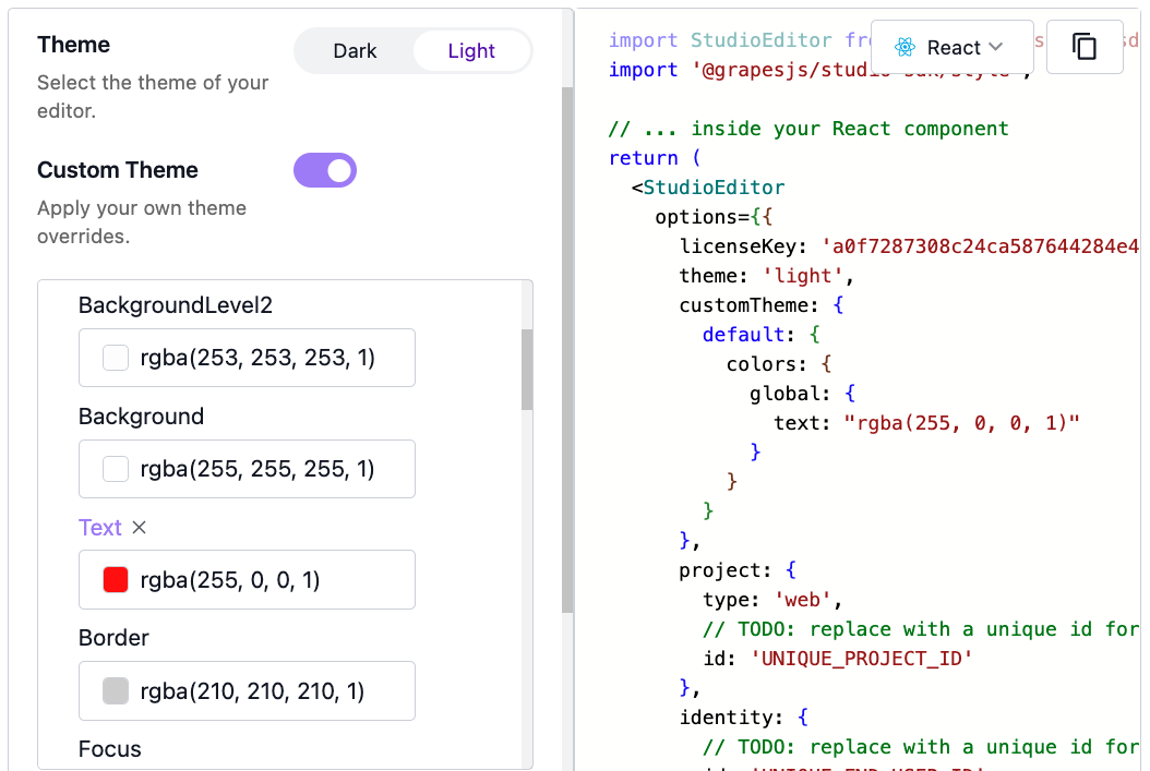
To reach this page, go to the SDK License Dashboard and click on "Edit" in one of your licenses, or create a new SDK License.
Custom Icons
You can customize the icons in Studio's user interface with the customTheme.icons option.
Here we set a custom SVG for the plus icon:
- React
- JS
- �🍇 Demo
import StudioEditor from '@grapesjs/studio-sdk/react';
import '@grapesjs/studio-sdk/style';

// ...
<StudioEditor
  options={{
    // ...
    customTheme: {
      icons: {
        plus: '<svg viewBox="0 0 32 32"><path d="M22 17h-5v5a1.001 1.001 0 01-2 0v-5h-5a1.001 1.001 0 010-2h5v-5a1.001 1.001 0 012 0v5h5a1.001 1.001 0 010 2zM16 0C7.163 0 0 7.16 0 16s7.163 16 16 16 16-7.16 16-16S24.837 0 16 0z" /></svg>'
      }
    }
  }}
/>
import createStudioEditor from '@grapesjs/studio-sdk';
import '@grapesjs/studio-sdk/style';

// ...
createStudioEditor({
  // ...
  customTheme: {
    icons: {
      plus: '<svg viewBox="0 0 32 32"><path d="M22 17h-5v5a1.001 1.001 0 01-2 0v-5h-5a1.001 1.001 0 010-2h5v-5a1.001 1.001 0 012 0v5h5a1.001 1.001 0 010 2zM16 0C7.163 0 0 7.16 0 16s7.163 16 16 16 16-7.16 16-16S24.837 0 16 0z" /></svg>'
    }
  }
})
Fill color and width/height set at the root <svg> tag will be overridden by Studio's styles.
Default Icons
Here's a list of all icons currently used in Studio:
alertRhombus
alignHorizontalCenter
alignHorizontalLeft
alignHorizontalRight
applicationBracketsOutline
arrowDown
arrowExpandAll
arrowRight
arrowULeftTop
arrowURightTop
borderAllVariant
borderRadius
borderStyle
calendar
cellphoneLink
check
checkBold
checkboxBlank
chevronUp
chevronDown
chevronLeft
chevronRight
close
codeBraces
cog
contentCopy
contentSave
delete
dotsVertical
emailOutline
eye
eyedropperVariant
eyeOff
eyeOffOutline
eyeOutline
fire
flare
floppy
folder
fullscreen
gradientVertical
helpCircle
home
image
information
informationVariant
layers
link
lock
lockOpenVariant
menuDown
newspaperVariantOutline
openInNew
paletteSwatch
panVertical
pencil
phone
plus
plusBox
powerPlug
refresh
rhombusOutline
rhombusSplit
rhombusSplitOutline
tag
target
targetVariant
textBoxMultiple
trayArrowDown
unfoldLessHorizontal
unfoldMoreHorizontal
viewDayOutline
viewGridPlus
web
xml
database
databaseOutline
databaseOutlineOn
databaseOutlineOff
databaseOutlineRemove
codeBrackets
toggleSwitchOutline
toggleSwitchOffOutline
null
string
number
cloudUpload
chat
creation
viewDashboard
rocketLaunch
lightningBolt
stop
arrowUp