Flex Columns
Project types | webemail |
Plan | Startup plan |
This plugin provides a set of flexible layout blocks based on CSS Flexbox, making it easy to structure content. It allows users to create responsive row/column layouts with intuitive controls to dynamically resize columns and adjust gaps directly in the canvas.
Install the Studio SDK plugins package:
- npm
- pnpm
- yarn
- CDN
npm i @grapesjs/studio-sdk-plugins
pnpm add @grapesjs/studio-sdk-plugins
yarn add @grapesjs/studio-sdk-plugins
// It's recommended to replace the `latest` tag with the specific latest version to avoid any potential breaking changes.
// The loaded plugin is globally available via `globalThis.StudioSdkPlugins_flexComponent`.
"https://unpkg.com/@grapesjs/studio-sdk-plugins@latest/dist/flexComponent/index.umd.js"
Import and use the plugin in your project:
- React
- JS
- 🍇 Demo
import StudioEditor from '@grapesjs/studio-sdk/react';
import '@grapesjs/studio-sdk/style';
import { flexComponent } from "@grapesjs/studio-sdk-plugins";
// ...
<StudioEditor
options={{
// ...
plugins: [
flexComponent?.init({
// ...options
})
],
project: {
default: {
pages: [
{
name: 'Home',
component: `
<div style="padding: 2rem">
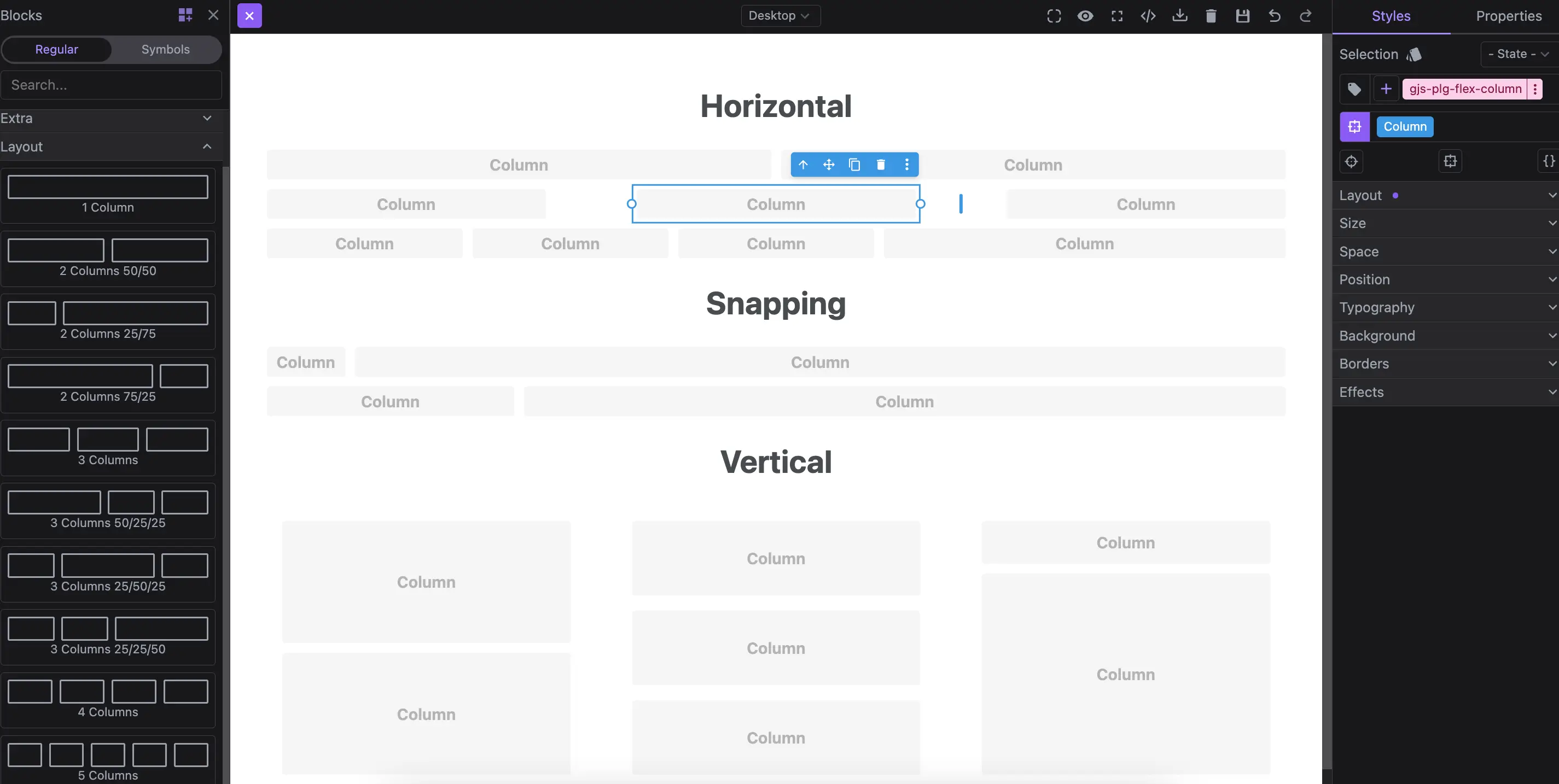
<h1>Horizontal</h1>
<div data-gjs-type="flex-row">
<div data-gjs-type="flex-column" style="flex-basis: 50%"></div>
<div data-gjs-type="flex-column" style="flex-basis: 50%"></div>
</div>
<div data-gjs-type="flex-row" style="gap: 2%">
<div data-gjs-type="flex-column" style="flex-basis: 32%"></div>
<div data-gjs-type="flex-column" style="flex-basis: 32%"></div>
<div data-gjs-type="flex-column" style="flex-basis: 32%"></div>
</div>
<div data-gjs-type="flex-row">
<div data-gjs-type="flex-column" style="flex-basis: 20%"></div>
<div data-gjs-type="flex-column" style="flex-basis: 20%"></div>
<div data-gjs-type="flex-column" style="flex-basis: 20%"></div>
<div data-gjs-type="flex-column" style="flex-basis: 40%"></div>
</div>
<h1>Snapping</h1>
<div data-gjs-type="flex-row" data-gjs-snap="true">
<div data-gjs-type="flex-column" style="flex-basis: 8.33%"></div>
<div data-gjs-type="flex-column" style="flex-basis: 91.66%"></div>
</div>
<div data-gjs-type="flex-row" data-gjs-snap="true" data-gjs-snap-divisions="4">
<div data-gjs-type="flex-column" style="flex-basis: 25%"></div>
<div data-gjs-type="flex-column" style="flex-basis: 75%"></div>
</div>
<h1>Vertical</h1>
<div data-gjs-type="flex-row" style="gap: 2%; height: 300px">
<div data-gjs-type="flex-column" style="flex-basis: 32%; padding: 1rem">
<div data-gjs-type="flex-row" style="flex-direction: column; height: 100%">
<div data-gjs-type="flex-column" style="flex-basis: 50%"></div>
<div data-gjs-type="flex-column" style="flex-basis: 50%"></div>
</div>
</div>
<div data-gjs-type="flex-column" style="flex-basis: 32%; padding: 1rem">
<div data-gjs-type="flex-row" style="gap: 2%; flex-direction: column; height: 100%">
<div data-gjs-type="flex-column" style="flex-basis: 32%"></div>
<div data-gjs-type="flex-column" style="flex-basis: 32%"></div>
<div data-gjs-type="flex-column" style="flex-basis: 32%"></div>
</div>
</div>
<div data-gjs-type="flex-column" style="flex-basis: 32%; padding: 1rem">
<div data-gjs-type="flex-row" data-gjs-snap="true" data-gjs-snap-divisions="5" style="flex-direction: column; height: 100%">
<div data-gjs-type="flex-column" style="flex-basis: 20%"></div>
<div data-gjs-type="flex-column" style="flex-basis: 80%"></div>
</div>
</div>
</div>
<div>
<style>
body { font-family: system-ui;}
h1 { text-align: center; }
</style>
`,
}
]
}
}
}}
/>
import createStudioEditor from '@grapesjs/studio-sdk';
import '@grapesjs/studio-sdk/style';
import { flexComponent } from "@grapesjs/studio-sdk-plugins";
// ...
createStudioEditor({
    // ...
    plugins: [
      flexComponent?.init({
        // ...options
      })
    ],
    project: {
      default: {
        pages: [
          {
            name: 'Home',
            component: `
            <div style="padding: 2rem">
              <h1>Horizontal</h1>
              <div data-gjs-type="flex-row">
                <div data-gjs-type="flex-column" style="flex-basis: 50%"></div>
                <div data-gjs-type="flex-column" style="flex-basis: 50%"></div>
              </div>
              <div data-gjs-type="flex-row" style="gap: 2%">
                <div data-gjs-type="flex-column" style="flex-basis: 32%"></div>
                <div data-gjs-type="flex-column" style="flex-basis: 32%"></div>
                <div data-gjs-type="flex-column" style="flex-basis: 32%"></div>
              </div>
              <div data-gjs-type="flex-row">
                <div data-gjs-type="flex-column" style="flex-basis: 20%"></div>
                <div data-gjs-type="flex-column" style="flex-basis: 20%"></div>
                <div data-gjs-type="flex-column" style="flex-basis: 20%"></div>
                <div data-gjs-type="flex-column" style="flex-basis: 40%"></div>
              </div>

              <h1>Snapping</h1>
              <div data-gjs-type="flex-row" data-gjs-snap="true">
                <div data-gjs-type="flex-column" style="flex-basis: 8.33%"></div>
                <div data-gjs-type="flex-column" style="flex-basis: 91.66%"></div>
              </div>
              <div data-gjs-type="flex-row" data-gjs-snap="true" data-gjs-snap-divisions="4">
                <div data-gjs-type="flex-column" style="flex-basis: 25%"></div>
                <div data-gjs-type="flex-column" style="flex-basis: 75%"></div>
              </div>

              <h1>Vertical</h1>
              <div data-gjs-type="flex-row" style="gap: 2%; height: 300px">
                <div data-gjs-type="flex-column" style="flex-basis: 32%; padding: 1rem">
                  <div data-gjs-type="flex-row" style="flex-direction: column; height: 100%">
                    <div data-gjs-type="flex-column" style="flex-basis: 50%"></div>
                    <div data-gjs-type="flex-column" style="flex-basis: 50%"></div>
                  </div>
                </div>
                <div data-gjs-type="flex-column" style="flex-basis: 32%; padding: 1rem">
                  <div data-gjs-type="flex-row" style="gap: 2%; flex-direction: column; height: 100%">
                    <div data-gjs-type="flex-column" style="flex-basis: 32%"></div>
                    <div data-gjs-type="flex-column" style="flex-basis: 32%"></div>
                    <div data-gjs-type="flex-column" style="flex-basis: 32%"></div>
                  </div>
                </div>
                <div data-gjs-type="flex-column" style="flex-basis: 32%; padding: 1rem">
                  <div data-gjs-type="flex-row" data-gjs-snap="true" data-gjs-snap-divisions="5" style="flex-direction: column; height: 100%">
                    <div data-gjs-type="flex-column" style="flex-basis: 20%"></div>
                    <div data-gjs-type="flex-column" style="flex-basis: 80%"></div>
                  </div>
                </div>
              </div>
            <div>

            <style>
              body { font-family: system-ui;}
              h1 { text-align: center; }
            </style>
            `,
          }
        ]
      }
    }


})
Email projects
The plugin also supports column snapping and resizing for the email project type.
- React
- JS
- 🍇 Demo
import StudioEditor from '@grapesjs/studio-sdk/react';
import '@grapesjs/studio-sdk/style';
import { flexComponent } from "@grapesjs/studio-sdk-plugins";
// ...
<StudioEditor
  options={{
      // ...
      plugins: [
        flexComponent?.init({
          // Indicate the email project type
          projectType: 'email'
        })
      ],
      project: {
        type: 'email',
        default: {
          pages: [
            {
              component: `
                <mjml>
                  <mj-body>
                    <mj-section>
                      <mj-column>
                        <mj-text align="center" font-weight="700" font-size="25px">Resizable columns</mj-text>
                      </mj-column>
                    </mj-section>
                    <mj-section>
                      <mj-column width="50%"></mj-column>
                      <mj-column width="50%"></mj-column>
                    </mj-section>
                    <mj-section>
                      <mj-column width="25%"></mj-column>
                      <mj-column width="75%"></mj-column>
                    </mj-section>
                    <mj-section>
                      <mj-column>
                        <mj-text align="center" font-weight="700" font-size="25px">Snapping</mj-text>
                      </mj-column>
                    </mj-section>
                    <mj-section data-gjs-snap="true" data-gjs-snap-divisions="4">
                      <mj-column width="75%"></mj-column>
                      <mj-column width="25%"></mj-column>
                    </mj-section>
                  </mj-body>
                </mjml>
              `,
            }
          ]
        }
      }


  }}
/>
import createStudioEditor from '@grapesjs/studio-sdk';
import '@grapesjs/studio-sdk/style';
import { flexComponent } from "@grapesjs/studio-sdk-plugins";
// ...
createStudioEditor({
    // ...
    plugins: [
      flexComponent?.init({
        // Indicate the email project type
        projectType: 'email'
      })
    ],
    project: {
      type: 'email',
      default: {
        pages: [
          {
            component: `
              <mjml>
                <mj-body>
                  <mj-section>
                    <mj-column>
                      <mj-text align="center" font-weight="700" font-size="25px">Resizable columns</mj-text>
                    </mj-column>
                  </mj-section>
                  <mj-section>
                    <mj-column width="50%"></mj-column>
                    <mj-column width="50%"></mj-column>
                  </mj-section>
                  <mj-section>
                    <mj-column width="25%"></mj-column>
                    <mj-column width="75%"></mj-column>
                  </mj-section>
                  <mj-section>
                    <mj-column>
                      <mj-text align="center" font-weight="700" font-size="25px">Snapping</mj-text>
                    </mj-column>
                  </mj-section>
                  <mj-section data-gjs-snap="true" data-gjs-snap-divisions="4">
                    <mj-column width="75%"></mj-column>
                    <mj-column width="25%"></mj-column>
                  </mj-section>
                </mj-body>
              </mjml>
            `,
          }
        ]
      }
    }


})
Plugin options
| Property | Type | Description |
|---|---|---|
licenseKey | string | The license key for the plugin. This is optional, only required if the plugin is used outside of Studio SDK. Example |
blocks | Block | Filter default layout blocks. Pass Example |
typeRow | string | Default component type for row. Default |
typeColumn | string | Default component type for column. Default |
extendTypeRow | boolean | Indicate if the existant Default |
extendTypeColumn | boolean | Indicate if the existant Default |
minItemPercent | number | Minimum item percent size in percentage. Default |
snapEnabled | boolean | Enable snapping by default. Default |
snapDivisions | number | Default divisions for snapping. Default |
disableGapHandler | boolean | Disable gap handler. Default |
gapHandleSize | number | Gap size in px. Default |
projectType | string | If you're using Example Default |
getSize | function | Provide a custom handler for getting the column size. Example |
getGap | function | Provide a custom handler for getting the gap size. Example |
getParentSize | function | Provide a custom handler for getting the parent size. Example |
isParentVertical | function | Provide a custom handler for checking if the parent layout is in vertical layout. Example |
setSize | function | Provide a custom handler for setting the column size. Example |
setGap | function | Provide a custom handler for setting the gap size. Example |