React
Project types | react |
Plan | Startup plan |
This plugin enables visual editing with your own React components. It includes a custom canvas renderer for the editor and a component for rendering saved projects with React, making it ideal for integrating visual editing into component-based applications.
Install the Studio SDK plugins package:
- npm
- pnpm
- yarn
npm i @grapesjs/studio-sdk-plugins
pnpm add @grapesjs/studio-sdk-plugins
yarn add @grapesjs/studio-sdk-plugins
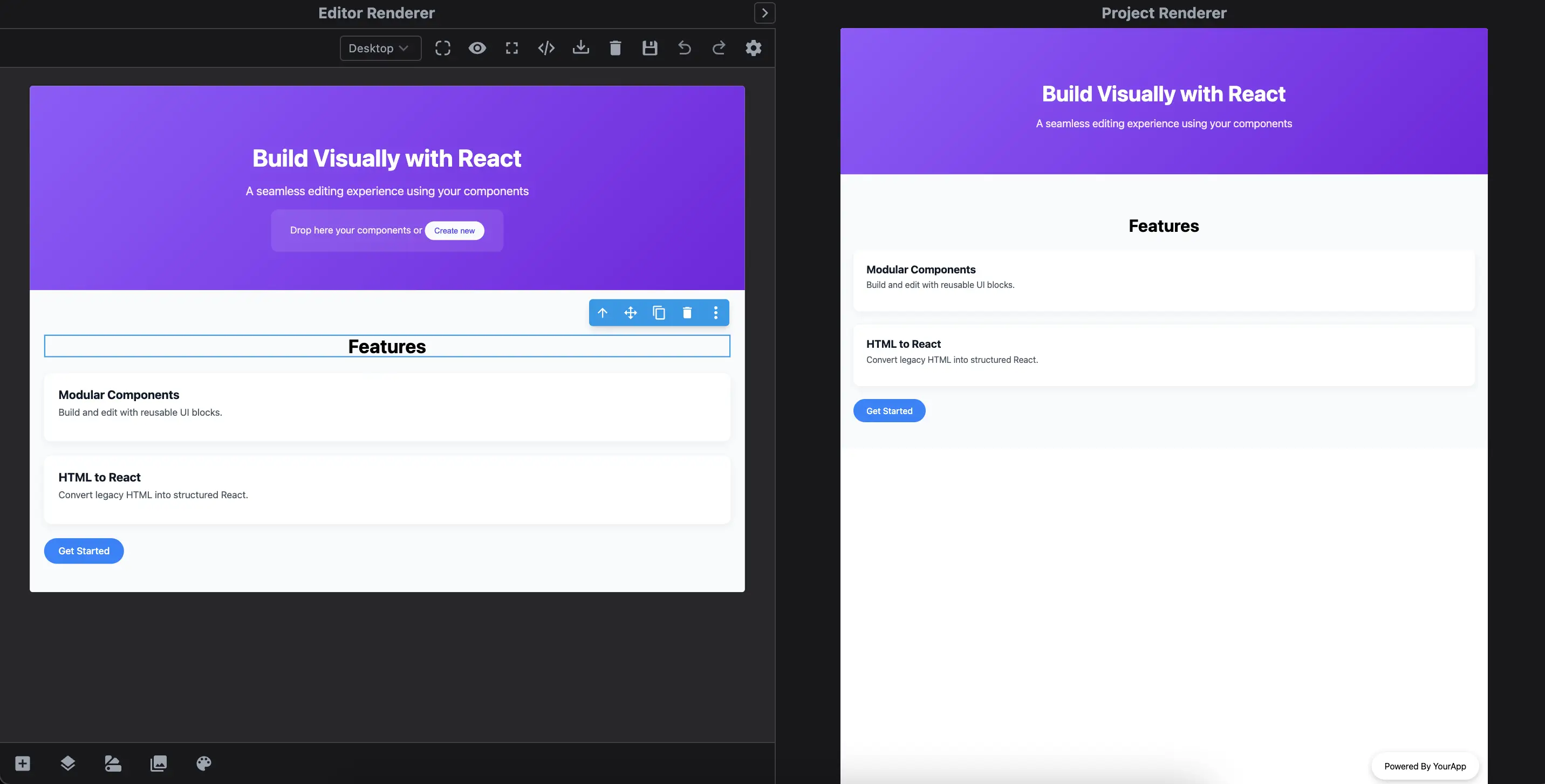
Below is a quick demo showing how content built in the editor maps to your actual React components in real time.
- Build pages and blocks directly with your custom React components.
- Automatically parse HTML into matching React elements.
- Add Pages and Blocks with React components.
- Includes the React canvas renderer for the editor and a lightweight component to render saved projects anywhere (ideal for SSR).
Check the code from the Demo tab with a complete example of how to use the plugin.
- React
- 🍇 Demo
import StudioEditor from '@grapesjs/studio-sdk/react';
import '@grapesjs/studio-sdk/style';

// Import React renderer plugin for the editor
import rendererReact from '@grapesjs/studio-sdk-plugins/dist/rendererReact';

// React renderer for the project JSON
// import { RenderProject } from '@grapesjs/studio-sdk-plugins/dist/rendererReact/rendererProject';
// <RenderProject projectData={projectDataJSON} config={reactRendererConfig}/>

// Full code in the Demo tab
// import Hero from './your/components/Hero';
const reactRendererConfig = {
  components: {
    Hero: {
      component: Hero, // Hero is a React component
      // props are in the shape of GrapesJS Traits
      props: () => [
        {
          type: 'text',
          name: 'title',
          label: 'Title'
        },
        {
          type: 'text',
          name: 'subtitle',
          label: 'Subtitle',
          value: 'Default Subtitle'
        }
      ],
    },
  }
}

// ...
<StudioEditor
  options={{
    // ...
    plugins: [
      rendererReact.init(reactRendererConfig),
      (editor) => {
        // Create blocks with React components
        editor.Blocks.add('feature', {
          label: 'Feature component',
          category: 'React',
          full: true,
          content: <Feature title="Feature title" description="Feature description" />
        }, { at: 0 });
      }
    ],
    project: {
      type: 'react', // Provide react type
      default: {
        pages: [
          {
            name: 'Page from React',
            // Create pages with React components
            component: (
              <>
                <Hero title="Build Visually with React" subtitle="A seamless editing experience using your components"/>
                <Section>
                  <h2 data-gjs-type="heading" style={{ textAlign: 'center', fontSize: '2rem' }}>Features</h2>
                  <Feature title="Modular Components" description="Build and edit with reusable UI blocks." />
                  <Feature title="HTML to React" description="Convert legacy HTML into structured React." />
                  <Button label="Get Started" href="#start" />
                </Section>
              </>
            )
          },
          {
            name: 'Page from HTML',
            component: `
              <h1>React Components from HTML</h1>
              <div data-gjs-type="Hero" title="React from HTML"></div>
              <style>
                body { font-family: system-ui; }
              </style>
            `
          }
        ]
      }
    },
  }}
/>
Plugin options
| Property | Type | Description |
|---|---|---|
licenseKey | string | The license key for the plugin. This is optional, only required if the plugin is used outside of Studio SDK. Example |
components | object | Map of custom components. Example |
errorComponent | ReactComponent | Custom error component. This is used when, for example, you're trying to render a page with an invalid id. Example |
rootComponent | ReactComponent | Custom root component that wraps the entire rendered project. Usually used to provide a layout or context for the entire application. Example |
headAfter | ReactComponent | Custom react component to append at the end of the Example |
bodyAfter | ReactComponent | Custom react component to append at the end of the Example |
Component config
| Property | Type | Description |
|---|---|---|
component* | ReactComponent | React Component Example |
allowPropId | boolean | Indicate if the component can accept the |
allowPropClassName | boolean | Indicate if the component can accept the |
allowChildren | boolean | Indicate if the component can accept children. |
props | function | Return an array of properties in a shape of GrapesJS traits. Example |
model | object | GrapesJS component model definition. Example |
wrapperStyle | object | Allows you to customize the style of the wrapper element around your React component. In the editor, all React components are automatically wrapped in a container element. This wrapper enables editing features like drag & drop, selection, and more. For most cases, styling the wrapper is sufficient. If you need deeper customization (e.g., changing the wrapper element type or structure), use the Example |
editorRender | ReactComponent | Custom render function for displaying the component inside the editor canvas. Use this when you want full control over how the component appears in the editor, including custom wrappers, helper elements, or injected behavior. The Example |