Iconify
Project types | web |
Plan | Startup plan |
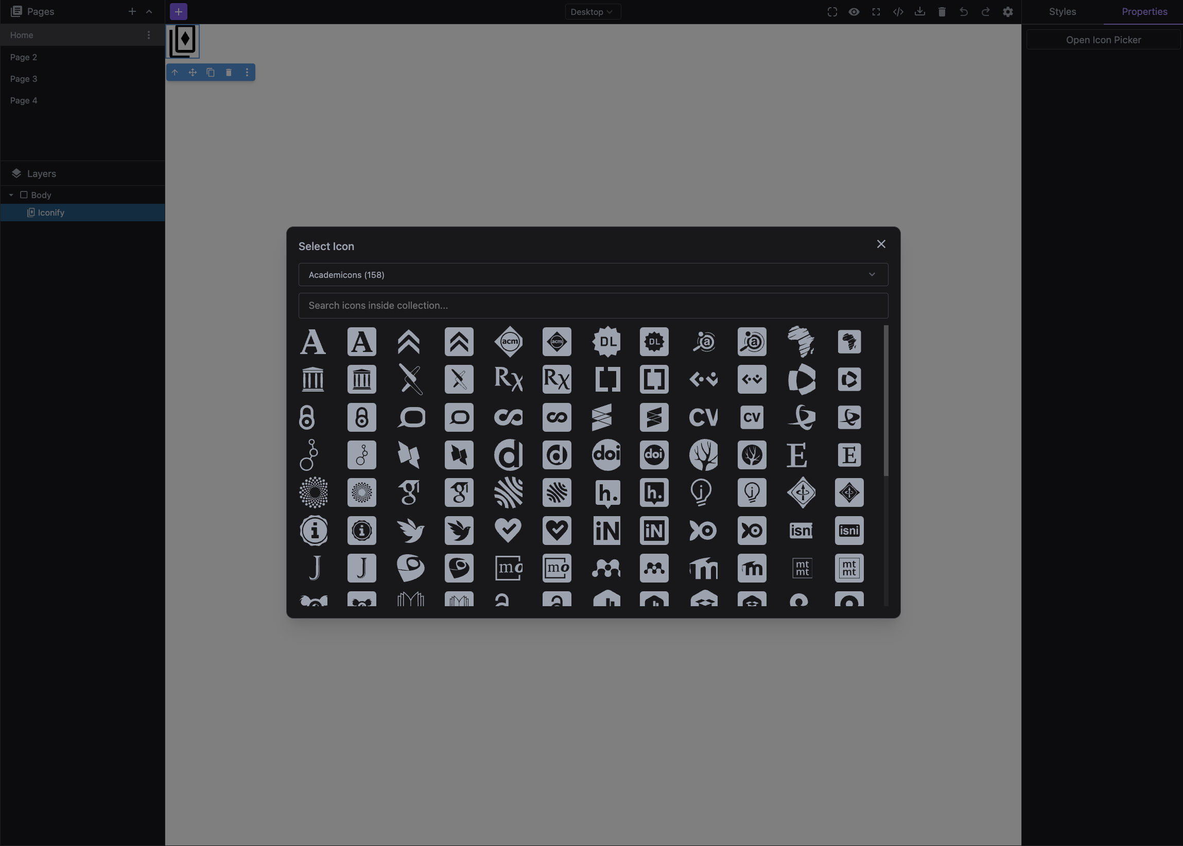
Add an icon component with the icon picker by levering the Iconify collections.
Install the Studio SDK plugins package:
- npm
- pnpm
- yarn
- CDN
npm i @grapesjs/studio-sdk-plugins
pnpm add @grapesjs/studio-sdk-plugins
yarn add @grapesjs/studio-sdk-plugins
// It's recommended to replace the `latest` tag with the specific latest version to avoid any potential breaking changes.
// The loaded plugin is globally available via `globalThis.StudioSdkPlugins_iconifyComponent`.
"https://unpkg.com/@grapesjs/studio-sdk-plugins@latest/dist/iconifyComponent/index.umd.js"
Import and use the plugin in your project:
- React
- JS
- 🍇 Demo
import StudioEditor from '@grapesjs/studio-sdk/react';
import '@grapesjs/studio-sdk/style';
import { iconifyComponent } from "@grapesjs/studio-sdk-plugins";
// ...
<StudioEditor
  options={{
      // ...
      plugins: [
        iconifyComponent.init({
          block: { category: 'Extra', label: 'Iconify' }
        })
      ],
      project: {
        default: {
          pages: [
            {
              name: 'Home',
              component: `
                <h2>Double click the icon below to show the icon picker</h2>
                <div data-type-iconify>
                  <svg xmlns="http://www.w3.org/2000/svg" viewBox="0 0 24 24"><path fill="currentColor" d="M12 2.5L8.42 8.06L2 9.74l4.2 5.14l-.38 6.62L12 19.09l6.18 2.41l-.38-6.62L22 9.74l-6.42-1.68zm-2.62 8c.62 0 1.12.5 1.12 1.13a1.12 1.12 0 0 1-1.12 1.12c-.63 0-1.13-.5-1.13-1.12c0-.63.5-1.13 1.13-1.13m5.25 0c.62 0 1.12.5 1.12 1.13a1.12 1.12 0 0 1-1.12 1.12c-.63 0-1.13-.5-1.13-1.12c0-.63.5-1.13 1.13-1.13M9 15h6a3.249 3.249 0 0 1-6 0"></path></svg
                </div>
              `,
            }
          ]
        }
      }

  }}
/>
import createStudioEditor from '@grapesjs/studio-sdk';
import '@grapesjs/studio-sdk/style';
import { iconifyComponent } from "@grapesjs/studio-sdk-plugins";
// ...
createStudioEditor({
    // ...
    plugins: [
      iconifyComponent.init({
        block: { category: 'Extra', label: 'Iconify' }
      })
    ],
    project: {
      default: {
        pages: [
          {
            name: 'Home',
            component: `
              <h2>Double click the icon below to show the icon picker</h2>
              <div data-type-iconify>
                <svg xmlns="http://www.w3.org/2000/svg" viewBox="0 0 24 24"><path fill="currentColor" d="M12 2.5L8.42 8.06L2 9.74l4.2 5.14l-.38 6.62L12 19.09l6.18 2.41l-.38-6.62L22 9.74l-6.42-1.68zm-2.62 8c.62 0 1.12.5 1.12 1.13a1.12 1.12 0 0 1-1.12 1.12c-.63 0-1.13-.5-1.13-1.12c0-.63.5-1.13 1.13-1.13m5.25 0c.62 0 1.12.5 1.12 1.13a1.12 1.12 0 0 1-1.12 1.12c-.63 0-1.13-.5-1.13-1.12c0-.63.5-1.13 1.13-1.13M9 15h6a3.249 3.249 0 0 1-6 0"></path></svg
              </div>
            `,
          }
        ]
      }
    }

})
Plugin options
| Property | Type | Description |
|---|---|---|
licenseKey | string | The license key for the plugin. This is optional, only required if the plugin is used outside of Studio SDK. Example |
block | Block | Additional Block properties of the component. Pass Example |
collections | array | List of icon collections to load. Example |
extendIconComponent | boolean | Extend the icon picker trait to the default icon component. Default |