Dialog
warning
This component is a work in progress.
Add a dialog component with additional functionalities.
Install the Studio SDK plugins package:
- npm
- pnpm
- yarn
- CDN
npm i @grapesjs/studio-sdk-plugins
pnpm add @grapesjs/studio-sdk-plugins
yarn add @grapesjs/studio-sdk-plugins
// It's recommended to replace the `latest` tag with the specific latest version to avoid any potential breaking changes.
// The loaded plugin is globally available via `globalThis.StudioSdkPlugins_dialogComponent`.
"https://unpkg.com/@grapesjs/studio-sdk-plugins@latest/dist/dialogComponent/index.umd.js"
To use the Dialog plugin, you need to import it into your project:
- React
- JS
- 🍇 Demo
import StudioEditor from '@grapesjs/studio-sdk/react';
import '@grapesjs/studio-sdk/style';
import { dialogComponent } from "@grapesjs/studio-sdk-plugins";
// ...
<StudioEditor
  options={{
      // ...
      plugins: [
        dialogComponent.init({
          block: { category: 'Extra', label: 'My Dialog' }
        })
      ]

  }}
/>
import createStudioEditor from '@grapesjs/studio-sdk';
import '@grapesjs/studio-sdk/style';
import { dialogComponent } from "@grapesjs/studio-sdk-plugins";
// ...
createStudioEditor({
    // ...
    plugins: [
      dialogComponent.init({
        block: { category: 'Extra', label: 'My Dialog' }
      })
    ]

})
Plugin options
| Property | Type | Description |
|---|---|---|
licenseKey | string | The license key for the plugin. This is optional, only required if the plugin is used outside of Studio SDK. Example |
block | object | Block options for the dialog component. See https://grapesjs.com/docs/api/block.html#properties for more information. Example |
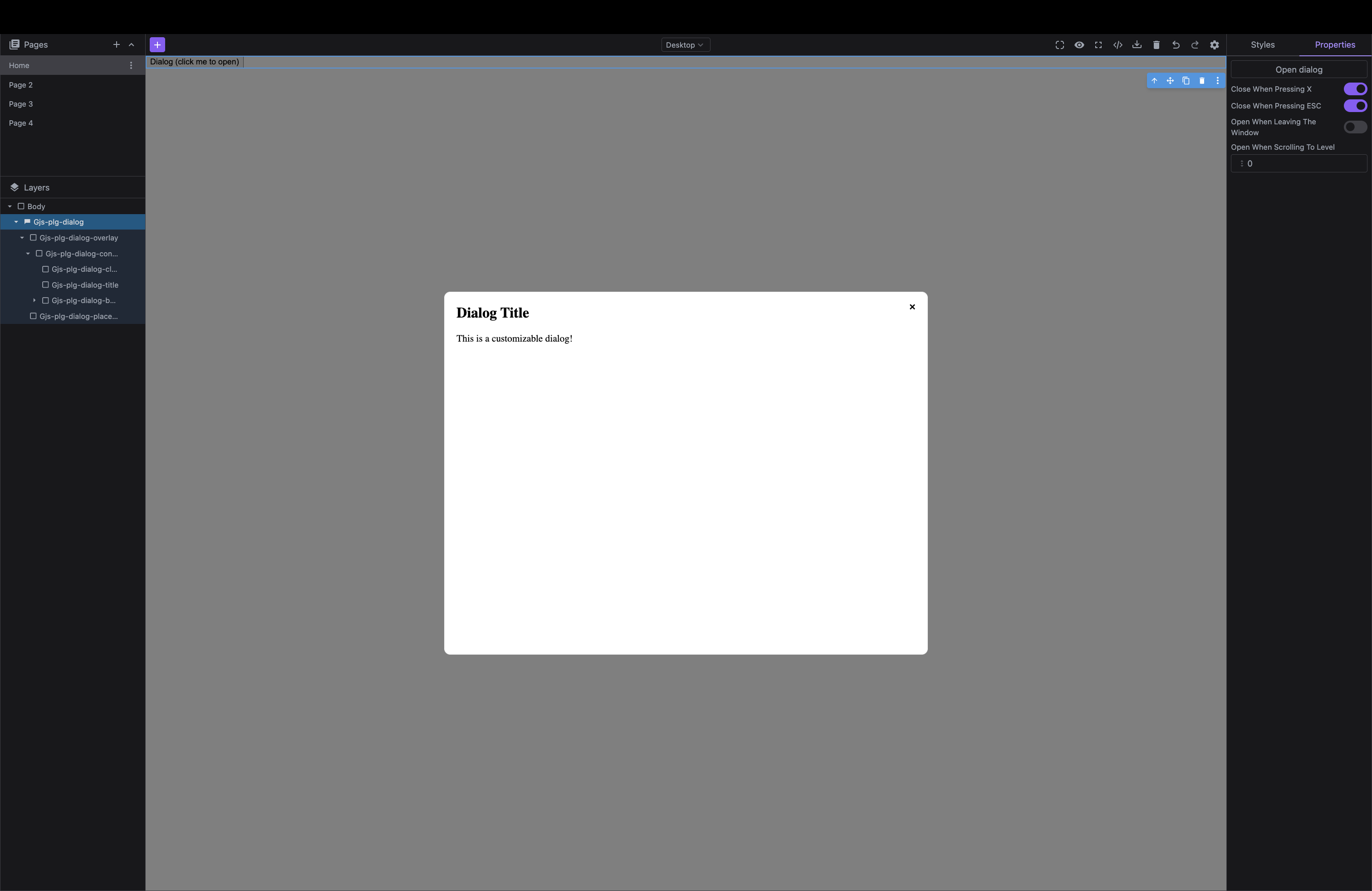
Component properties
| Property | Type | Description |
|---|---|---|
closeWhenPressingX* | boolean | Whether the dialog should close when pressing the X button. |
closeWhenPressingEsc* | boolean | Whether the dialog should close when pressing the Escape key. |
openWhenLeavingWindow* | boolean | Whether the dialog should open when leaving the window. |
openWhenScrollingToLevel* | string | Whether the dialog should open when scrolling to a specific level. Example |