Empty State
Project types | webemail |
Plan | Startup plan |
Update empty components with custom content inside.
Install the Studio SDK plugins package:
- npm
- pnpm
- yarn
- CDN
npm i @grapesjs/studio-sdk-plugins
pnpm add @grapesjs/studio-sdk-plugins
yarn add @grapesjs/studio-sdk-plugins
// It's recommended to replace the `latest` tag with the specific latest version to avoid any potential breaking changes.
// The loaded plugin is globally available via `globalThis.StudioSdkPlugins_canvasEmptyState`.
"https://unpkg.com/@grapesjs/studio-sdk-plugins@latest/dist/canvasEmptyState/index.umd.js"
Import and use the plugin in your project:
- React
- JS
- 🍇 Demo
import StudioEditor from '@grapesjs/studio-sdk/react';
import '@grapesjs/studio-sdk/style';
import { canvasEmptyState } from '@grapesjs/studio-sdk-plugins';
// ...
<StudioEditor
options={{
// ...
project: {
// For demo purposes, define a default empty project to display the body's empty state.
default: { pages: [{ name: 'Home' }] }
},
plugins: [
canvasEmptyState?.init({
emptyStates: [
{
isValid: ['wrapper'],
render: ({ editor, mount, unmount }) => {
const container = document.createElement('div');
container.className = 'empty-state-wrapper';
container.innerHTML = `
<div class="empty-state-wrapper__card">
<div class="empty-state-wrapper__content">
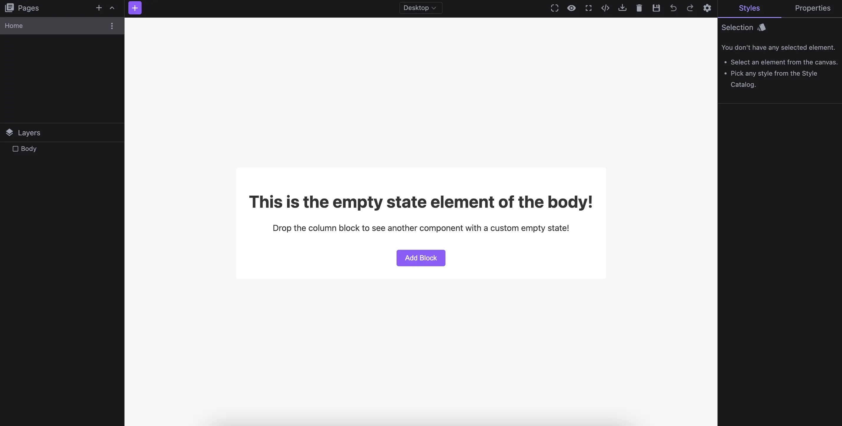
<h1>This is the empty state element of the body!</h1>
<p>Drop the column block to see another component with a custom empty state!</p>
</div>
<button class="empty-state-wrapper__btn">Add Block</button>
</div>
<style>
.empty-state-wrapper {
font-family: system-ui, sans-serif;
background-color: #f5f5f5;
display: flex;
justify-content: center;
align-items: center;
height: 100dvh;
}
.empty-state-wrapper__card {
text-align: center;
display: flex;
flex-direction: column;
align-items: center;
justify-content: center;
padding: 24px;
border-radius: 4px;
background-color: white;
color: #333;
gap: 16px;
}
.empty-state-wrapper__btn {
background-color: #8b5cf6;
padding: 8px 16px;
margin: 0;
color: white;
border: none;
cursor: pointer;
border-radius: 4px;
}
</style>
`;
const btn = container.querySelector('button');
btn.addEventListener('click', () => {
editor.runCommand('studio:layoutToggle', {
id: 'emptyStateWrapperBlocks',
layout: { type: 'panelBlocks' },
header: { label: 'Blocks' },
placer: { type: 'absolute', position: 'left' }
});
});
// Mount the empty state container
mount(container);
return () => unmount(container);
}
},
{
isValid: ({ component }) => component.is('gridColumn'),
render: ({ editor, component, mount }) => {
const container = document.createElement('div');
container.className = 'empty-state-wrapper';
container.innerHTML = `
<button class="empty-state-column__btn">Add text to column</button>
<style>
.empty-state-wrapper {
display: flex;
justify-content: center;
align-items: center;
}
.empty-state-column__btn {
background-color: #8b5cf6;
padding: 8px 16px;
margin: 0;
color: white;
border: none;
cursor: pointer;
border-radius: 4px;
}
</style>
`;
const btn = container.querySelector('button');
btn.addEventListener('click', () => {
const textCmp = component.append('<div>New Text</div>')[0];
editor.select(textCmp);
textCmp.trigger('active');
});
mount(container);
}
}
]
})
],
}}
/>
import createStudioEditor from '@grapesjs/studio-sdk';
import '@grapesjs/studio-sdk/style';
import { canvasEmptyState } from '@grapesjs/studio-sdk-plugins';
// ...
createStudioEditor({
    // ...
    project: {
      // For demo purposes, define a default empty project to display the body's empty state.
      default: { pages: [{ name: 'Home' }] }
    },
    plugins: [
      canvasEmptyState?.init({
        emptyStates: [
          {
            isValid: ['wrapper'],
            render: ({ editor, mount, unmount }) => {
              const container = document.createElement('div');
              container.className = 'empty-state-wrapper';
              container.innerHTML = `
                <div class="empty-state-wrapper__card">
                  <div class="empty-state-wrapper__content">
                    <h1>This is the empty state element of the body!</h1>
                    <p>Drop the column block to see another component with a custom empty state!</p>
                  </div>
                  <button class="empty-state-wrapper__btn">Add Block</button>
                </div>

                <style>
                .empty-state-wrapper {
                  font-family: system-ui, sans-serif;
                  background-color: #f5f5f5;
                  display: flex;
                  justify-content: center;
                  align-items: center;
                  height: 100dvh;
                }
                .empty-state-wrapper__card {
                  text-align: center;
                  display: flex;
                  flex-direction: column;
                  align-items: center;
                  justify-content: center;
                  padding: 24px;
                  border-radius: 4px;
                  background-color: white;
                  color: #333;
                  gap: 16px;
                }
                .empty-state-wrapper__btn {
                  background-color: #8b5cf6;
                  padding: 8px 16px;
                  margin: 0;
                  color: white;
                  border: none;
                  cursor: pointer;
                  border-radius: 4px;
                }
                </style>
              `;

              const btn = container.querySelector('button');
              btn.addEventListener('click', () => {
                editor.runCommand('studio:layoutToggle', {
                  id: 'emptyStateWrapperBlocks',
                  layout: { type: 'panelBlocks' },
                  header: { label: 'Blocks' },
                  placer: { type: 'absolute', position: 'left' }
                });
              });

              // Mount the empty state container
              mount(container);
              return () => unmount(container);
            }
          },
          {
            isValid: ({ component }) => component.is('gridColumn'),
            render: ({ editor, component, mount }) => {
              const container = document.createElement('div');
              container.className = 'empty-state-wrapper';
              container.innerHTML = `
                <button class="empty-state-column__btn">Add text to column</button>
                <style>
                  .empty-state-wrapper {
                    display: flex;
                    justify-content: center;
                    align-items: center;
                  }
                  .empty-state-column__btn {
                    background-color: #8b5cf6;
                    padding: 8px 16px;
                    margin: 0;
                    color: white;
                    border: none;
                    cursor: pointer;
                    border-radius: 4px;
                  }
                </style>
              `;
              const btn = container.querySelector('button');
              btn.addEventListener('click', () => {
                const textCmp = component.append('<div>New Text</div>')[0];
                editor.select(textCmp);
                textCmp.trigger('active');
              });
              mount(container);
            }
          }
        ]
      })
    ],


})
Plugin options
| Property | Type | Description |
|---|---|---|
licenseKey | string | The license key for the plugin. This is optional, only required if the plugin is used outside of Studio SDK. Example |
emptyStates | array | Empty state types to render. Example |