Sidebar Buttons
Project types | webemail |
Plan | Free plan |
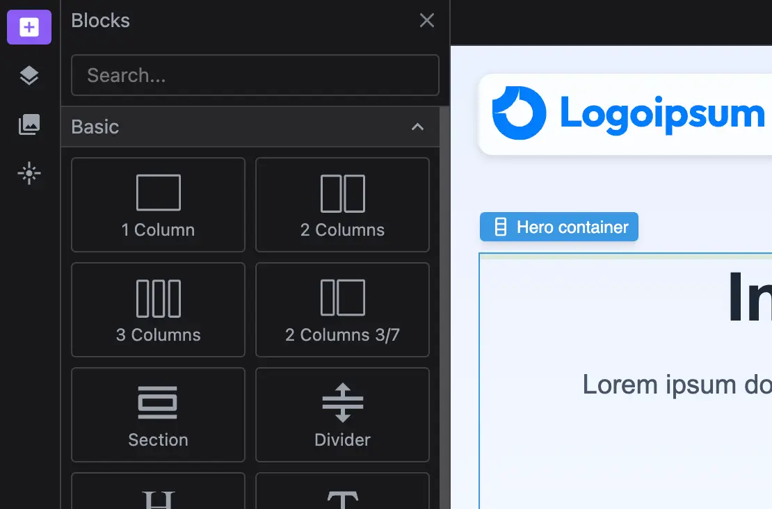
Add a customizable sidebar to centralize key editor actions. Easily toggle panels like Layers, Blocks, and Assets for a more efficient workflow. Comes with predefined responsive layouts for tablet and mobile screens.
Install the Studio SDK plugins package:
- npm
- pnpm
- yarn
- CDN
npm i @grapesjs/studio-sdk-plugins
pnpm add @grapesjs/studio-sdk-plugins
yarn add @grapesjs/studio-sdk-plugins
// It's recommended to replace the `latest` tag with the specific latest version to avoid any potential breaking changes.
// The loaded plugin is globally available via `globalThis.StudioSdkPlugins_layoutSidebarButtons`.
"https://unpkg.com/@grapesjs/studio-sdk-plugins@latest/dist/layoutSidebarButtons/index.umd.js"
Import and use the plugin in your project:
- React
- JS
- 🍇 Demo
import StudioEditor from '@grapesjs/studio-sdk/react';
import '@grapesjs/studio-sdk/style';
import { layoutSidebarButtons } from '@grapesjs/studio-sdk-plugins';
// ...
<StudioEditor
  options={{
      // ...
      plugins: [
        layoutSidebarButtons
      ],
  }}
/>
import createStudioEditor from '@grapesjs/studio-sdk';
import '@grapesjs/studio-sdk/style';
import { layoutSidebarButtons } from '@grapesjs/studio-sdk-plugins';
// ...
createStudioEditor({
    // ...
    plugins: [
      layoutSidebarButtons
    ],
})
Customization
You can customize the sidebar by adding your own buttons or extending the existing ones. Each responsive breakpoint can have its own unique set of controls to optimize the editing experience across different screen sizes.
- React
- JS
- 🍇 Demo
import StudioEditor from '@grapesjs/studio-sdk/react';
import '@grapesjs/studio-sdk/style';
import { layoutSidebarButtons } from '@grapesjs/studio-sdk-plugins';
// ...
<StudioEditor
  options={{
      // ...
      plugins: [
        layoutSidebarButtons.init({
          sidebarButton({ id, buttonProps, breakpoint, createSidebarButton }) {
            // Skip updates to the sidebar buttons for layout with a breakpoint (tablet/mobile)
            if (breakpoint) return buttonProps;

            // Customize the button for 'panelBlocks'
            if (id === 'panelBlocks') {
              return createSidebarButton({
                layoutComponent: {
                  type: 'panelBlocks',
                  symbols: false,
                  blocks: ({ blocks }) => blocks.filter(block => block.category?.getLabel() === 'Basic')
                }
              });
              // Customize the button for 'panelPagesLayers'
            } else if (id === 'panelPagesLayers') {
              return createSidebarButton({
                label: 'Layers',
                layoutComponent: { type: 'panelLayers' }
              });
              // Show 'panelAssets' with another placer
            } else if (id === 'panelAssets') {
              return createSidebarButton({
                layoutCommand: { placer: { type: 'absolute', position: 'right' } }
              });
              // Hide 'panelGlobalStyles' button
            } else if (id === 'panelGlobalStyles') {
              return null;
            }

            // Return default button props
            return buttonProps;
          },
          sidebarButtons({ breakpoint, sidebarButtons, createSidebarButton }) {
            // Add a custom button for the default layout
            return !breakpoint
              ? [
                  ...sidebarButtons,
                  createSidebarButton({
                    id: 'customButton',
                    icon: 'flare',
                    layoutCommand: {
                      header: false,
                      placer: { type: 'dialog', title: 'Custom Dialog' }
                    },
                    layoutComponent: {
                      type: 'custom',
                      render: () => 'Custom layout'
                    }
                  })
                ]
              : sidebarButtons;
          },
          rootLayout({ breakpoint, rootLayout, sidebarButtons, createSidebarButton }) {
            if (breakpoint === 768) {
              return {
                ...rootLayout,
                children: [
                  { type: 'canvas' },
                  {
                    type: 'sidebarBottom',
                    style: { padding: '0 5px', alignItems: 'center', gap: 10, minHeight: 39 },
                    children: [
                      ...sidebarButtons,
                      createSidebarButton({
                        id: 'customButton',
                        icon: 'flare',
                        label: 'Custom',
                        layoutCommand: { placer: { type: 'absolute', position: 'right' } },
                        layoutComponent: {
                          type: 'custom',
                          render: () => 'Custom layout'
                        }
                      }),
                      { type: 'devices', style: { width: 100, marginLeft: 'auto' } }
                    ]
                  }
                ]
              };
            }
            return rootLayout;
          }
        }),
      ],
  }}
/>
import createStudioEditor from '@grapesjs/studio-sdk';
import '@grapesjs/studio-sdk/style';
import { layoutSidebarButtons } from '@grapesjs/studio-sdk-plugins';
// ...
createStudioEditor({
    // ...
    plugins: [
      layoutSidebarButtons.init({
        sidebarButton({ id, buttonProps, breakpoint, createSidebarButton }) {
          // Skip updates to the sidebar buttons for layout with a breakpoint (tablet/mobile)
          if (breakpoint) return buttonProps;

          // Customize the button for 'panelBlocks'
          if (id === 'panelBlocks') {
            return createSidebarButton({
              layoutComponent: {
                type: 'panelBlocks',
                symbols: false,
                blocks: ({ blocks }) => blocks.filter(block => block.category?.getLabel() === 'Basic')
              }
            });
            // Customize the button for 'panelPagesLayers'
          } else if (id === 'panelPagesLayers') {
            return createSidebarButton({
              label: 'Layers',
              layoutComponent: { type: 'panelLayers' }
            });
            // Show 'panelAssets' with another placer
          } else if (id === 'panelAssets') {
            return createSidebarButton({
              layoutCommand: { placer: { type: 'absolute', position: 'right' } }
            });
            // Hide 'panelGlobalStyles' button
          } else if (id === 'panelGlobalStyles') {
            return null;
          }

          // Return default button props
          return buttonProps;
        },
        sidebarButtons({ breakpoint, sidebarButtons, createSidebarButton }) {
          // Add a custom button for the default layout
          return !breakpoint
            ? [
                ...sidebarButtons,
                createSidebarButton({
                  id: 'customButton',
                  icon: 'flare',
                  layoutCommand: {
                    header: false,
                    placer: { type: 'dialog', title: 'Custom Dialog' }
                  },
                  layoutComponent: {
                    type: 'custom',
                    render: () => 'Custom layout'
                  }
                })
              ]
            : sidebarButtons;
        },
        rootLayout({ breakpoint, rootLayout, sidebarButtons, createSidebarButton }) {
          if (breakpoint === 768) {
            return {
              ...rootLayout,
              children: [
                { type: 'canvas' },
                {
                  type: 'sidebarBottom',
                  style: { padding: '0 5px', alignItems: 'center', gap: 10, minHeight: 39 },
                  children: [
                    ...sidebarButtons,
                    createSidebarButton({
                      id: 'customButton',
                      icon: 'flare',
                      label: 'Custom',
                      layoutCommand: { placer: { type: 'absolute', position: 'right' } },
                      layoutComponent: {
                        type: 'custom',
                        render: () => 'Custom layout'
                      }
                    }),
                    { type: 'devices', style: { width: 100, marginLeft: 'auto' } }
                  ]
                }
              ]
            };
          }
          return rootLayout;
        }
      }),
    ],
})
Plugin options
| Property | Type | Description |
|---|---|---|
licenseKey | string | The license key for the plugin. This is optional, only required if the plugin is used outside of Studio SDK. Example |
sidebarButton | function | Extend each sidebar button per breakpoint. Example |
sidebarButtons | function | Add or filter the resultant buttons per breakpoint. Example |
sidebarLayoutCommand | function | Customize the layout command object of each sidebar button. Example |
rootLayout | function | Customize the resultant root layout per breakpoint. Example |
breakpointTablet | number | Custom tablet breakpoint. Default |
breakpointMobile | number | Custom mobile breakpoint. Default |