Table
Project types | web |
Plan | Startup plan |
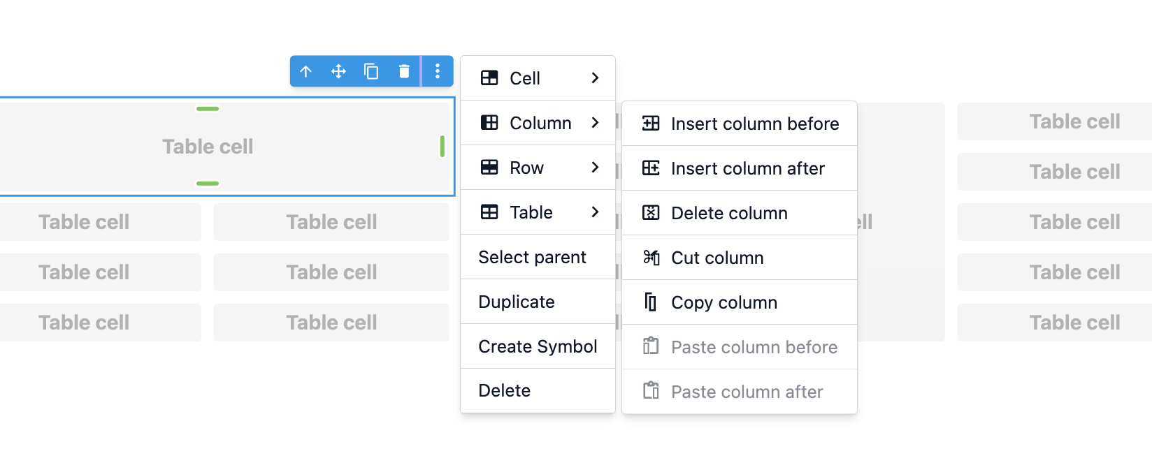
Add table component with additional functionalities.
Install the Studio SDK plugins package:
- npm
- pnpm
- yarn
- CDN
npm i @grapesjs/studio-sdk-plugins
pnpm add @grapesjs/studio-sdk-plugins
yarn add @grapesjs/studio-sdk-plugins
// It's recommended to replace the `latest` tag with the specific latest version to avoid any potential breaking changes.
// The loaded plugin is globally available via `globalThis.StudioSdkPlugins_tableComponent`.
"https://unpkg.com/@grapesjs/studio-sdk-plugins@latest/dist/tableComponent/index.umd.js"
Import and use the table plugin in your project:
- React
- JS
- 🍇 Demo
import StudioEditor from '@grapesjs/studio-sdk/react';
import '@grapesjs/studio-sdk/style';
import { tableComponent } from "@grapesjs/studio-sdk-plugins";
// ...
<StudioEditor
  options={{
      // ...
      plugins: [
        tableComponent.init({
          block: { category: 'Extra', label: 'My Table' }
        })
      ],
      project: {
        default: {
          pages: [
            {
              name: 'Home',
              component: `
                <h1>Table plugin</h1>
                <table>
                  <tbody>
                    <tr>
                      <td>Cell 0:0</td>
                      <td></td>
                    </tr>
                    <tr>
                      <td></td>
                      <td>Cell 1:1</td>
                    </tr>
                  </tbody>
                </table>
            `},
          ]
        },
      }

  }}
/>
import createStudioEditor from '@grapesjs/studio-sdk';
import '@grapesjs/studio-sdk/style';
import { tableComponent } from "@grapesjs/studio-sdk-plugins";
// ...
createStudioEditor({
    // ...
    plugins: [
      tableComponent.init({
        block: { category: 'Extra', label: 'My Table' }
      })
    ],
    project: {
      default: {
        pages: [
          {
            name: 'Home',
            component: `
              <h1>Table plugin</h1>
              <table>
                <tbody>
                  <tr>
                    <td>Cell 0:0</td>
                    <td></td>
                  </tr>
                  <tr>
                    <td></td>
                    <td>Cell 1:1</td>
                  </tr>
                </tbody>
              </table>
          `},
        ]
      },
    }

})
Plugin options
| Property | Type | Description |
|---|---|---|
block | Block options for the table component. See https://grapesjs.com/docs/api/block.html#properties for more information. Example | |
licenseKey | string | The license key for the plugin. This is optional, only required if the plugin is used outside of Studio SDK. Example |
openSettings | function | Customize the layout for table component setting actions, which by default are shown in a popover. Example |