Global Styles
Studio SDK offers a Global Styles panel, enabling you to define common styles that apply across all elements in your project. This panel simplifies the process of setting up and maintaining consistent styling, making it easy for end users to edit and manage global styles.
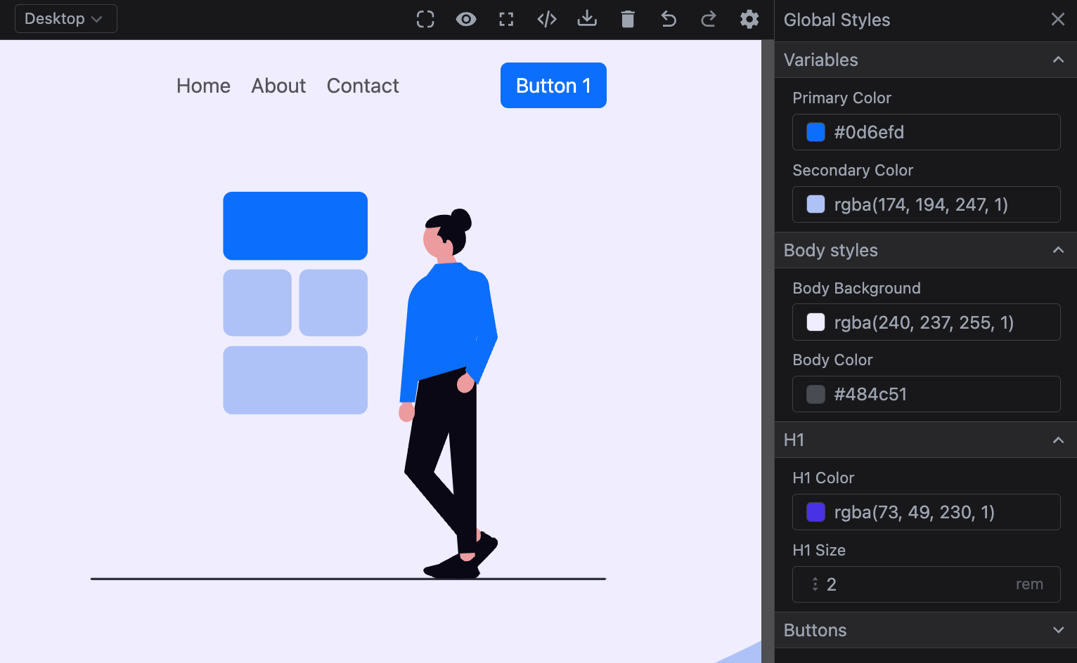
Table of Contents
Initialization
To enable global styles, configure the globalStyles.default option. Each item in this array represents a style rule that applies across the project.
Here's a simple example of setting up global styles:
- React
- JS
- 🍇 Demo
import StudioEditor from '@grapesjs/studio-sdk/react';
import '@grapesjs/studio-sdk/style';

// ...
<StudioEditor
  options={{
    // ...
    plugins: [
      editor =>
        editor.onReady(() => {
          // let's show the global style panel on start
          editor.runCommand('studio:layoutToggle', {
            id: 'gs',
            layout: 'panelGlobalStyles',
            header: { label: 'Global Styles' },
            placer: { type: 'absolute', position: 'right' }
          });
        })
    ],
    project: {
      default: {
        pages: [
          { name: 'Home', component: '<h1>Home page</h1>'},
          { name: 'About', component: '<h1>About page</h1>'},
        ]
      }
    },
    globalStyles: {
      default: [
        {
          id: 'h1Color',
          property: 'color',
          field: 'color',
          defaultValue: 'red',
          selector: 'h1',
          label: 'H1 color'
        },
        {
          id: 'h1Size',
          property: 'font-size',
          field: { type: 'number', min: 0.1, max: 10, step: 0.1, units: ['rem'] },
          defaultValue: '2rem',
          selector: 'h1',
          label: 'H1 size'
        }
      ]
    }
  }}
/>
import createStudioEditor from '@grapesjs/studio-sdk';
import '@grapesjs/studio-sdk/style';

// ...
createStudioEditor({
  // ...
  plugins: [
    editor =>
      editor.onReady(() => {
        // let's show the global style panel on start
        editor.runCommand('studio:layoutToggle', {
          id: 'gs',
          layout: 'panelGlobalStyles',
          header: { label: 'Global Styles' },
          placer: { type: 'absolute', position: 'right' }
        });
      })
  ],
  project: {
    default: {
      pages: [
        { name: 'Home', component: '<h1>Home page</h1>'},
        { name: 'About', component: '<h1>About page</h1>'},
      ]
    }
  },
  globalStyles: {
    default: [
      {
        id: 'h1Color',
        property: 'color',
        field: 'color',
        defaultValue: 'red',
        selector: 'h1',
        label: 'H1 color'
      },
      {
        id: 'h1Size',
        property: 'font-size',
        field: { type: 'number', min: 0.1, max: 10, step: 0.1, units: ['rem'] },
        defaultValue: '2rem',
        selector: 'h1',
        label: 'H1 size'
      }
    ]
  }
})
In this example, we've defined two global styles: the color and font size for h1 elements. Updating these styles in the panel will automatically apply the changes to all h1 elements across your project. You can see the effect by navigating through a different page.
Properties
Global Style properties
Below are the available properties for the global style object.
Show properties
| Property | Type | Description |
|---|---|---|
id* | string | A unique identifier for the style rule. Example |
property* | string | The CSS property name (e.g., 'color', 'font-size', 'margin', etc.). Example |
selector* | string | The CSS selector to which this style will be applied. Example |
label | string | The label for the style rule (used in the editor UI). Example |
field | GlobalStyleFieldProps | The field to render in the editor UI. |
defaultValue | string, number | Default value to use on the CSS property. |
value | string, number | The value to be applied to the CSS property. |
category | object | Put the style rule in a category. Example |
Field properties
Below are the properties available for individual global style fields.
Show properties
Text
| Property | Type | Description |
|---|---|---|
type* | text | Simple text field type. |
defaultValue | string | Default value to use on the field. Unlike the |
Color
| Property | Type | Description |
|---|---|---|
defaultValue | string | Default value to use on the field. Unlike the |
type* | color | Field type for colors properties. |
Number
| Property | Type | Description |
|---|---|---|
defaultValue | string | Default value to use on the field. Unlike the |
type* | number | Field type for numeric properties. |
min | number | Minimum value allowed. |
max | number | Maximum value allowed. |
step | number | Step value. |
units | array | Units to display. Example |
Select
| Property | Type | Description |
|---|---|---|
defaultValue | string | Default value to use on the field. Unlike the |
type* | select | Select field type. |
options | array | Options to display in the field. Example |
SelectFont
| Property | Type | Description |
|---|---|---|
defaultValue | string | Default value to use on the field. Unlike the |
type* | selectFont | Select field type. |
options | array | Prepend custom options to the font select. Example |
Radio
| Property | Type | Description |
|---|---|---|
defaultValue | string | Default value to use on the field. Unlike the |
type* | radio | Similar to the select field type but render options as buttons. |
options | array | Options to display in the field. Example |
Updating Global Styles
Global styles are powerful and highly flexible, but be mindful when adjusting the configuration once it’s set, as updates made by end-users in the Global Styles panel will impact element styles across the project. Think of it as creating an internal design system—a well-defined configuration supports consistency, enables reusable templates, and makes future maintenance easier.
Below, you'll find examples demonstrating the effects of adding, updating, and deleting global styles in the configuration. These will illustrate how each action impacts the project's element styles.
Adding a new style
When adding a new rule with a new id to the global styles, it integrates seamlessly without impacting existing styles. However, if you set a defaultValue, be aware that it may override the default value of the specified CSS property, potentially affecting elements styled by that rule.
- React
- JS
- 🍇 Demo
import StudioEditor from '@grapesjs/studio-sdk/react';
import '@grapesjs/studio-sdk/style';

// ...
<StudioEditor
  options={{
    // ...
    plugins: [
      editor =>
        editor.onReady(() => {
          editor.runCommand('studio:layoutToggle', {
            id: 'gs',
            layout: 'panelGlobalStyles',
            header: { label: 'Global Styles' },
            placer: { type: 'absolute', position: 'right' }
          });
        })
    ],
    project: {
      // loading by default a project containing already h1Color (blue) and h1Size (3rem)
      default: {
        styles:[{selectors:[],selectorsAdd:"h1",style:{color:{type:"data-variable",defaultValue:"red",path:"globalStyles.h1Color.value"},"font-size":{type:"data-variable",defaultValue:"2rem",path:"globalStyles.h1Size.value"}},groups:["globalStyles:h1Color","globalStyles:h1Size"]}],
        pages:[{name:"Home",component:"<h1>Home page Update</h1><p>Home page text</p>"}],
        dataSources:[{id:"globalStyles",records:[{value:"blue",id:"h1Color",property:"color",field:"color",defaultValue:"red",selector:"h1",label:"H1 color",_internal:!0},{value:"3rem",id:"h1Size",property:"font-size",field:{type:"number",min:.1,max:10,step:.1,units:["rem"]},defaultValue:"2rem",selector:"h1",label:"H1 size",_internal:!0}]}]
      }
    },
    globalStyles: {
      default: [
        {
          id: 'h1Color',
          property: 'color',
          field: 'color',
          defaultValue: 'red',
          selector: 'h1',
          label: 'H1 color'
        },
        // Adding a new rule
        {
          id: 'h1Weight',
          property: 'font-weight',
          field: {
            type: 'select',
            options: [{ id: '500', label: 'Normal' }, { id: '600', label: 'Bold' }]
          },
          defaultValue: '', // skip default value to avoid any kind of override
          selector: 'h1',
          label: 'H1 weight'
        },
        {
          id: 'h1Size',
          property: 'font-size',
          field: { type: 'number', min: 0.1, max: 10, step: 0.1, units: ['rem'] },
          defaultValue: '2rem',
          selector: 'h1',
          label: 'H1 size'
        }
      ]
    }
  }}
/>
import createStudioEditor from '@grapesjs/studio-sdk';
import '@grapesjs/studio-sdk/style';

// ...
createStudioEditor({
  // ...
  plugins: [
    editor =>
      editor.onReady(() => {
        editor.runCommand('studio:layoutToggle', {
          id: 'gs',
          layout: 'panelGlobalStyles',
          header: { label: 'Global Styles' },
          placer: { type: 'absolute', position: 'right' }
        });
      })
  ],
  project: {
    // loading by default a project containing already h1Color (blue) and h1Size (3rem)
    default: {
      styles:[{selectors:[],selectorsAdd:"h1",style:{color:{type:"data-variable",defaultValue:"red",path:"globalStyles.h1Color.value"},"font-size":{type:"data-variable",defaultValue:"2rem",path:"globalStyles.h1Size.value"}},groups:["globalStyles:h1Color","globalStyles:h1Size"]}],
      pages:[{name:"Home",component:"<h1>Home page Update</h1><p>Home page text</p>"}],
      dataSources:[{id:"globalStyles",records:[{value:"blue",id:"h1Color",property:"color",field:"color",defaultValue:"red",selector:"h1",label:"H1 color",_internal:!0},{value:"3rem",id:"h1Size",property:"font-size",field:{type:"number",min:.1,max:10,step:.1,units:["rem"]},defaultValue:"2rem",selector:"h1",label:"H1 size",_internal:!0}]}]
    }
  },
  globalStyles: {
    default: [
      {
        id: 'h1Color',
        property: 'color',
        field: 'color',
        defaultValue: 'red',
        selector: 'h1',
        label: 'H1 color'
      },
      // Adding a new rule
      {
        id: 'h1Weight',
        property: 'font-weight',
        field: {
          type: 'select',
          options: [{ id: '500', label: 'Normal' }, { id: '600', label: 'Bold' }]
        },
        defaultValue: '', // skip default value to avoid any kind of override
        selector: 'h1',
        label: 'H1 weight'
      },
      {
        id: 'h1Size',
        property: 'font-size',
        field: { type: 'number', min: 0.1, max: 10, step: 0.1, units: ['rem'] },
        defaultValue: '2rem',
        selector: 'h1',
        label: 'H1 size'
      }
    ]
  }
})
Updating existing style
When updating an existing global style, only specific properties can be modified to minimize disruptions to current styles. For example, properties like label and field can be updated, but changes to property, defaultValue, or selector are skipped to avoid breaking existing style rules.
- React
- JS
- 🍇 Demo
import StudioEditor from '@grapesjs/studio-sdk/react';
import '@grapesjs/studio-sdk/style';

// ...
<StudioEditor
  options={{
    // ...
    plugins: [
      editor =>
        editor.onReady(() => {
          editor.runCommand('studio:layoutToggle', {
            id: 'gs',
            layout: 'panelGlobalStyles',
            header: { label: 'Global Styles' },
            placer: { type: 'absolute', position: 'right' }
          });
        })
    ],
    project: {
      // loading by default a project containing h1Color (blue), h1Size (3rem) and h1Weight (500)
      default: {
        styles:[{selectors:[],selectorsAdd:"h1",style:{color:{type:"data-variable",defaultValue:"red",path:"globalStyles.h1Color.value"},"font-size":{type:"data-variable",defaultValue:"2rem",path:"globalStyles.h1Size.value"},"font-weight":{type:"data-variable",defaultValue:"",path:"globalStyles.h1Weight.value"}},groups:["globalStyles:h1Color","globalStyles:h1Size","globalStyles:h1Weight"]}],
        pages:[{name:"Home",component:"<h1>Home page Update</h1><p>Home page text</p>"}],
        dataSources:[{id:"globalStyles",records:[{value:"blue",id:"h1Color",property:"color",field:"color",defaultValue:"red",selector:"h1",label:"H1 color",_internal:!0},{value:"3rem",id:"h1Size",property:"font-size",field:{type:"number",min:.1,max:10,step:.1,units:["rem"]},defaultValue:"2rem",selector:"h1",label:"H1 size",_internal:!0},{value:"500",id:"h1Weight",property:"font-weight",field:{type:"select",options:[{id:"500",label:"Normal"},{id:"600",label:"Bold"}]},defaultValue:"",selector:"h1",label:"H1 weight",_internal:!0}]}]
      }
    },
    globalStyles: {
      default: [
        {
          id: 'h1Color',
          property: 'color',
          field: 'color',
          defaultValue: 'red',
          selector: 'h1',
          label: 'H1 color'
        },
        {
          // Same id, as a different one would create a new global style
          id: 'h1Weight',

          // Skipped from updates
          property: 'font-family',
          defaultValue: 'another value',
          selector: 'h5',

          // Valid for updates
          label: 'H1 weight (Up)',
          field: { type: 'number', min: 500, max: 600, step: 100 },
        },
        {
          id: 'h1Size',
          property: 'font-size',
          field: { type: 'number', min: 0.1, max: 10, step: 0.1, units: ['rem'] },
          defaultValue: '2rem',
          selector: 'h1',
          label: 'H1 size'
        }
      ]

    }
  }}
/>
import createStudioEditor from '@grapesjs/studio-sdk';
import '@grapesjs/studio-sdk/style';

// ...
createStudioEditor({
  // ...
  plugins: [
    editor =>
      editor.onReady(() => {
        editor.runCommand('studio:layoutToggle', {
          id: 'gs',
          layout: 'panelGlobalStyles',
          header: { label: 'Global Styles' },
          placer: { type: 'absolute', position: 'right' }
        });
      })
  ],
  project: {
    // loading by default a project containing h1Color (blue), h1Size (3rem) and h1Weight (500)
    default: {
      styles:[{selectors:[],selectorsAdd:"h1",style:{color:{type:"data-variable",defaultValue:"red",path:"globalStyles.h1Color.value"},"font-size":{type:"data-variable",defaultValue:"2rem",path:"globalStyles.h1Size.value"},"font-weight":{type:"data-variable",defaultValue:"",path:"globalStyles.h1Weight.value"}},groups:["globalStyles:h1Color","globalStyles:h1Size","globalStyles:h1Weight"]}],
      pages:[{name:"Home",component:"<h1>Home page Update</h1><p>Home page text</p>"}],
      dataSources:[{id:"globalStyles",records:[{value:"blue",id:"h1Color",property:"color",field:"color",defaultValue:"red",selector:"h1",label:"H1 color",_internal:!0},{value:"3rem",id:"h1Size",property:"font-size",field:{type:"number",min:.1,max:10,step:.1,units:["rem"]},defaultValue:"2rem",selector:"h1",label:"H1 size",_internal:!0},{value:"500",id:"h1Weight",property:"font-weight",field:{type:"select",options:[{id:"500",label:"Normal"},{id:"600",label:"Bold"}]},defaultValue:"",selector:"h1",label:"H1 weight",_internal:!0}]}]
    }
  },
  globalStyles: {
    default: [
      {
        id: 'h1Color',
        property: 'color',
        field: 'color',
        defaultValue: 'red',
        selector: 'h1',
        label: 'H1 color'
      },
      {
        // Same id, as a different one would create a new global style
        id: 'h1Weight',

        // Skipped from updates
        property: 'font-family',
        defaultValue: 'another value',
        selector: 'h5',

        // Valid for updates
        label: 'H1 weight (Up)',
        field: { type: 'number', min: 500, max: 600, step: 100 },
      },
      {
        id: 'h1Size',
        property: 'font-size',
        field: { type: 'number', min: 0.1, max: 10, step: 0.1, units: ['rem'] },
        defaultValue: '2rem',
        selector: 'h1',
        label: 'H1 size'
      }
    ]

  }
})
Removing existing style
Removing a rule from the global styles configuration will prevent it from appearing in the Global Styles panel, but it won't delete the style from the project. This ensures that any styles previously applied remain intact, avoiding unexpected changes to the project's appearance.
- React
- JS
- 🍇 Demo
import StudioEditor from '@grapesjs/studio-sdk/react';
import '@grapesjs/studio-sdk/style';

// ...
<StudioEditor
  options={{
    // ...
    plugins: [
      editor =>
        editor.onReady(() => {
          editor.runCommand('studio:layoutToggle', {
            id: 'gs',
            layout: 'panelGlobalStyles',
            header: { label: 'Global Styles' },
            placer: { type: 'absolute', position: 'right' }
          });
        })
    ],
    project: {
      // loading by default a project containing h1Color (blue), h1Size (3rem) and h1Weight (500)
      default: {
        styles:[{selectors:[],selectorsAdd:"h1",style:{color:{type:"data-variable",defaultValue:"red",path:"globalStyles.h1Color.value"},"font-size":{type:"data-variable",defaultValue:"2rem",path:"globalStyles.h1Size.value"},"font-weight":{type:"data-variable",defaultValue:"",path:"globalStyles.h1Weight.value"}},groups:["globalStyles:h1Color","globalStyles:h1Size","globalStyles:h1Weight"]}],
        pages:[{name:"Home",component:"<h1>Home page Update</h1><p>Home page text</p>"}],
        dataSources:[{id:"globalStyles",records:[{value:"blue",id:"h1Color",property:"color",field:"color",defaultValue:"red",selector:"h1",label:"H1 color",_internal:!0},{value:"3rem",id:"h1Size",property:"font-size",field:{type:"number",min:.1,max:10,step:.1,units:["rem"]},defaultValue:"2rem",selector:"h1",label:"H1 size",_internal:!0},{value:"500",id:"h1Weight",property:"font-weight",field:{type:"select",options:[{id:"500",label:"Normal"},{id:"600",label:"Bold"}]},defaultValue:"",selector:"h1",label:"H1 weight",_internal:!0}]}]
      }
    },
    globalStyles: {
      default: [
        {
          id: 'h1Color',
          property: 'color',
          field: 'color',
          defaultValue: 'red',
          selector: 'h1',
          label: 'H1 color'
        },
        {
          id: 'h1Size',
          property: 'font-size',
          field: { type: 'number', min: 0.1, max: 10, step: 0.1, units: ['rem'] },
          defaultValue: '2rem',
          selector: 'h1',
          label: 'H1 size'
        }
        // Removed 'h1Weight'
      ]
    }
  }}
/>
import createStudioEditor from '@grapesjs/studio-sdk';
import '@grapesjs/studio-sdk/style';

// ...
createStudioEditor({
  // ...
  plugins: [
    editor =>
      editor.onReady(() => {
        editor.runCommand('studio:layoutToggle', {
          id: 'gs',
          layout: 'panelGlobalStyles',
          header: { label: 'Global Styles' },
          placer: { type: 'absolute', position: 'right' }
        });
      })
  ],
  project: {
    // loading by default a project containing h1Color (blue), h1Size (3rem) and h1Weight (500)
    default: {
      styles:[{selectors:[],selectorsAdd:"h1",style:{color:{type:"data-variable",defaultValue:"red",path:"globalStyles.h1Color.value"},"font-size":{type:"data-variable",defaultValue:"2rem",path:"globalStyles.h1Size.value"},"font-weight":{type:"data-variable",defaultValue:"",path:"globalStyles.h1Weight.value"}},groups:["globalStyles:h1Color","globalStyles:h1Size","globalStyles:h1Weight"]}],
      pages:[{name:"Home",component:"<h1>Home page Update</h1><p>Home page text</p>"}],
      dataSources:[{id:"globalStyles",records:[{value:"blue",id:"h1Color",property:"color",field:"color",defaultValue:"red",selector:"h1",label:"H1 color",_internal:!0},{value:"3rem",id:"h1Size",property:"font-size",field:{type:"number",min:.1,max:10,step:.1,units:["rem"]},defaultValue:"2rem",selector:"h1",label:"H1 size",_internal:!0},{value:"500",id:"h1Weight",property:"font-weight",field:{type:"select",options:[{id:"500",label:"Normal"},{id:"600",label:"Bold"}]},defaultValue:"",selector:"h1",label:"H1 weight",_internal:!0}]}]
    }
  },
  globalStyles: {
    default: [
      {
        id: 'h1Color',
        property: 'color',
        field: 'color',
        defaultValue: 'red',
        selector: 'h1',
        label: 'H1 color'
      },
      {
        id: 'h1Size',
        property: 'font-size',
        field: { type: 'number', min: 0.1, max: 10, step: 0.1, units: ['rem'] },
        defaultValue: '2rem',
        selector: 'h1',
        label: 'H1 size'
      }
      // Removed 'h1Weight'
    ]
  }
})
I18n
The labels of the Global Styles panel can be translated into different languages based on the id assigned to each global style rule. The configuration in i18n takes precedence over labels defined directly in the global styles configuration.
- React
- JS
- 🍇 Demo
import StudioEditor from '@grapesjs/studio-sdk/react';
import '@grapesjs/studio-sdk/style';

// ...
<StudioEditor
  options={{
    // ...
    plugins: [
      editor =>
        editor.onReady(() => {
          editor.runCommand('studio:layoutToggle', {
            id: 'gs',
            layout: 'panelGlobalStyles',
            header: { label: 'Global Styles' },
            placer: { type: 'absolute', position: 'right' }
          });
        })
    ],
    project: {
      default: {pages: [{ name: 'Home', component: '<h1>Home page</h1>'}]}
    },
    globalStyles: {
      default: [
        {
          id: 'h1Color',
          property: 'color',
          category: { id: 'h1Styles', label: 'H1 styles', open: true },
          field: 'color',
          defaultValue: 'red',
          selector: 'h1',
          label: 'H1 color (Up)'
        },
        {
          id: 'h1Size',
          property: 'font-size',
          field: {
            type: 'select',
            options: [
              { id: '2rem', label: 'Normal' },
              { id: '3rem', label: 'Big' }
            ]
          },
          category: { id: 'h1Styles' },
          defaultValue: '2rem',
          selector: 'h1',
          label: 'H1 size'
        }
      ]
    },
    i18n: {
      locales: {
        en: {
          globalStyleManager: {
            notFound: 'No global styles found',
            fields: {
              // The key is the global style id
              h1Color: {
                label: 'H1 color (EN)'
              },
              h1Size: {
                label: 'H1 size (EN)',
                options: {
                  '2rem': 'Normal (EN)',
                  '3rem': 'Big (EN)'
                }
              }
            },
            categories: {
              // category id
              h1Styles: {
                label: 'H1 styles (EN)'
              }
            }
          }
        }
      }
    }
  }}
/>
import createStudioEditor from '@grapesjs/studio-sdk';
import '@grapesjs/studio-sdk/style';

// ...
createStudioEditor({
  // ...
  plugins: [
    editor =>
      editor.onReady(() => {
        editor.runCommand('studio:layoutToggle', {
          id: 'gs',
          layout: 'panelGlobalStyles',
          header: { label: 'Global Styles' },
          placer: { type: 'absolute', position: 'right' }
        });
      })
  ],
  project: {
    default: {pages: [{ name: 'Home', component: '<h1>Home page</h1>'}]}
  },
  globalStyles: {
    default: [
      {
        id: 'h1Color',
        property: 'color',
        category: { id: 'h1Styles', label: 'H1 styles', open: true },
        field: 'color',
        defaultValue: 'red',
        selector: 'h1',
        label: 'H1 color (Up)'
      },
      {
        id: 'h1Size',
        property: 'font-size',
        field: {
          type: 'select',
          options: [
            { id: '2rem', label: 'Normal' },
            { id: '3rem', label: 'Big' }
          ]
        },
        category: { id: 'h1Styles' },
        defaultValue: '2rem',
        selector: 'h1',
        label: 'H1 size'
      }
    ]
  },
  i18n: {
    locales: {
      en: {
        globalStyleManager: {
          notFound: 'No global styles found',
          fields: {
            // The key is the global style id
            h1Color: {
              label: 'H1 color (EN)'
            },
            h1Size: {
              label: 'H1 size (EN)',
              options: {
                '2rem': 'Normal (EN)',
                '3rem': 'Big (EN)'
              }
            }
          },
          categories: {
            // category id
            h1Styles: {
              label: 'H1 styles (EN)'
            }
          }
        }
      }
    }
  }
})
Advanced Usage
In this section, we'll explore a more comprehensive example of global styles configuration, including grouping styles with categories, using CSS variables for dynamic theming, and integrating styles with an external CSS library. These features offer enhanced flexibility and control over your design system.
- React
- JS
- 🍇 Demo
import StudioEditor from '@grapesjs/studio-sdk/react';
import '@grapesjs/studio-sdk/style';

// ...
<StudioEditor
  options={{
    // ...
    plugins: [
      editor =>
        editor.onReady(() => {
          editor.runCommand('studio:layoutToggle', {
            id: 'gs',
            layout: 'panelGlobalStyles',
            header: { label: 'Global Styles' },
            placer: { type: 'absolute', position: 'right' }
          });
        })
    ],
    project: {
      default: {
        pages: [
          {
            name: 'Home',
            component: `<!doctype html>
              <html>
                <head>
                  <meta name="viewport" content="width=device-width, initial-scale=1">
                  <link href="https://cdn.jsdelivr.net/npm/[email protected]/dist/css/bootstrap.min.css" rel="stylesheet">
                </head>
                <body>
                  <style>
                    .btn {
                      border: none;
                    }
                    .text-primary {
                      color: var(--bs-primary) !important;
                    }
                    .bg-secondary {
                      background-color: var(--bs-secondary) !important;
                    }
                    .btn-primary {
                      --bs-btn-bg: var(--bs-primary);
                    }
                    .btn-primary-soft {
                      --bs-btn-bg: color-mix(in srgb, var(--bs-primary), transparent 90%);
                      --bs-btn-color: var(--bs-primary);
                    }
                  </style>
                  <nav class="navbar navbar-expand-lg py-3">
                    <div class="container px-5">
                        <a class="navbar-brand text-primary" href="##">Demo section</a>
                        <div class="collapse navbar-collapse">
                            <ul class="navbar-nav ms-auto me-lg-5">
                                <li class="nav-item"><a class="nav-link" href="##">Home</a></li>
                                <li class="nav-item"><a class="nav-link" href="##">About</a></li>
                                <li class="nav-item"><a class="nav-link" href="##">Contact</a></li>
                            </ul>
                            <a class="my-btn-cls btn ms-lg-4 btn-primary" href="##">
                                Button 1
                            </a>
                        </div>
                    </div>
                  </nav>
                  <header>
                    <div class="pt-5">
                        <div class="container px-5">
                            <div class="row gx-5 align-items-center">
                                <div class="col-lg-6">
                                    <h1 class="mb-3">Build your project faster in Studio</h1>
                                    <p class="mb-5">Lorem ipsum dolor sit amet, consectetuer adipiscing elit. Aenean commodo ligula eget dolor.</p>
                                    <div class="d-flex flex-column flex-sm-row">
                                        <a class="my-btn-cls btn btn-lg btn-primary me-sm-3 mb-3 mb-sm-0" href="#btn2">
                                            Button 2
                                        </a>
                                        <a class="my-btn-cls btn btn-lg btn-primary-soft" href="##" target="_blank">
                                          Button 3
                                        </a>
                                    </div>
                                </div>
                                <div class="col-lg-6">
                                  <svg xmlns="http://www.w3.org/2000/svg" viewBox="0 0 678.6 510.8">
                                    <path d="M353 90H187c-7 0-12-6-12-12V12c0-7 5-12 12-12h166c7 0 12 5 12 12v66c0 6-5 12-12 12Z" fill="var(--bs-primary)"/>
                                    <path d="M353 293H187c-7 0-12-6-12-12v-66c0-7 5-12 12-12h166c7 0 12 5 12 12v66c0 6-5 12-12 12Zm-1-103h-65c-7 0-12-6-12-12v-64c0-7 5-12 12-12h65c7 0 13 5 13 12v64c0 6-6 12-13 12Zm-100 0h-65c-7 0-12-6-12-12v-64c0-7 5-12 12-12h65c7 0 13 5 13 12v64c0 6-6 12-13 12Z" fill="var(--bs-secondary)"/>
                                    <path d="m679 509-2 2H2a1 1 0 1 1 0-3h675l2 1Z" fill="#2f2e43"/>
                                    <path fill="#ec9c9f" d="m522 454-14 15-15-14 14-14 15 13z"/>
                                    <path d="m533 469-30 31c-2 3-5 5-9 6l-8 3c-2 1-4 0-5-1s-2-4-1-6l8-14 8-30h1l6 3c4 1 7-1 9-3 3-4 1-10 1-10 1-1 2-2 3-1 2 0 3 2 4 3 2 0 8 4 8 5 3 0 5 0 6 2 2 1 2 3 2 5s-1 5-3 7Z" fill="#090814"/>
                                    <path fill="#ec9c9f" d="M486 471h20v20h-20z"/>
                                    <path d="M502 509h-43c-3 0-7-1-10-3l-8-3-3-4c0-3 2-4 4-5l16-4 28-15 1 7c3 3 6 5 9 4 5 0 9-6 9-6l2 1 1 5 2 10 3 6-3 4c-2 2-5 3-8 3Zm6-289h-71l-24 149 71 85 24-21-56-64 56-149z" fill="#090814"/>
                                    <path fill="#090814" d="m466 242 42-22v255l-24 1-18-234z"/>
                                    <path d="m423 280 1-23-14-1v24c-3 2-4 6-4 10-1 7 4 13 10 13s11-5 11-13c0-4-1-8-4-10Z" fill="#ec9c9f"/>
                                    <path d="M488 53s19 0 12-19c-7-18-21-10-21-10s-6 3-4 10" fill="#090814"/>
                                    <path d="M490 62a26 26 0 1 0-34 25l5 33 26-21s-6-7-9-15c7-5 12-13 12-22Z" fill="#ec9c9f"/>
                                    <path d="M476 84s4-13-2-19-6 3-6 3l-4-1s0-9-8-10l5-11s-19 3-20 1c-4-15 37-27 48-4 17 35-13 41-13 41Z" fill="#090814"/>
                                    <path d="M453 107c-19 4-33 20-35 39l-11 131h20l26-170Z" fill="var(--bs-primary)"/>
                                    <path fill="var(--bs-primary)" d="m434 212-4 37 88-26-11-27 20-45-41-58-32 2-12 16"/>
                                    <path d="m505 247 12-20-12-7-12 20c-3 1-6 3-9 7-3 6-2 13 3 16 5 4 12 1 16-5 2-4 3-8 2-11Z" fill="#ec9c9f"/>
                                    <path d="m480 94 7-1 12 10c14 2 18 3 23 12 2 4 3 8 3 13l11 64-26 62-17-19 18-49-3-11" fill="var(--bs-primary)"/>
                                  </svg>
                                </div>
                            </div>
                        </div>
                    </div>
                    <div class="mt-5" style="margin-bottom: -1px;">
                        <svg xmlns="http://www.w3.org/2000/svg" viewBox="0 0 144.54 17.34" preserveAspectRatio="none" fill="var(--bs-secondary)"><path d="M144.54,17.34H0V0H144.54ZM0,0S32.36,17.34,72.27,17.34,144.54,0,144.54,0"></path></svg>
                    </div>
                  </header>
                  <section class="bg-secondary py-5">
                    <div class="container px-5">
                        <div class="row gx-5 justify-content-center">
                            <div class="col-lg-8">
                                <div class="text-center mb-10">
                                    <h1 class="mb-2">Build your project faster in Studio</h1>
                                    <p class="lead">Lorem ipsum dolor sit amet, consectetuer adipiscing elit. Aenean commodo ligula eget dolor.</p>
                                </div>
                            </div>
                        </div>
                    </div>
                  </section>
                </body>
              </html>
            `
          }
        ]
      }
    },
    globalStyles: {
      default: [
        // Variables
        {
          id: 'varPrimary',
          property: '--bs-primary', // connect to a CSS variable
          field: 'color',
          selector: ':root',
          label: 'Primary color',
          defaultValue: '#0d6efd',
          category: { id: 'vars', label: 'Variables', open: true }
        },
        {
          id: 'varSecondary',
          property: '--bs-secondary',
          field: 'color',
          selector: ':root',
          label: 'Secondary color',
          defaultValue: '#eff0f1',
          category: { id: 'vars' }
        },
        // Body
        {
          id: 'bodyBg',
          property: 'background-color',
          field: 'color',
          selector: 'body',
          label: 'Body background',
          defaultValue: 'white',
          category: { id: 'body', label: 'Body styles' }
        },
        {
          id: 'bodyColor',
          property: 'color',
          field: 'color',
          selector: 'body',
          label: 'Body color',
          defaultValue: '#484c51',
          category: { id: 'body' }
        },
        // H1
        {
          id: 'h1Color',
          property: 'color',
          field: 'color',
          selector: 'h1',
          label: 'H1 color',
          defaultValue: 'inherit',
          category: { id: 'h1', label: 'H1' }
        },
        {
          id: 'h1Size',
          property: 'font-size',
          field: { type: 'number', min: 0.1, max: 10, step: 0.1, units: ['rem'] },
          defaultValue: '2rem',
          selector: 'h1',
          label: 'H1 size',
          category: { id: 'h1' }
        },
        // Button
        {
          id: 'btnColor',
          property: 'background-color',
          field: 'color',
          selector: '.btn-primary',
          label: 'Primary button color',
          category: { id: 'buttons', label: 'Buttons' }
        },
        {
          id: 'btnRadius',
          property: 'border-radius',
          field: {
            type: 'select',
            options: [
              { id: '0', label: 'None' },
              { id: '', label: 'Default' },
              { id: '1rem', label: 'Large' },
              { id: '10rem', label: 'Full' }
            ]
          },
          selector: '.btn',
          label: 'Button radius',
          category: { id: 'buttons' }
        }
      ]
    }
  }}
/>
import createStudioEditor from '@grapesjs/studio-sdk';
import '@grapesjs/studio-sdk/style';

// ...
createStudioEditor({
  // ...
  plugins: [
    editor =>
      editor.onReady(() => {
        editor.runCommand('studio:layoutToggle', {
          id: 'gs',
          layout: 'panelGlobalStyles',
          header: { label: 'Global Styles' },
          placer: { type: 'absolute', position: 'right' }
        });
      })
  ],
  project: {
    default: {
      pages: [
        {
          name: 'Home',
          component: `<!doctype html>
            <html>
              <head>
                <meta name="viewport" content="width=device-width, initial-scale=1">
                <link href="https://cdn.jsdelivr.net/npm/[email protected]/dist/css/bootstrap.min.css" rel="stylesheet">
              </head>
              <body>
                <style>
                  .btn {
                    border: none;
                  }
                  .text-primary {
                    color: var(--bs-primary) !important;
                  }
                  .bg-secondary {
                    background-color: var(--bs-secondary) !important;
                  }
                  .btn-primary {
                    --bs-btn-bg: var(--bs-primary);
                  }
                  .btn-primary-soft {
                    --bs-btn-bg: color-mix(in srgb, var(--bs-primary), transparent 90%);
                    --bs-btn-color: var(--bs-primary);
                  }
                </style>
                <nav class="navbar navbar-expand-lg py-3">
                  <div class="container px-5">
                      <a class="navbar-brand text-primary" href="##">Demo section</a>
                      <div class="collapse navbar-collapse">
                          <ul class="navbar-nav ms-auto me-lg-5">
                              <li class="nav-item"><a class="nav-link" href="##">Home</a></li>
                              <li class="nav-item"><a class="nav-link" href="##">About</a></li>
                              <li class="nav-item"><a class="nav-link" href="##">Contact</a></li>
                          </ul>
                          <a class="my-btn-cls btn ms-lg-4 btn-primary" href="##">
                              Button 1
                          </a>
                      </div>
                  </div>
                </nav>
                <header>
                  <div class="pt-5">
                      <div class="container px-5">
                          <div class="row gx-5 align-items-center">
                              <div class="col-lg-6">
                                  <h1 class="mb-3">Build your project faster in Studio</h1>
                                  <p class="mb-5">Lorem ipsum dolor sit amet, consectetuer adipiscing elit. Aenean commodo ligula eget dolor.</p>
                                  <div class="d-flex flex-column flex-sm-row">
                                      <a class="my-btn-cls btn btn-lg btn-primary me-sm-3 mb-3 mb-sm-0" href="#btn2">
                                          Button 2
                                      </a>
                                      <a class="my-btn-cls btn btn-lg btn-primary-soft" href="##" target="_blank">
                                        Button 3
                                      </a>
                                  </div>
                              </div>
                              <div class="col-lg-6">
                                <svg xmlns="http://www.w3.org/2000/svg" viewBox="0 0 678.6 510.8">
                                  <path d="M353 90H187c-7 0-12-6-12-12V12c0-7 5-12 12-12h166c7 0 12 5 12 12v66c0 6-5 12-12 12Z" fill="var(--bs-primary)"/>
                                  <path d="M353 293H187c-7 0-12-6-12-12v-66c0-7 5-12 12-12h166c7 0 12 5 12 12v66c0 6-5 12-12 12Zm-1-103h-65c-7 0-12-6-12-12v-64c0-7 5-12 12-12h65c7 0 13 5 13 12v64c0 6-6 12-13 12Zm-100 0h-65c-7 0-12-6-12-12v-64c0-7 5-12 12-12h65c7 0 13 5 13 12v64c0 6-6 12-13 12Z" fill="var(--bs-secondary)"/>
                                  <path d="m679 509-2 2H2a1 1 0 1 1 0-3h675l2 1Z" fill="#2f2e43"/>
                                  <path fill="#ec9c9f" d="m522 454-14 15-15-14 14-14 15 13z"/>
                                  <path d="m533 469-30 31c-2 3-5 5-9 6l-8 3c-2 1-4 0-5-1s-2-4-1-6l8-14 8-30h1l6 3c4 1 7-1 9-3 3-4 1-10 1-10 1-1 2-2 3-1 2 0 3 2 4 3 2 0 8 4 8 5 3 0 5 0 6 2 2 1 2 3 2 5s-1 5-3 7Z" fill="#090814"/>
                                  <path fill="#ec9c9f" d="M486 471h20v20h-20z"/>
                                  <path d="M502 509h-43c-3 0-7-1-10-3l-8-3-3-4c0-3 2-4 4-5l16-4 28-15 1 7c3 3 6 5 9 4 5 0 9-6 9-6l2 1 1 5 2 10 3 6-3 4c-2 2-5 3-8 3Zm6-289h-71l-24 149 71 85 24-21-56-64 56-149z" fill="#090814"/>
                                  <path fill="#090814" d="m466 242 42-22v255l-24 1-18-234z"/>
                                  <path d="m423 280 1-23-14-1v24c-3 2-4 6-4 10-1 7 4 13 10 13s11-5 11-13c0-4-1-8-4-10Z" fill="#ec9c9f"/>
                                  <path d="M488 53s19 0 12-19c-7-18-21-10-21-10s-6 3-4 10" fill="#090814"/>
                                  <path d="M490 62a26 26 0 1 0-34 25l5 33 26-21s-6-7-9-15c7-5 12-13 12-22Z" fill="#ec9c9f"/>
                                  <path d="M476 84s4-13-2-19-6 3-6 3l-4-1s0-9-8-10l5-11s-19 3-20 1c-4-15 37-27 48-4 17 35-13 41-13 41Z" fill="#090814"/>
                                  <path d="M453 107c-19 4-33 20-35 39l-11 131h20l26-170Z" fill="var(--bs-primary)"/>
                                  <path fill="var(--bs-primary)" d="m434 212-4 37 88-26-11-27 20-45-41-58-32 2-12 16"/>
                                  <path d="m505 247 12-20-12-7-12 20c-3 1-6 3-9 7-3 6-2 13 3 16 5 4 12 1 16-5 2-4 3-8 2-11Z" fill="#ec9c9f"/>
                                  <path d="m480 94 7-1 12 10c14 2 18 3 23 12 2 4 3 8 3 13l11 64-26 62-17-19 18-49-3-11" fill="var(--bs-primary)"/>
                                </svg>
                              </div>
                          </div>
                      </div>
                  </div>
                  <div class="mt-5" style="margin-bottom: -1px;">
                      <svg xmlns="http://www.w3.org/2000/svg" viewBox="0 0 144.54 17.34" preserveAspectRatio="none" fill="var(--bs-secondary)"><path d="M144.54,17.34H0V0H144.54ZM0,0S32.36,17.34,72.27,17.34,144.54,0,144.54,0"></path></svg>
                  </div>
                </header>
                <section class="bg-secondary py-5">
                  <div class="container px-5">
                      <div class="row gx-5 justify-content-center">
                          <div class="col-lg-8">
                              <div class="text-center mb-10">
                                  <h1 class="mb-2">Build your project faster in Studio</h1>
                                  <p class="lead">Lorem ipsum dolor sit amet, consectetuer adipiscing elit. Aenean commodo ligula eget dolor.</p>
                              </div>
                          </div>
                      </div>
                  </div>
                </section>
              </body>
            </html>
          `
        }
      ]
    }
  },
  globalStyles: {
    default: [
      // Variables
      {
        id: 'varPrimary',
        property: '--bs-primary', // connect to a CSS variable
        field: 'color',
        selector: ':root',
        label: 'Primary color',
        defaultValue: '#0d6efd',
        category: { id: 'vars', label: 'Variables', open: true }
      },
      {
        id: 'varSecondary',
        property: '--bs-secondary',
        field: 'color',
        selector: ':root',
        label: 'Secondary color',
        defaultValue: '#eff0f1',
        category: { id: 'vars' }
      },
      // Body
      {
        id: 'bodyBg',
        property: 'background-color',
        field: 'color',
        selector: 'body',
        label: 'Body background',
        defaultValue: 'white',
        category: { id: 'body', label: 'Body styles' }
      },
      {
        id: 'bodyColor',
        property: 'color',
        field: 'color',
        selector: 'body',
        label: 'Body color',
        defaultValue: '#484c51',
        category: { id: 'body' }
      },
      // H1
      {
        id: 'h1Color',
        property: 'color',
        field: 'color',
        selector: 'h1',
        label: 'H1 color',
        defaultValue: 'inherit',
        category: { id: 'h1', label: 'H1' }
      },
      {
        id: 'h1Size',
        property: 'font-size',
        field: { type: 'number', min: 0.1, max: 10, step: 0.1, units: ['rem'] },
        defaultValue: '2rem',
        selector: 'h1',
        label: 'H1 size',
        category: { id: 'h1' }
      },
      // Button
      {
        id: 'btnColor',
        property: 'background-color',
        field: 'color',
        selector: '.btn-primary',
        label: 'Primary button color',
        category: { id: 'buttons', label: 'Buttons' }
      },
      {
        id: 'btnRadius',
        property: 'border-radius',
        field: {
          type: 'select',
          options: [
            { id: '0', label: 'None' },
            { id: '', label: 'Default' },
            { id: '1rem', label: 'Large' },
            { id: '10rem', label: 'Full' }
          ]
        },
        selector: '.btn',
        label: 'Button radius',
        category: { id: 'buttons' }
      }
    ]
  }
})
Usage in Email Projects
Global Styles can also be used in email projects with the same configuration approach as web, allowing you to style MJML components or specific selectors.
The main difference is that, in addition to using classic selectors like .some-link-wrapper > a, you can also apply global styles directly to MJML tags, such as mj-section, mj-button, or mj-text.
You can also continue using HTML selectors in email templates, but note that MJML components are often compiled into inline styles, so targeting the MJML tags directly gives more predictable results.
- React
- JS
- 🍇 Demo
import StudioEditor from '@grapesjs/studio-sdk/react';
import '@grapesjs/studio-sdk/style';

// ...
<StudioEditor
  options={{
    // ...
    plugins: [
      editor =>
        editor.onReady(() => {
          editor.runCommand('studio:layoutToggle', {
            id: 'gs',
            layout: 'panelGlobalStyles',
            header: { label: 'Global Styles' },
            placer: { type: 'absolute', position: 'left' }
          });
        })
    ],
    project: {
      type: 'email',
      default: {
        pages: [
          {
            component: `<mjml>
              <mj-head>
                <mj-attributes>
                  <mj-text />
                  <mj-section background-color="#eee" />
                  <mj-button background-color="#cf549e" />
                </mj-attributes>
              </mj-head>
              <mj-body>
                <mj-section>
                  <mj-column background-color="#ddd">
                    <mj-text>Some text and a <a href="##">link</a></mj-text>
                    <mj-button>Button</mj-button>
                  </mj-column>
                </mj-section>
              </mj-body>
            </mjml>`
          }
        ]
      }
    },
    globalStyles: {
      default: [
        // ALL
        {
          id: 'all-color',
          field: { type: 'color', defaultValue: '#000000' },
          label: 'Color',
          property: 'color',
          selector: 'mj-all',
          category: { id: 'all', label: 'All', open: true }
        },
        {
          id: 'all-font-size',
          field: { type: 'number', min: 0, step: 1, units: ['px'], defaultValue: '13px' },
          label: 'Font size',
          property: 'font-size',
          selector: 'mj-all',
          category: { id: 'all' }
        },
        // Sections
        {
          id: 'section-bg',
          field: { type: 'color', defaultValue: 'initial' },
          label: 'Background',
          property: 'background-color',
          selector: 'mj-section',
          category: { id: 'sections', label: 'Sections', open: true }
        },
        // Text
        {
          id: 'text-color',
          field: { type: 'color', defaultValue: '#000000' },
          label: 'Color',
          property: 'color',
          selector: 'mj-text',
          category: { id: 'text', label: 'Text', open: true }
        },
        // Links
        {
          id: 'link-color',
          field: { type: 'color', defaultValue: '#000000' },
          label: 'Color',
          property: 'color',
          selector: 'a',
          category: { id: 'links', label: 'Links', open: true }
        },
        // Buttons
        {
          id: 'button-bg',
          field: { row: true, type: 'color', defaultValue: '#414141' },
          label: 'Background',
          property: 'background-color',
          selector: 'mj-button',
          category: { id: 'buttons', label: 'Buttons', open: true }
        },
        {
          id: 'button-border-radius',
          field: { type: 'number', min: 0, units: ['px'], defaultValue: '3px' },
          label: 'Border radius',
          property: 'border-radius',
          selector: 'mj-button',
          category: { id: 'buttons' }
        }
      ]
    },
  }}
/>
import createStudioEditor from '@grapesjs/studio-sdk';
import '@grapesjs/studio-sdk/style';

// ...
createStudioEditor({
  // ...
  plugins: [
    editor =>
      editor.onReady(() => {
        editor.runCommand('studio:layoutToggle', {
          id: 'gs',
          layout: 'panelGlobalStyles',
          header: { label: 'Global Styles' },
          placer: { type: 'absolute', position: 'left' }
        });
      })
  ],
  project: {
    type: 'email',
    default: {
      pages: [
        {
          component: `<mjml>
            <mj-head>
              <mj-attributes>
                <mj-text />
                <mj-section background-color="#eee" />
                <mj-button background-color="#cf549e" />
              </mj-attributes>
            </mj-head>
            <mj-body>
              <mj-section>
                <mj-column background-color="#ddd">
                  <mj-text>Some text and a <a href="##">link</a></mj-text>
                  <mj-button>Button</mj-button>
                </mj-column>
              </mj-section>
            </mj-body>
          </mjml>`
        }
      ]
    }
  },
  globalStyles: {
    default: [
      // ALL
      {
        id: 'all-color',
        field: { type: 'color', defaultValue: '#000000' },
        label: 'Color',
        property: 'color',
        selector: 'mj-all',
        category: { id: 'all', label: 'All', open: true }
      },
      {
        id: 'all-font-size',
        field: { type: 'number', min: 0, step: 1, units: ['px'], defaultValue: '13px' },
        label: 'Font size',
        property: 'font-size',
        selector: 'mj-all',
        category: { id: 'all' }
      },
      // Sections
      {
        id: 'section-bg',
        field: { type: 'color', defaultValue: 'initial' },
        label: 'Background',
        property: 'background-color',
        selector: 'mj-section',
        category: { id: 'sections', label: 'Sections', open: true }
      },
      // Text
      {
        id: 'text-color',
        field: { type: 'color', defaultValue: '#000000' },
        label: 'Color',
        property: 'color',
        selector: 'mj-text',
        category: { id: 'text', label: 'Text', open: true }
      },
      // Links
      {
        id: 'link-color',
        field: { type: 'color', defaultValue: '#000000' },
        label: 'Color',
        property: 'color',
        selector: 'a',
        category: { id: 'links', label: 'Links', open: true }
      },
      // Buttons
      {
        id: 'button-bg',
        field: { row: true, type: 'color', defaultValue: '#414141' },
        label: 'Background',
        property: 'background-color',
        selector: 'mj-button',
        category: { id: 'buttons', label: 'Buttons', open: true }
      },
      {
        id: 'button-border-radius',
        field: { type: 'number', min: 0, units: ['px'], defaultValue: '3px' },
        label: 'Border radius',
        property: 'border-radius',
        selector: 'mj-button',
        category: { id: 'buttons' }
      }
    ]
  },
})