Layout
Studio SDK provides a powerful and flexible layout system specifically for the editor UI, enabling full customization of editor components and panel arrangements to suit your specific needs.
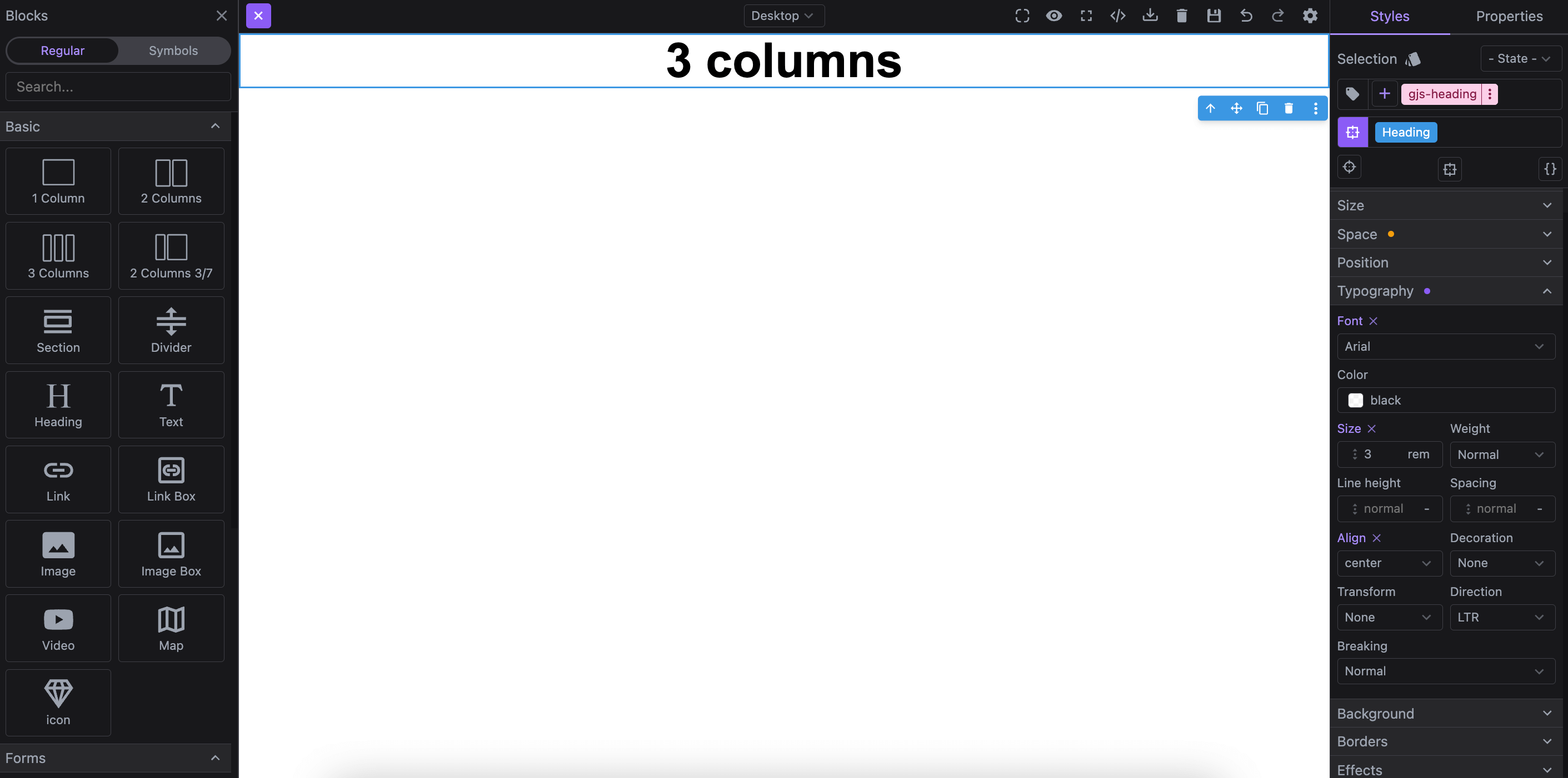
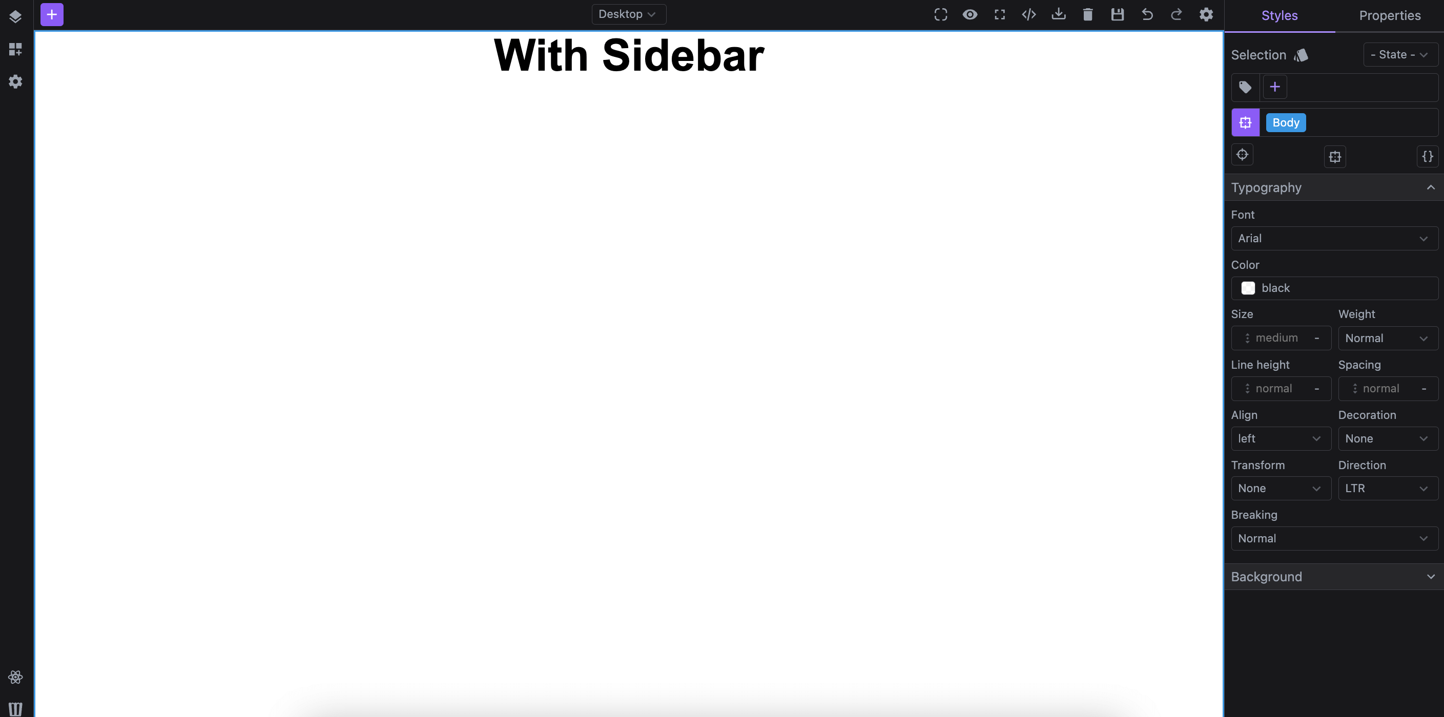
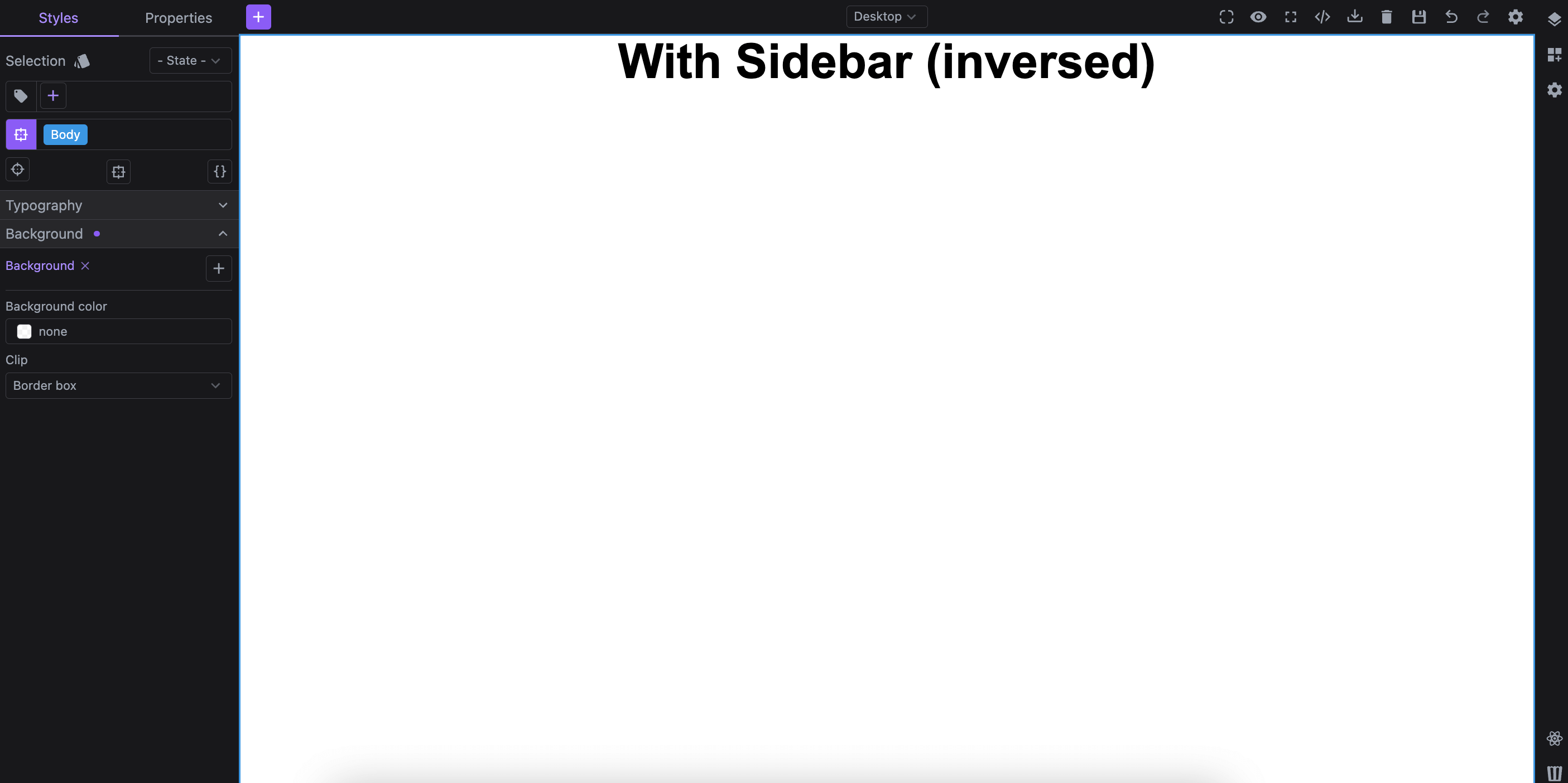
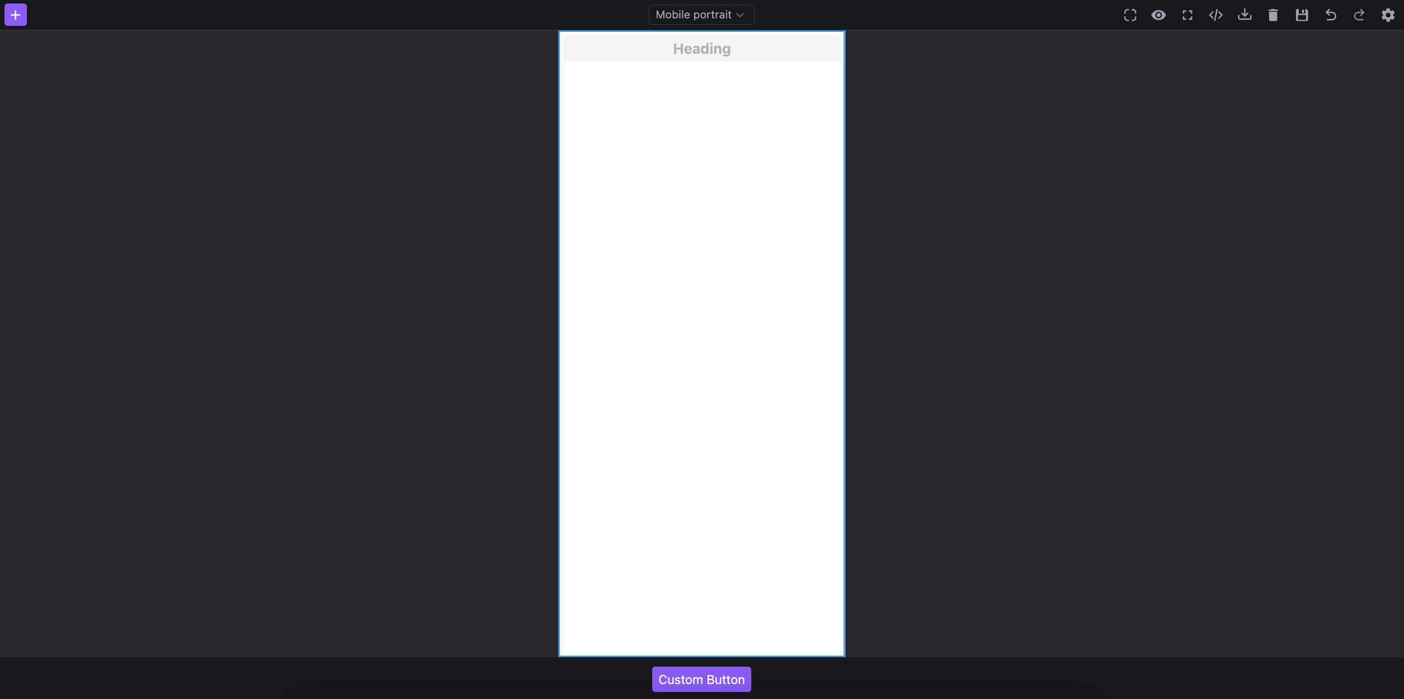
Table of Contents
Initialization
Studio initializes with a preconfigured layout, allowing you to start using the editor right out of the box.
Below is the configuration used by the default layout via layout.default option.
The layout config is ideal for framework-agnostic UI assembly, but React consumers can also import and compose the editor UI directly with the public Studio components. See the React Layout Components section below.
- React
- JS
- 🍇 Demo
import StudioEditor from '@grapesjs/studio-sdk/react';
import '@grapesjs/studio-sdk/style';

// ...
<StudioEditor
  options={{
    // ...
    project: {
      default: {
        pages: [{ name: 'Home', component: '<h1>Home page</h1>'}]
      }
    },
    layout: {
      default: {
        type: 'row',
        style: { height: '100%' },
        children: [
          { type: 'sidebarLeft' },
          { type: 'canvasSidebarTop' },
          { type: 'sidebarRight' }
        ]
      },
    }
  }}
/>
import createStudioEditor from '@grapesjs/studio-sdk';
import '@grapesjs/studio-sdk/style';

// ...
createStudioEditor({
  // ...
  project: {
    default: {
      pages: [{ name: 'Home', component: '<h1>Home page</h1>'}]
    }
  },
  layout: {
    default: {
      type: 'row',
      style: { height: '100%' },
      children: [
        { type: 'sidebarLeft' },
        { type: 'canvasSidebarTop' },
        { type: 'sidebarRight' }
      ]
    },
  }
})
The layout is built using Studio component configurations, each defined by a type along with other properties.
Studio includes a set of predefined Layout Components, which you can use to compose a customized editor interface.
Required conditions
When configuring the layout, keep these two requirements in mind:
-
The root component of
layout.defaultmust be aroworcolumntype. -
The
layout.defaultmust include inside one of the Canvas components.
Layout Components
Check the Layout Components page to explore all the components available for building your editor interface.
Responsive Layout
Studio supports also responsive configuration, enabling the layout to adjust automatically based on the width of the editor container.
Just like with layout.default, each responsive layout configuration must adhere to the same required conditions.
- React
- JS
- 🍇 Demo
import StudioEditor from '@grapesjs/studio-sdk/react';
import '@grapesjs/studio-sdk/style';

// ...
<StudioEditor
  options={{
    // ...
    layout: {
      default: {
        type: 'row',
        style: { height: '100%' },
        children: [
          { type: 'sidebarLeft' },
          { type: 'canvasSidebarTop' },
          { type: 'sidebarRight' }
        ]
      },
      responsive: {
        // Studio will switch the layout when the editor container width is below 1000px.
        1000: {
          type: 'row',
          style: { height: '100%' },
          children: [{ type: 'sidebarLeft' }, { type: 'canvas' }]
        },
        600: {
          type: 'column',
          style: { height: '100%' },
          children: [{ type: 'canvas' }, { type: 'row', children: 'Text' }]
        }
      }
    }
  }}
/>
import createStudioEditor from '@grapesjs/studio-sdk';
import '@grapesjs/studio-sdk/style';

// ...
createStudioEditor({
  // ...
  layout: {
    default: {
      type: 'row',
      style: { height: '100%' },
      children: [
        { type: 'sidebarLeft' },
        { type: 'canvasSidebarTop' },
        { type: 'sidebarRight' }
      ]
    },
    responsive: {
      // Studio will switch the layout when the editor container width is below 1000px.
      1000: {
        type: 'row',
        style: { height: '100%' },
        children: [{ type: 'sidebarLeft' }, { type: 'canvas' }]
      },
      600: {
        type: 'column',
        style: { height: '100%' },
        children: [{ type: 'canvas' }, { type: 'row', children: 'Text' }]
      }
    }
  }
})
Layout Commands
Studio provides a set of commands for managing the layout of the editor interface.
Dynamic layouts
You can manage dynamic layouts with studio:layoutAdd, studio:layoutRemove, and studio:layoutToggle commands. Various placer types are available to position your components precisely.
Absolute placer
Use absolute placer allows you to position the layout at a specific absolute location within the editor interface.
- React
- JS
- 🍇 Demo
import StudioEditor from '@grapesjs/studio-sdk/react';
import '@grapesjs/studio-sdk/style';

// ...
<StudioEditor
  options={{
    // ...
    layout: {
      default: {
        type: 'row',
        style: { height: '100%' },
        children: [
          {
            type: 'column',
            style: { padding: 5, gap: 5, borderRightWidth: 1, zIndex: 20, alignItems: 'center' },
            children: [
              {
                type: 'button',
                icon: 'layers',
                editorEvents: {
                  'studio:layoutToggle:layoutId1': ({ fromEvent, setState }) => setState({ active: fromEvent.isOpen })
                },
                onClick: ({ editor }) => {
                  editor.runCommand('studio:layoutRemove', { id: 'layoutId2' });
                  editor.runCommand('studio:layoutToggle', {
                    id: 'layoutId1',
                    layout: { type: 'panelPagesLayers' },
                    header: { label: 'Layers' },
                    placer: { type: 'absolute', position: 'left' },
                    style: { marginLeft: 42 }
                  });
                }
              },
              {
                type: 'button',
                icon: 'viewGridPlus',
                editorEvents: {
                  'studio:layoutToggle:layoutId2': ({ fromEvent, setState }) => setState({ active: fromEvent.isOpen })
                },
                onClick: ({ editor }) => {
                  editor.runCommand('studio:layoutRemove', { id: 'layoutId1' });
                  editor.runCommand('studio:layoutToggle', {
                    id: 'layoutId2',
                    layout: { type: 'panelBlocks' },
                    header: { label: 'Blocks' },
                    placer: { type: 'absolute', position: 'right' },
                  });
                }
              }
            ]
          },
          { type: 'canvas', grow: true }
        ]
      },
    }
  }}
/>
import createStudioEditor from '@grapesjs/studio-sdk';
import '@grapesjs/studio-sdk/style';

// ...
createStudioEditor({
  // ...
  layout: {
    default: {
      type: 'row',
      style: { height: '100%' },
      children: [
        {
          type: 'column',
          style: { padding: 5, gap: 5, borderRightWidth: 1, zIndex: 20, alignItems: 'center' },
          children: [
            {
              type: 'button',
              icon: 'layers',
              editorEvents: {
                'studio:layoutToggle:layoutId1': ({ fromEvent, setState }) => setState({ active: fromEvent.isOpen })
              },
              onClick: ({ editor }) => {
                editor.runCommand('studio:layoutRemove', { id: 'layoutId2' });
                editor.runCommand('studio:layoutToggle', {
                  id: 'layoutId1',
                  layout: { type: 'panelPagesLayers' },
                  header: { label: 'Layers' },
                  placer: { type: 'absolute', position: 'left' },
                  style: { marginLeft: 42 }
                });
              }
            },
            {
              type: 'button',
              icon: 'viewGridPlus',
              editorEvents: {
                'studio:layoutToggle:layoutId2': ({ fromEvent, setState }) => setState({ active: fromEvent.isOpen })
              },
              onClick: ({ editor }) => {
                editor.runCommand('studio:layoutRemove', { id: 'layoutId1' });
                editor.runCommand('studio:layoutToggle', {
                  id: 'layoutId2',
                  layout: { type: 'panelBlocks' },
                  header: { label: 'Blocks' },
                  placer: { type: 'absolute', position: 'right' },
                });
              }
            }
          ]
        },
        { type: 'canvas', grow: true }
      ]
    },
  }
})
Static placer
Use static placer to position your components according to a specifically defined layout in your configuration.
- React
- JS
- 🍇 Demo
import StudioEditor from '@grapesjs/studio-sdk/react';
import '@grapesjs/studio-sdk/style';

// ...
<StudioEditor
  options={{
    // ...
    layout: {
      default: {
        type: 'row',
        style: { height: '100%' },
        children: [
          {
            type: 'column',
            style: { padding: 5, gap: 5, borderRightWidth: 1, alignItems: 'center' },
            children: [
              {
                type: 'button',
                tooltip: 'Layers',
                icon: 'layers',
                editorEvents: {
                  'studio:layoutToggle:layoutId1': ({ fromEvent, setState }) => setState({ active: fromEvent.isOpen })
                },
                onClick: ({ editor }) => {
                  editor.runCommand('studio:layoutRemove', { id: 'layoutId2' });
                  editor.runCommand('studio:layoutToggle', {
                    id: 'layoutId1',
                    layout: { type: 'panelPagesLayers' },
                    header: { label: 'Layers' },
                    placer: { type: 'static', layoutId: 'hiddenLeftContainer' },
                    style: { width: 300, overflow: 'hidden' }
                  });
                }
              },
              {
                type: 'button',
                tooltip: 'Blocks',
                icon: 'viewGridPlus',
                editorEvents: {
                  'studio:layoutToggle:layoutId2': ({ fromEvent, setState }) => setState({ active: fromEvent.isOpen })
                },
                onClick: ({ editor }) => {
                  editor.runCommand('studio:layoutRemove', { id: 'layoutId1' });
                  editor.runCommand('studio:layoutToggle', {
                    id: 'layoutId2',
                    layout: { type: 'panelBlocks' },
                    header: { label: 'Blocks' },
                    placer: { type: 'static', layoutId: 'hiddenRightContainer' },
                    style: { width: 300, overflow: 'hidden' }
                  });
                }
              }
            ]
          },
          { id: 'hiddenLeftContainer', type: 'column' },
          { type: 'canvas', grow: true },
          { id: 'hiddenRightContainer', type: 'column' }
        ]
      }
    }
  }}
/>
import createStudioEditor from '@grapesjs/studio-sdk';
import '@grapesjs/studio-sdk/style';

// ...
createStudioEditor({
  // ...
  layout: {
    default: {
      type: 'row',
      style: { height: '100%' },
      children: [
        {
          type: 'column',
          style: { padding: 5, gap: 5, borderRightWidth: 1, alignItems: 'center' },
          children: [
            {
              type: 'button',
              tooltip: 'Layers',
              icon: 'layers',
              editorEvents: {
                'studio:layoutToggle:layoutId1': ({ fromEvent, setState }) => setState({ active: fromEvent.isOpen })
              },
              onClick: ({ editor }) => {
                editor.runCommand('studio:layoutRemove', { id: 'layoutId2' });
                editor.runCommand('studio:layoutToggle', {
                  id: 'layoutId1',
                  layout: { type: 'panelPagesLayers' },
                  header: { label: 'Layers' },
                  placer: { type: 'static', layoutId: 'hiddenLeftContainer' },
                  style: { width: 300, overflow: 'hidden' }
                });
              }
            },
            {
              type: 'button',
              tooltip: 'Blocks',
              icon: 'viewGridPlus',
              editorEvents: {
                'studio:layoutToggle:layoutId2': ({ fromEvent, setState }) => setState({ active: fromEvent.isOpen })
              },
              onClick: ({ editor }) => {
                editor.runCommand('studio:layoutRemove', { id: 'layoutId1' });
                editor.runCommand('studio:layoutToggle', {
                  id: 'layoutId2',
                  layout: { type: 'panelBlocks' },
                  header: { label: 'Blocks' },
                  placer: { type: 'static', layoutId: 'hiddenRightContainer' },
                  style: { width: 300, overflow: 'hidden' }
                });
              }
            }
          ]
        },
        { id: 'hiddenLeftContainer', type: 'column' },
        { type: 'canvas', grow: true },
        { id: 'hiddenRightContainer', type: 'column' }
      ]
    }
  }
})
Popover placer
The popover placer allows you to position your components inside a dynamically positioned popover.
- React
- JS
- 🍇 Demo
import StudioEditor from '@grapesjs/studio-sdk/react';
import '@grapesjs/studio-sdk/style';

// ...
<StudioEditor
  options={{
    // ...
    layout: {
      default: {
        type: 'row',
        style: { height: '100%' },
        children: [
          {
            type: 'column',
            style: { padding: 5, borderRightWidth: 1, alignItems: 'center', justifyContent: 'space-between' },
            children: [
              {
                type: 'button',
                tooltip: 'Layers',
                icon: 'layers',
                editorEvents: {
                  'studio:layoutToggle:layoutId1': ({ fromEvent, setState }) => setState({ active: fromEvent.isOpen })
                },
                onClick: ({ editor, event }) => {
                  const rect = event.currentTarget.getBoundingClientRect();
                  editor.runCommand('studio:layoutRemove', { id: 'layoutId2' });
                  editor.runCommand('studio:layoutToggle', {
                    id: 'layoutId1',
                    layout: { type: 'panelLayers' },
                    header: { label: 'Layers' },
                    placer: { type: 'popover', x: rect.x + rect.width, y: rect.y },
                    style: { height: 300, width: 230 }
                  });
                }
              },
              {
                type: 'button',
                tooltip: 'Blocks',
                icon: 'viewGridPlus',
                editorEvents: {
                  'studio:layoutToggle:layoutId2': ({ fromEvent, setState }) => setState({ active: fromEvent.isOpen }),
                  'block:drag:stop': ({ fromEvent, editor }) => {
                    fromEvent && editor.runCommand('studio:layoutRemove', { id: 'layoutId2' });
                  }
                },
                onClick: ({ editor, event }) => {
                  const rect = event.currentTarget.getBoundingClientRect();
                  editor.runCommand('studio:layoutRemove', { id: 'layoutId1' });
                  editor.runCommand('studio:layoutToggle', {
                    id: 'layoutId2',
                    layout: { type: 'panelBlocks', symbols: false },
                    header: { label: 'Blocks' },
                    placer: { type: 'popover', closeOnClickAway: true, x: rect.x + rect.width, y: rect.y },
                    style: { height: 300, width: 230 }
                  });
                }
              }
            ]
          },
          { type: 'canvas', grow: true }
        ]
      },
    }
  }}
/>
import createStudioEditor from '@grapesjs/studio-sdk';
import '@grapesjs/studio-sdk/style';

// ...
createStudioEditor({
  // ...
  layout: {
    default: {
      type: 'row',
      style: { height: '100%' },
      children: [
        {
          type: 'column',
          style: { padding: 5, borderRightWidth: 1, alignItems: 'center', justifyContent: 'space-between' },
          children: [
            {
              type: 'button',
              tooltip: 'Layers',
              icon: 'layers',
              editorEvents: {
                'studio:layoutToggle:layoutId1': ({ fromEvent, setState }) => setState({ active: fromEvent.isOpen })
              },
              onClick: ({ editor, event }) => {
                const rect = event.currentTarget.getBoundingClientRect();
                editor.runCommand('studio:layoutRemove', { id: 'layoutId2' });
                editor.runCommand('studio:layoutToggle', {
                  id: 'layoutId1',
                  layout: { type: 'panelLayers' },
                  header: { label: 'Layers' },
                  placer: { type: 'popover', x: rect.x + rect.width, y: rect.y },
                  style: { height: 300, width: 230 }
                });
              }
            },
            {
              type: 'button',
              tooltip: 'Blocks',
              icon: 'viewGridPlus',
              editorEvents: {
                'studio:layoutToggle:layoutId2': ({ fromEvent, setState }) => setState({ active: fromEvent.isOpen }),
                'block:drag:stop': ({ fromEvent, editor }) => {
                  fromEvent && editor.runCommand('studio:layoutRemove', { id: 'layoutId2' });
                }
              },
              onClick: ({ editor, event }) => {
                const rect = event.currentTarget.getBoundingClientRect();
                editor.runCommand('studio:layoutRemove', { id: 'layoutId1' });
                editor.runCommand('studio:layoutToggle', {
                  id: 'layoutId2',
                  layout: { type: 'panelBlocks', symbols: false },
                  header: { label: 'Blocks' },
                  placer: { type: 'popover', closeOnClickAway: true, x: rect.x + rect.width, y: rect.y },
                  style: { height: 300, width: 230 }
                });
              }
            }
          ]
        },
        { type: 'canvas', grow: true }
      ]
    },
  }
})
Dialog placer
The dialog placer enables you to position your layout within a dialog component.
- React
- JS
- 🍇 Demo
import StudioEditor from '@grapesjs/studio-sdk/react';
import '@grapesjs/studio-sdk/style';

// ...
<StudioEditor
  options={{
    // ...
    layout: {
      default: {
        type: 'row',
        style: { height: '100%' },
        children: [
          {
            type: 'column',
            style: { padding: 5, borderRightWidth: 1, alignItems: 'center' },
            children: [
              {
                type: 'button',
                tooltip: 'Layers',
                icon: 'layers',
                onClick: ({ editor }) => {
                  editor.runCommand('studio:layoutToggle', {
                    id: 'layoutId1',
                    header: false,
                    layout: { type: 'panelLayers' },
                    placer: { type: 'dialog', title: 'Layers' },
                    style: { height: 300 }
                  });
                }
              },
              {
                type: 'button',
                tooltip: 'Blocks',
                icon: 'viewGridPlus',
                onClick: ({ editor }) => {
                  editor.runCommand('studio:layoutToggle', {
                    id: 'layoutId2',
                    header: false,
                    layout: { type: 'panelBlocks', symbols: false },
                    placer: { type: 'dialog', title: 'Blocks', size: 'l' },
                    style: { height: 300 }
                  });
                }
              }
            ]
          },
          { type: 'canvas', grow: true }
        ]
      },
    }
  }}
/>
import createStudioEditor from '@grapesjs/studio-sdk';
import '@grapesjs/studio-sdk/style';

// ...
createStudioEditor({
  // ...
  layout: {
    default: {
      type: 'row',
      style: { height: '100%' },
      children: [
        {
          type: 'column',
          style: { padding: 5, borderRightWidth: 1, alignItems: 'center' },
          children: [
            {
              type: 'button',
              tooltip: 'Layers',
              icon: 'layers',
              onClick: ({ editor }) => {
                editor.runCommand('studio:layoutToggle', {
                  id: 'layoutId1',
                  header: false,
                  layout: { type: 'panelLayers' },
                  placer: { type: 'dialog', title: 'Layers' },
                  style: { height: 300 }
                });
              }
            },
            {
              type: 'button',
              tooltip: 'Blocks',
              icon: 'viewGridPlus',
              onClick: ({ editor }) => {
                editor.runCommand('studio:layoutToggle', {
                  id: 'layoutId2',
                  header: false,
                  layout: { type: 'panelBlocks', symbols: false },
                  placer: { type: 'dialog', title: 'Blocks', size: 'l' },
                  style: { height: 300 }
                });
              }
            }
          ]
        },
        { type: 'canvas', grow: true }
      ]
    },
  }
})
React Layout Components
Most Layout Components are also exported for React consumers via
@grapesjs/studio-sdk/react, so you can assemble the editor UI directly in React instead of using the
framework-agnostic layout config.
To enable this mode, pass withComponents to StudioEditor and provide your own React layout. When doing so, make sure your tree includes StudioCanvas.
The example below reproduces the default web layout using some layout components and Tailwind utilities for styling.
Some components include built-in defaults. For example, if you omit children inside StudioSidebarTop, Studio will render its default content.
- React
import StudioEditor,
  { StudioButton, StudioCanvas, StudioCommands, StudioDevices, StudioIcon, StudioPanelLayers, StudioPanelPages, StudioPanelProperties, StudioPanelSelectors, StudioPanelStyles, StudioSidebarBottom, StudioSidebarLeft, StudioSidebarRight, StudioSidebarTop, StudioTabs, StudioWithEditor, useStudioEditor }
  from '@grapesjs/studio-sdk/react';
import '@grapesjs/studio-sdk/style';

// Use the studio hook to access the editor instance.
// NOTE: the editor is undefined on first render, handle that case in your UI
function ComponentWithEditor() {
  const editor = useStudioEditor();
  return <div>{!editor ? 'Loading...' : 'Editor available'}</div>;
}

// ...
<StudioEditor options={{ ... }} withComponents>
  <div className="flex flex-col flex-nowrap gap-3 h-full p-3">
    <StudioSidebarTop className="rounded-md border gap-3 px-3">
      <div className="flex-grow">
        <StudioButton
          variant="primary"
          icon="plus"
          size="s"
          onClick={({ editor }) => editor.runCommand(StudioCommands.openBlocks)}
        />
      </div>
      <div>
        <StudioDevices/>
      </div>
      <div className="flex flex-grow items-center gap-4 justify-end">
        <StudioWithEditor>
          {({ editor }) =>
            [
              { id: 'core:component-outline', icon: 'borderRadius' },
              { id: 'core:preview', icon: 'eye' },
              { id: 'core:fullscreen', icon: 'arrowExpandAll', opts: { target: 'body' } },
              { id: 'studio:dialogExportCode', icon: 'xml' },
              { id: 'studio:dialogImportCode', icon: 'trayArrowDown' },
              { id: 'studio:clearPage', icon: 'delete' },
              { id: 'core:undo', icon: 'arrowULeftTop' },
              { id: 'core:redo', icon: 'arrowURightTop' }
            ].map(cmd => (
              <button
                key={cmd.id}
                onClick={() => {
                  const { Commands } = editor;
                  Commands.isActive(cmd.id) ? Commands.stop(cmd.id) : Commands.run(cmd.id, cmd.opts);
                }}
              >
                <StudioIcon icon={cmd.icon} size="18px" />
              </button>
            ))
          }
        </StudioWithEditor>
      </div>
    </StudioSidebarTop>

    <div className="flex flex-nowrap flex-grow gap-3 min-h-0">
      <StudioSidebarLeft className="border rounded-md">
        <StudioPanelPages />
        <StudioPanelLayers header={{ label: 'Layers', icon: 'layers', className: 'border-y' }} />
      </StudioSidebarLeft>

      <StudioCanvas className="flex-grow" overlayProps={{ className: 'hidden' }} />

      <StudioSidebarRight className="border rounded-md">
        <StudioTabs
          value="styles"
          tabs={[
            {
              id: 'styles',
              label: 'Styles',
              children: (
                <>
                  <StudioPanelSelectors className="p-2" />
                  <StudioPanelStyles className="border-t" />
                </>
              )
            },
            {
              id: 'props',
              label: 'Properties',
              children: <StudioPanelProperties className="p-2" />
            }
          ]}
        />
      </StudioSidebarRight>
    </div>

    <StudioSidebarBottom className="rounded-md border gap-3 px-3">
      <ComponentWithEditor/>
    </StudioSidebarBottom>
  </div>
</StudioEditor>