Blocks
Blocks let users easily add pre-configured content to the editor. A block can represent a single component, like an image, or a group of components.
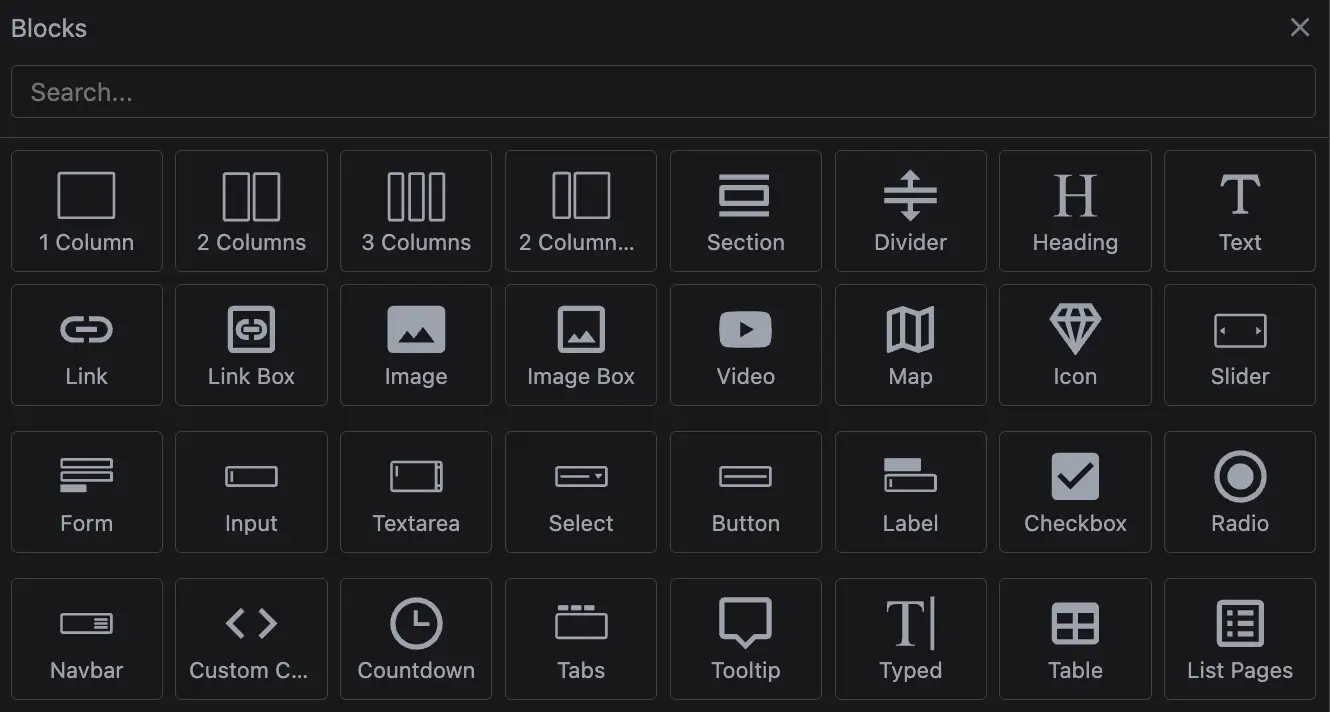
This guide will walk you through setting up and customizing blocks using the built-in Block Manager. The default Block Manager UI is lightweight, with built-in drag-and-drop support. However, you can also extend it or build a custom UI to better fit your needs.
For a better understanding of this guide, we recommend checking out the Components section first.
Initialization
Studio SDK comes with a set of basic blocks tailored to the selected project type. You can easily extend this by adding custom blocks using the blocks.default option.
The demo below shows how to initialize the editor with your custom blocks.
- React
- JS
- 🍇 Demo
import StudioEditor from '@grapesjs/studio-sdk/react';
import '@grapesjs/studio-sdk/style';

// ...
<StudioEditor
  options={{
    // ...
    blocks: {
      default: [
        {
          id: 'my-block-image',
          label: 'My Image',
          media: '<svg viewBox="0 0 24 24"><path d="M20 5a2 2 0 0 1 2 2v10a2 2 0 0 1-2 2H4a2 2 0 0 1-2-2V7c0-1.1.9-2 2-2h16M5 16h14l-4.5-6-3.5 4.5-2.5-3L5 16Z"/></svg>',
          // Component Definition as content
          content: { type: 'image', src: 'https://picsum.photos/seed/my-image/100/100' }
        },
        {
          id: 'my-block-section',
          label: 'My Section',
          media: '<svg viewBox="0 0 24 24"><path d="M21 3H3c-.6 0-1 .4-1 1v6c0 .6.4 1 1 1h18c.6 0 1-.4 1-1V4c0-.6-.4-1-1-1m0 10H3c-.6 0-1 .4-1 1v6c0 .6.4 1 1 1h18c.6 0 1-.4 1-1v-6c0-.6-.4-1-1-1Z"/></svg>',
          // Component Definition with nested components
          content: {
            tagName: 'section',
            style: { padding: '25px', background: '#f3f3f3' },
            components: [
              { tagName: 'h1', components: 'Section' },
              { type: 'image', src: 'https://picsum.photos/seed/my-image/100/100' }
            ]
          }
        },
        {
          id: 'my-block-section-html',
          label: 'My HTML',
          media: '<svg viewBox="0 0 24 24"><path d="M21 3H3c-.6 0-1 .4-1 1v6c0 .6.4 1 1 1h18c.6 0 1-.4 1-1V4c0-.6-.4-1-1-1m0 10H3c-.6 0-1 .4-1 1v6c0 .6.4 1 1 1h18c.6 0 1-.4 1-1v-6c0-.6-.4-1-1-1Z"/></svg>',
          // HTML strings will be transformed to Component Definitions
          content: `
            <section style="padding: 25px; background: #f3f3f3">
              <h1>Section (HTML)</h1>
              <img src="https://picsum.photos/seed/my-image/100/100" />
            </section>
          `
        }
      ]
    },
    // Custom default project for demo purpose
    project: {
      default: {
        pages: [ { name: 'Home', component: '<h1>Blocks demo project</h1>' } ]
      },
    },
    // Custom editor layout for demo purpose
    layout: {
      default: {
        type: 'row',
        style: { height: '100%' },
        children: [
          {
            type: 'panelBlocks',
            header: { label: 'Blocks', collapsible: false, style: { width: '300px' } },
            symbols: false,
          },
          { type: 'canvas' }
        ]
      }
    },
  }}
/>
import createStudioEditor from '@grapesjs/studio-sdk';
import '@grapesjs/studio-sdk/style';

// ...
createStudioEditor({
  // ...
  blocks: {
    default: [
      {
        id: 'my-block-image',
        label: 'My Image',
        media: '<svg viewBox="0 0 24 24"><path d="M20 5a2 2 0 0 1 2 2v10a2 2 0 0 1-2 2H4a2 2 0 0 1-2-2V7c0-1.1.9-2 2-2h16M5 16h14l-4.5-6-3.5 4.5-2.5-3L5 16Z"/></svg>',
        // Component Definition as content
        content: { type: 'image', src: 'https://picsum.photos/seed/my-image/100/100' }
      },
      {
        id: 'my-block-section',
        label: 'My Section',
        media: '<svg viewBox="0 0 24 24"><path d="M21 3H3c-.6 0-1 .4-1 1v6c0 .6.4 1 1 1h18c.6 0 1-.4 1-1V4c0-.6-.4-1-1-1m0 10H3c-.6 0-1 .4-1 1v6c0 .6.4 1 1 1h18c.6 0 1-.4 1-1v-6c0-.6-.4-1-1-1Z"/></svg>',
        // Component Definition with nested components
        content: {
          tagName: 'section',
          style: { padding: '25px', background: '#f3f3f3' },
          components: [
            { tagName: 'h1', components: 'Section' },
            { type: 'image', src: 'https://picsum.photos/seed/my-image/100/100' }
          ]
        }
      },
      {
        id: 'my-block-section-html',
        label: 'My HTML',
        media: '<svg viewBox="0 0 24 24"><path d="M21 3H3c-.6 0-1 .4-1 1v6c0 .6.4 1 1 1h18c.6 0 1-.4 1-1V4c0-.6-.4-1-1-1m0 10H3c-.6 0-1 .4-1 1v6c0 .6.4 1 1 1h18c.6 0 1-.4 1-1v-6c0-.6-.4-1-1-1Z"/></svg>',
        // HTML strings will be transformed to Component Definitions
        content: `
          <section style="padding: 25px; background: #f3f3f3">
            <h1>Section (HTML)</h1>
            <img src="https://picsum.photos/seed/my-image/100/100" />
          </section>
        `
      }
    ]
  },
  // Custom default project for demo purpose
  project: {
    default: {
      pages: [ { name: 'Home', component: '<h1>Blocks demo project</h1>' } ]
    },
  },
  // Custom editor layout for demo purpose
  layout: {
    default: {
      type: 'row',
      style: { height: '100%' },
      children: [
        {
          type: 'panelBlocks',
          header: { label: 'Blocks', collapsible: false, style: { width: '300px' } },
          symbols: false,
        },
        { type: 'canvas' }
      ]
    }
  },
})

In the demo above, you can see that the predefined blocks are added after your default ones. If you need to remove or filter them for any reason, you can do so programmatically.
Configuration
Each block comes with configurable properties. You can group blocks into categories, add custom media, and create dynamic content for the dropped component.
In the demo below, you'll see some common configuration options in action.
- React
- JS
- 🍇 Demo
import StudioEditor from '@grapesjs/studio-sdk/react';
import '@grapesjs/studio-sdk/style';

// ...
<StudioEditor
  options={{// ...
    blocks: {
      default: [
        {
          id: 'image-1',
          label: 'Image',
          // Put the block in a category
          category: 'Images',
          media: '<svg viewBox="0 0 24 24"><path d="M20 5a2 2 0 0 1 2 2v10a2 2 0 0 1-2 2H4a2 2 0 0 1-2-2V7c0-1.1.9-2 2-2h16M5 16h14l-4.5-6-3.5 4.5-2.5-3L5 16Z"/></svg>',
          content: { type: 'image', src: 'https://picsum.photos/seed/my-image-1/100/100' },
          // Select the created component when dropped in the canvas
          select: true
        },
        {
          id: 'image-2',
          label: 'Activate Image',
          category: 'Images',
          media: '<svg viewBox="0 0 24 24"><path d="M20 5a2 2 0 0 1 2 2v10a2 2 0 0 1-2 2H4a2 2 0 0 1-2-2V7c0-1.1.9-2 2-2h16M5 16h14l-4.5-6-3.5 4.5-2.5-3L5 16Z"/></svg>',
          content: { type: 'image', src: 'https://picsum.photos/seed/my-image-2/100/100' },
          select: true,
          // The Component View of the 'image' has a custom 'onActive' method (opens Asset Manager)
          // that will be triggered when the component is dropped in the canvas.
          activate: true
        },
        {
          id: 'section-1',
          label: 'Full block',
          category: 'Sections',
          media: '<svg viewBox="0 0 24 24"><path d="M21 3H3c-.6 0-1 .4-1 1v6c0 .6.4 1 1 1h18c.6 0 1-.4 1-1V4c0-.6-.4-1-1-1m0 10H3c-.6 0-1 .4-1 1v6c0 .6.4 1 1 1h18c.6 0 1-.4 1-1v-6c0-.6-.4-1-1-1Z"/></svg>',
          content: '<section>Simple section</section>',
          // Full width block
          full: true
        },
        {
          id: 'section-2',
          label: 'Your media',
          category: 'Sections',
          media: '<img src="https://picsum.photos/seed/my-image-10/200/200" style="width: 200px; height: 100px; display: block; object-fit: cover; border-radius: 3px;"/>',
          content: '<section>Media as image</section>',
          full: true,
          // This will remove default classes of the block
          attributes: { class: 'custom-class' }
        },
        {
          id: 'section-3',
          label: 'Disabled',
          category: 'Sections',
          media: '<svg viewBox="0 0 24 24"><path d="M12 2c5.5 0 10 4.5 10 10s-4.5 10-10 10S2 17.5 2 12 6.5 2 12 2m0 2c-1.9 0-3.6.6-4.9 1.7l11.2 11.2c1-1.4 1.7-3.1 1.7-4.9a8 8 0 0 0-8-8m4.9 14.3L5.7 7.1a8 8 0 0 0 11.2 11.2Z"/></svg>',
          content: '<section>Disabled</section>',
          // Disable the block
          disable: true,
          // Custom onClick callback
          onClick(block) {
            alert(`Block ${block.getLabel()} disabled`);
          }
        },
        {
          id: 'section-4',
          label: 'Dynamic',
          category: 'Sections',
          media: '<svg viewBox="0 0 24 24"><path d="M7 11H1v2h6v-2m2.2-3.2L7 5.6 5.5 7.1l2.2 2 1.4-1.3M13 1h-2v6h2V1m5.4 6L17 5.7l-2.2 2.2 1.4 1.4L18.4 7M17 11v2h6v-2h-6m-5-2a3 3 0 0 0-3 3 3 3 0 0 0 3 3 3 3 0 0 0 3-3 3 3 0 0 0-3-3m2.8 7.2 2.1 2.2 1.5-1.4-2.2-2.2-1.4 1.4m-9.2.8 1.5 1.4 2-2.2-1.3-1.4L5.6 17m5.4 6h2v-6h-2v6Z"/></svg>',
          // Content as a function, you can return the HTML string or a Component Defintion
          content: () => `<section>Section created at: ${new Date().toUTCString()}</section>`
        }
      ]
    },
    // Custom default project for demo purpose
    project: {/**/},
    // Custom editor layout for demo purpose
    layout: {/**/}
  }}
/>
import createStudioEditor from '@grapesjs/studio-sdk';
import '@grapesjs/studio-sdk/style';

// ...
createStudioEditor({// ...
  blocks: {
    default: [
      {
        id: 'image-1',
        label: 'Image',
        // Put the block in a category
        category: 'Images',
        media: '<svg viewBox="0 0 24 24"><path d="M20 5a2 2 0 0 1 2 2v10a2 2 0 0 1-2 2H4a2 2 0 0 1-2-2V7c0-1.1.9-2 2-2h16M5 16h14l-4.5-6-3.5 4.5-2.5-3L5 16Z"/></svg>',
        content: { type: 'image', src: 'https://picsum.photos/seed/my-image-1/100/100' },
        // Select the created component when dropped in the canvas
        select: true
      },
      {
        id: 'image-2',
        label: 'Activate Image',
        category: 'Images',
        media: '<svg viewBox="0 0 24 24"><path d="M20 5a2 2 0 0 1 2 2v10a2 2 0 0 1-2 2H4a2 2 0 0 1-2-2V7c0-1.1.9-2 2-2h16M5 16h14l-4.5-6-3.5 4.5-2.5-3L5 16Z"/></svg>',
        content: { type: 'image', src: 'https://picsum.photos/seed/my-image-2/100/100' },
        select: true,
        // The Component View of the 'image' has a custom 'onActive' method (opens Asset Manager)
        // that will be triggered when the component is dropped in the canvas.
        activate: true
      },
      {
        id: 'section-1',
        label: 'Full block',
        category: 'Sections',
        media: '<svg viewBox="0 0 24 24"><path d="M21 3H3c-.6 0-1 .4-1 1v6c0 .6.4 1 1 1h18c.6 0 1-.4 1-1V4c0-.6-.4-1-1-1m0 10H3c-.6 0-1 .4-1 1v6c0 .6.4 1 1 1h18c.6 0 1-.4 1-1v-6c0-.6-.4-1-1-1Z"/></svg>',
        content: '<section>Simple section</section>',
        // Full width block
        full: true
      },
      {
        id: 'section-2',
        label: 'Your media',
        category: 'Sections',
        media: '<img src="https://picsum.photos/seed/my-image-10/200/200" style="width: 200px; height: 100px; display: block; object-fit: cover; border-radius: 3px;"/>',
        content: '<section>Media as image</section>',
        full: true,
        // This will remove default classes of the block
        attributes: { class: 'custom-class' }
      },
      {
        id: 'section-3',
        label: 'Disabled',
        category: 'Sections',
        media: '<svg viewBox="0 0 24 24"><path d="M12 2c5.5 0 10 4.5 10 10s-4.5 10-10 10S2 17.5 2 12 6.5 2 12 2m0 2c-1.9 0-3.6.6-4.9 1.7l11.2 11.2c1-1.4 1.7-3.1 1.7-4.9a8 8 0 0 0-8-8m4.9 14.3L5.7 7.1a8 8 0 0 0 11.2 11.2Z"/></svg>',
        content: '<section>Disabled</section>',
        // Disable the block
        disable: true,
        // Custom onClick callback
        onClick(block) {
          alert(`Block ${block.getLabel()} disabled`);
        }
      },
      {
        id: 'section-4',
        label: 'Dynamic',
        category: 'Sections',
        media: '<svg viewBox="0 0 24 24"><path d="M7 11H1v2h6v-2m2.2-3.2L7 5.6 5.5 7.1l2.2 2 1.4-1.3M13 1h-2v6h2V1m5.4 6L17 5.7l-2.2 2.2 1.4 1.4L18.4 7M17 11v2h6v-2h-6m-5-2a3 3 0 0 0-3 3 3 3 0 0 0 3 3 3 3 0 0 0 3-3 3 3 0 0 0-3-3m2.8 7.2 2.1 2.2 1.5-1.4-2.2-2.2-1.4 1.4m-9.2.8 1.5 1.4 2-2.2-1.3-1.4L5.6 17m5.4 6h2v-6h-2v6Z"/></svg>',
        // Content as a function, you can return the HTML string or a Component Defintion
        content: () => `<section>Section created at: ${new Date().toUTCString()}</section>`
      }
    ]
  },
  // Custom default project for demo purpose
  project: {/**/},
  // Custom editor layout for demo purpose
  layout: {/**/}
})

Click insertion
When a block is clicked in the Block Manager, Studio tries to append its content to the canvas automatically. You can customize that behavior globally with appendOnClick.
- return
falseto disable click insertion for the current block - return
trueto continue with the default click insertion flow - return
{ target, content }to fully override where and how the block is inserted
This hook is closely related to component-level dropTargets and appendFallback:
appendOnClickis the global entry point for block clicksdropTargetsdefines which components are considered valid custom targetsappendFallbackdefines how the final insertion should be wrapped when no normal target is valid
The example below shows all three paths:
- disable click insertion for one block
- provide a custom global override for another block
- fall through to the component-level
appendFallbackfor the default behavior
- React
- JS
- 🍇 Demo
import StudioEditor from '@grapesjs/studio-sdk/react';
import '@grapesjs/studio-sdk/style';

// ...
<StudioEditor
  options={{
    // ...
    plugins: [
      editor => {
        editor.Components.addType('custom-row', {
          model: {
            defaults: {
              name: 'Row',
              draggable: (src, trg) => trg.getType() === 'wrapper',
              droppable: src => src.getType() === 'custom-column',
              style: 'display: flex; gap: 16px; min-height: 140px; padding: 18px; border: 2px dashed #7c8aa5; background: #f8fafc;'
            }
          }
        });

        editor.Components.addType('custom-column', {
          model: {
            defaults: {
              name: 'Column',
              draggable: (src, trg) => trg.getType() === 'custom-row',
              droppable: false,
              style: 'flex: 1; min-height: 90px; padding: 16px; border: 1px solid #9fb0ca; background: white;',
              components: 'Column content',
              dropTargets: ({ root }) => ({
                items: root.findType('custom-row').map(component => ({ component })),
                notFound: 'This component can only be inserted inside a Row, and none was found.'
              }),
              appendFallback: ({ content, dropTargets, editor }) => ({
                target: dropTargets[0]?.component || editor.getWrapper(),
                content: dropTargets.length
                  ? content
                  : {
                      type: 'custom-row',
                      components: content
                    }
              })
            }
          }
        });
      }
    ],
    blocks: {
      default: [
        {
          id: 'row',
          label: 'Row',
          content: { type: 'custom-row' }
        },
        {
          id: 'column',
          label: 'Column',
          content: { type: 'custom-column' }
        },
        {
          id: 'column-custom-content',
          label: 'Column (Custom Content)',
          content: { type: 'custom-column' }
        },
        {
          id: 'column-disabled',
          label: 'Column (Disabled Click)',
          content: { type: 'custom-column' }
        }
      ],
      appendOnClick: ({ block, root }) => {
        if (block.getId() === 'column-disabled') {
          return { notFound: 'Click insertion is disabled for this block.' };
        }

        // Provide a custom global override for this block
        if (block.getId() === 'column-custom-content') {
          return {
            target: root,
            content: {
              type: 'custom-row',
              components: [block.getContent(), block.getContent(), block.getContent()]
            }
          };
        }

        // Proceed with the default behavior and component-level appendFallback
        return true;
      },
    },
    project: {
      default: { pages: [{ name: 'Home' }] }
    },
    layout: {
      default: {
        type: 'row',
        style: { height: '100%' },
        children: [
          {
            type: 'panelBlocks',
            header: { label: 'Blocks', collapsible: false, style: { width: '300px' } },
            symbols: false,
          },
          { type: 'canvas' }
        ]
      }
    },

  }}
/>
import createStudioEditor from '@grapesjs/studio-sdk';
import '@grapesjs/studio-sdk/style';

// ...
createStudioEditor({
  // ...
  plugins: [
    editor => {
      editor.Components.addType('custom-row', {
        model: {
          defaults: {
            name: 'Row',
            draggable: (src, trg) => trg.getType() === 'wrapper',
            droppable: src => src.getType() === 'custom-column',
            style: 'display: flex; gap: 16px; min-height: 140px; padding: 18px; border: 2px dashed #7c8aa5; background: #f8fafc;'
          }
        }
      });

      editor.Components.addType('custom-column', {
        model: {
          defaults: {
            name: 'Column',
            draggable: (src, trg) => trg.getType() === 'custom-row',
            droppable: false,
            style: 'flex: 1; min-height: 90px; padding: 16px; border: 1px solid #9fb0ca; background: white;',
            components: 'Column content',
            dropTargets: ({ root }) => ({
              items: root.findType('custom-row').map(component => ({ component })),
              notFound: 'This component can only be inserted inside a Row, and none was found.'
            }),
            appendFallback: ({ content, dropTargets, editor }) => ({
              target: dropTargets[0]?.component || editor.getWrapper(),
              content: dropTargets.length
                ? content
                : {
                    type: 'custom-row',
                    components: content
                  }
            })
          }
        }
      });
    }
  ],
  blocks: {
    default: [
      {
        id: 'row',
        label: 'Row',
        content: { type: 'custom-row' }
      },
      {
        id: 'column',
        label: 'Column',
        content: { type: 'custom-column' }
      },
      {
        id: 'column-custom-content',
        label: 'Column (Custom Content)',
        content: { type: 'custom-column' }
      },
      {
        id: 'column-disabled',
        label: 'Column (Disabled Click)',
        content: { type: 'custom-column' }
      }
    ],
    appendOnClick: ({ block, root }) => {
      if (block.getId() === 'column-disabled') {
        return { notFound: 'Click insertion is disabled for this block.' };
      }

      // Provide a custom global override for this block
      if (block.getId() === 'column-custom-content') {
        return {
          target: root,
          content: {
            type: 'custom-row',
            components: [block.getContent(), block.getContent(), block.getContent()]
          }
        };
      }

      // Proceed with the default behavior and component-level appendFallback
      return true;
    },
  },
  project: {
    default: { pages: [{ name: 'Home' }] }
  },
  layout: {
    default: {
      type: 'row',
      style: { height: '100%' },
      children: [
        {
          type: 'panelBlocks',
          header: { label: 'Blocks', collapsible: false, style: { width: '300px' } },
          symbols: false,
        },
        { type: 'canvas' }
      ]
    }
  },

})
If you want to disable click insertion completely, you can do it globally with:
blocks: {
  appendOnClick: () => false
}
Programmatic usage
If you need to manage blocks dynamically, you can use the GrapesJS Blocks APIs.
In the demo below, you'll see how to add, update, and remove blocks using editor.Blocks API. Here, we update the blocks on load via a custom plugin, but these methods can be applied at any time.
- React
- JS
- 🍇 Demo
import StudioEditor from '@grapesjs/studio-sdk/react';
import '@grapesjs/studio-sdk/style';

// ...
<StudioEditor
  options={{// ...
    plugins: [
      // Example of a custom plugin to manage blocks
      editor => {
        const { Blocks } = editor;
        const blockMedia = '<svg viewBox="0 0 24 24"><path d="M19,5H22V7H19V10H17V7H14V5H17V2H19V5M17,19V13H19V21H3V5H11V7H5V19H17Z" /></svg>';
        const newCategory = {
          id: 'new-category',
          label: 'New Category',
          icon: '<svg viewBox="0 0 24 24"><path d="M7 11H1v2h6v-2m2.2-3.2L7 5.6 5.5 7.1l2.2 2 1.4-1.3M13 1h-2v6h2V1m5.4 6L17 5.7l-2.2 2.2 1.4 1.4L18.4 7M17 11v2h6v-2h-6m-5-2a3 3 0 0 0-3 3 3 3 0 0 0 3 3 3 3 0 0 0 3-3 3 3 0 0 0-3-3m2.8 7.2 2.1 2.2 1.5-1.4-2.2-2.2-1.4 1.4m-9.2.8 1.5 1.4 2-2.2-1.3-1.4L5.6 17m5.4 6h2v-6h-2v6Z"/></svg>'
        };

        // Remove already defined blocks (keep only 'text' and 'image')
        const allBlocksId = Blocks.getAll().map(block => block.id);
        const blocksToKeep = ['text', 'image'];
        allBlocksId.forEach(blockId => {
          if (!blocksToKeep.includes(blockId)) {
            Blocks.remove(blockId);
          }
        });

        // Add new blocks
        Blocks.add('block-id-1', {
          label: 'Block 1',
          media: blockMedia,
          category: newCategory,
          content: '<div>Block 1</div>'
        }, {
          at: 0 // Let's place this block at the beginning of the list
        });

        Blocks.add('block-id-2', {
          label: 'Block 2',
          media: blockMedia,
          category: newCategory,
          content: '<div>Block 2</div>'
        });

        Blocks.add('block-id-3', {
          label: 'Block 3',
          media: blockMedia,
          category: 'Another Category',
          content: '<div>Block 3</div>'
        });

        // Update defined blocks
        const blockImage = Blocks.get('image');
        blockImage?.set({
          label: 'Image (updated)',
          content: '<img src="https://placehold.co/200/777/white.png?text=Image+Updated"/>'
        });

    },
    ],
    // Custom default project for demo purpose
    project: {/**/},
    // Custom editor layout for demo purpose
    layout: {/**/}
  }}
/>
import createStudioEditor from '@grapesjs/studio-sdk';
import '@grapesjs/studio-sdk/style';

// ...
createStudioEditor({// ...
  plugins: [
    // Example of a custom plugin to manage blocks
    editor => {
      const { Blocks } = editor;
      const blockMedia = '<svg viewBox="0 0 24 24"><path d="M19,5H22V7H19V10H17V7H14V5H17V2H19V5M17,19V13H19V21H3V5H11V7H5V19H17Z" /></svg>';
      const newCategory = {
        id: 'new-category',
        label: 'New Category',
        icon: '<svg viewBox="0 0 24 24"><path d="M7 11H1v2h6v-2m2.2-3.2L7 5.6 5.5 7.1l2.2 2 1.4-1.3M13 1h-2v6h2V1m5.4 6L17 5.7l-2.2 2.2 1.4 1.4L18.4 7M17 11v2h6v-2h-6m-5-2a3 3 0 0 0-3 3 3 3 0 0 0 3 3 3 3 0 0 0 3-3 3 3 0 0 0-3-3m2.8 7.2 2.1 2.2 1.5-1.4-2.2-2.2-1.4 1.4m-9.2.8 1.5 1.4 2-2.2-1.3-1.4L5.6 17m5.4 6h2v-6h-2v6Z"/></svg>'
      };

      // Remove already defined blocks (keep only 'text' and 'image')
      const allBlocksId = Blocks.getAll().map(block => block.id);
      const blocksToKeep = ['text', 'image'];
      allBlocksId.forEach(blockId => {
        if (!blocksToKeep.includes(blockId)) {
          Blocks.remove(blockId);
        }
      });

      // Add new blocks
      Blocks.add('block-id-1', {
        label: 'Block 1',
        media: blockMedia,
        category: newCategory,
        content: '<div>Block 1</div>'
      }, {
        at: 0 // Let's place this block at the beginning of the list
      });

      Blocks.add('block-id-2', {
        label: 'Block 2',
        media: blockMedia,
        category: newCategory,
        content: '<div>Block 2</div>'
      });

      Blocks.add('block-id-3', {
        label: 'Block 3',
        media: blockMedia,
        category: 'Another Category',
        content: '<div>Block 3</div>'
      });

      // Update defined blocks
      const blockImage = Blocks.get('image');
      blockImage?.set({
        label: 'Image (updated)',
        content: '<img src="https://placehold.co/200/777/white.png?text=Image+Updated"/>'
      });

  },
  ],
  // Custom default project for demo purpose
  project: {/**/},
  // Custom editor layout for demo purpose
  layout: {/**/}
})
Events
You can also subscribe to block events to trigger custom actions. For a complete list of available events, check the reference here.
In the demo below, we demonstrate how to use block events to update a label during drag operations and disable a block based when the component changes.
- React
- JS
- 🍇 Demo
import StudioEditor from '@grapesjs/studio-sdk/react';
import '@grapesjs/studio-sdk/style';

// ...
<StudioEditor
  options={{
    // ...
    plugins: [
      editor => {
        const { Blocks, Components } = editor;

        // Remove all blocks for the demo purpose
        Blocks.getAll().map(block => block.id).forEach(id => Blocks.remove(id));

        // Create a new component
        Components.addType('cmp-unique', {
          model: {
            defaults: {
              copyable: false,
              components: '{{ PLACEHOLDER_COMPONENT }}',
              style: { 'text-align': 'center', color: 'red' }
            }
          }
        });

        // Add a new block
        Blocks.add('block-unique', {
          label: 'Unique Block',
          media: '<svg viewBox="0 0 24 24"><path d="M19,5H22V7H19V10H17V7H14V5H17V2H19V5M17,19V13H19V21H3V5H11V7H5V19H17Z" /></svg>',
          content: { type: 'cmp-unique' },
          full: true
        });

        const cleanUpBlockDrag = block => {
          block.set({ label: block.getLabel().replace('(Drag)', '').trim() });
        };

        // Update block during drag operations
        editor.on(Blocks.events.dragStart, block => {
          block.set({ label: `${block.getLabel()} (Drag)` });
        });
        editor.on(Blocks.events.dragEnd, (createdComponent, block) => {
          cleanUpBlockDrag(block);
        });

        // Disable block based on the component
        editor.on(Components.events.add, cmp => {
          if (cmp.get('type') === 'cmp-unique') {
            const block = Blocks.get('block-unique');
            cleanUpBlockDrag(block);
            block.set({ disable: true });
          }
        });
        editor.on(Components.events.removed, cmp => {
          if (cmp.get('type') === 'cmp-unique') {
            Blocks.get('block-unique').set({ disable: false });
          }
        });

    },
    ],
    // Custom default project for demo purpose
    project: {/**/},
    // Custom editor layout for demo purpose
    layout: {/**/}
  }}
/>
import createStudioEditor from '@grapesjs/studio-sdk';
import '@grapesjs/studio-sdk/style';

// ...
createStudioEditor({
  // ...
  plugins: [
    editor => {
      const { Blocks, Components } = editor;

      // Remove all blocks for the demo purpose
      Blocks.getAll().map(block => block.id).forEach(id => Blocks.remove(id));

      // Create a new component
      Components.addType('cmp-unique', {
        model: {
          defaults: {
            copyable: false,
            components: '{{ PLACEHOLDER_COMPONENT }}',
            style: { 'text-align': 'center', color: 'red' }
          }
        }
      });

      // Add a new block
      Blocks.add('block-unique', {
        label: 'Unique Block',
        media: '<svg viewBox="0 0 24 24"><path d="M19,5H22V7H19V10H17V7H14V5H17V2H19V5M17,19V13H19V21H3V5H11V7H5V19H17Z" /></svg>',
        content: { type: 'cmp-unique' },
        full: true
      });

      const cleanUpBlockDrag = block => {
        block.set({ label: block.getLabel().replace('(Drag)', '').trim() });
      };

      // Update block during drag operations
      editor.on(Blocks.events.dragStart, block => {
        block.set({ label: `${block.getLabel()} (Drag)` });
      });
      editor.on(Blocks.events.dragEnd, (createdComponent, block) => {
        cleanUpBlockDrag(block);
      });

      // Disable block based on the component
      editor.on(Components.events.add, cmp => {
        if (cmp.get('type') === 'cmp-unique') {
          const block = Blocks.get('block-unique');
          cleanUpBlockDrag(block);
          block.set({ disable: true });
        }
      });
      editor.on(Components.events.removed, cmp => {
        if (cmp.get('type') === 'cmp-unique') {
          Blocks.get('block-unique').set({ disable: false });
        }
      });

  },
  ],
  // Custom default project for demo purpose
  project: {/**/},
  // Custom editor layout for demo purpose
  layout: {/**/}
})
I18n
All block manager labels are integrated with I18n GrapesJS module. Below is a reference for each available key.
- React
- JS
- 🍇 Demo
import StudioEditor from '@grapesjs/studio-sdk/react';
import '@grapesjs/studio-sdk/style';

// ...
<StudioEditor
  options={{
    // ...
    i18n: {
      locales: {
        en: {
          blockManager: {
            notFound: "No blocks found",
            blocks: "Blocks",
            add: "Add more blocks",
            search: "Search...",
            types: {
              regular: "Regular",
              symbols: "Symbols"
            },
            symbols: {
              notFound: "No symbols found",
              instancesProject: "Instance/s in the project",
              delete: "Delete symbol",
              deleteConfirm: "Are you sure you want to delete the symbol? All instances inside the project will be detached."
            }
          },
        }
      }
    },
    // Custom default project for demo purpose
    project: {/**/},
    // Custom editor layout for demo purpose
    layout: {/**/}
  }}
/>
import createStudioEditor from '@grapesjs/studio-sdk';
import '@grapesjs/studio-sdk/style';

// ...
createStudioEditor({
  // ...
  i18n: {
    locales: {
      en: {
        blockManager: {
          notFound: "No blocks found",
          blocks: "Blocks",
          add: "Add more blocks",
          search: "Search...",
          types: {
            regular: "Regular",
            symbols: "Symbols"
          },
          symbols: {
            notFound: "No symbols found",
            instancesProject: "Instance/s in the project",
            delete: "Delete symbol",
            deleteConfirm: "Are you sure you want to delete the symbol? All instances inside the project will be detached."
          }
        },
      }
    }
  },
  // Custom default project for demo purpose
  project: {/**/},
  // Custom editor layout for demo purpose
  layout: {/**/}
})
Since blocks and categories can be added dynamically, they must be referenced by their ID.
- React
- JS
- 🍇 Demo
import StudioEditor from '@grapesjs/studio-sdk/react';
import '@grapesjs/studio-sdk/style';

// ...
<StudioEditor
  options={{
    // ...
    i18n: {
      locales: {
        en: {
          blockManager: {
            labels: {
              block1: 'Block 1 (EN)',
              block2: 'Block 2 (EN)',
            },
            categories: {
              category1: 'Category 1 (EN)',
              category2: 'Category 2 (EN)',
            },
          }
        }
      }
    },
    plugins: [
      editor => {
        const { Blocks } = editor;
        const blockMedia = '<svg viewBox="0 0 24 24"><path d="M19,5H22V7H19V10H17V7H14V5H17V2H19V5M17,19V13H19V21H3V5H11V7H5V19H17Z" /></svg>';
        // Remove all blocks for the demo purpose
        Blocks.getAll().map(block => block.id).forEach(id => Blocks.remove(id));

        Blocks.add('block1', {
          label: 'Block 1',
          media: blockMedia,
          category: { id: 'category1', label: 'Category 1' },
          content: '<div>Block 1</div>'
        });

        Blocks.add('block2', {
          label: 'Block 2',
          media: blockMedia,
          category: { id: 'category2', label: 'Category 2' },
          content: '<div>Block 2</div>'
        });

    }
    ],

    // Custom default project for demo purpose
    project: {/**/},
    // Custom editor layout for demo purpose
    layout: {/**/}
  }}
/>
import createStudioEditor from '@grapesjs/studio-sdk';
import '@grapesjs/studio-sdk/style';

// ...
createStudioEditor({
  // ...
  i18n: {
    locales: {
      en: {
        blockManager: {
          labels: {
            block1: 'Block 1 (EN)',
            block2: 'Block 2 (EN)',
          },
          categories: {
            category1: 'Category 1 (EN)',
            category2: 'Category 2 (EN)',
          },
        }
      }
    }
  },
  plugins: [
    editor => {
      const { Blocks } = editor;
      const blockMedia = '<svg viewBox="0 0 24 24"><path d="M19,5H22V7H19V10H17V7H14V5H17V2H19V5M17,19V13H19V21H3V5H11V7H5V19H17Z" /></svg>';
      // Remove all blocks for the demo purpose
      Blocks.getAll().map(block => block.id).forEach(id => Blocks.remove(id));

      Blocks.add('block1', {
        label: 'Block 1',
        media: blockMedia,
        category: { id: 'category1', label: 'Category 1' },
        content: '<div>Block 1</div>'
      });

      Blocks.add('block2', {
        label: 'Block 2',
        media: blockMedia,
        category: { id: 'category2', label: 'Category 2' },
        content: '<div>Block 2</div>'
      });

  }
  ],

  // Custom default project for demo purpose
  project: {/**/},
  // Custom editor layout for demo purpose
  layout: {/**/}
})
Customization
The Block Manager UI is rendered using the built-in panelBlocks layout component. You can create multiple custom panelBlocks, each with its own set of properties.
In the demo below, we showcase different ways to customize the panelBlocks component.
- React
- JS
- 🍇 Demo
import StudioEditor from '@grapesjs/studio-sdk/react';
import '@grapesjs/studio-sdk/style';

function openBlocks(editor, layout) {
  editor.runCommand('studio:layoutUpdate', {
    id: 'blockPanelContainer',
    layout,
    header: false,
    placer: { type: 'static', layoutId: 'hiddenColumnForBlocks' },
    style: { width: 250, height: '100%', borderRightWidth: 1 }
  });
}

// ...
<StudioEditor
  options={{
    // ...
    layout: {
      default: {
        type: 'row',
        style: { height: '100%' },
        children: [
          {
            type: 'sidebarLeft',
            resizable: false,
            style: { padding: '10px 5px', alignItems: 'center', width: 45, gap: 10 },
            children: [
              {
                type: 'button',
                icon: '<svg viewBox="0 0 24 24"><path d="M14,17H12V9H10V7H14M19,3H5A2,2 0 0,0 3,5V19A2,2 0 0,0 5,21H19A2,2 0 0,0 21,19V5A2,2 0 0,0 19,3Z" /></svg>',
                tooltip: 'Simple panel',
                onClick: ({ editor }) => {
                  openBlocks(editor, {
                    type: 'panelBlocks',
                    symbols: false,
                    search: false
                  });
                }
              },
              {
                type: 'button',
                icon: '<svg viewBox="0 0 24 24"><path d="M15,11C15,12.11 14.1,13 13,13H11V15H15V17H9V13C9,11.89 9.9,11 11,11H13V9H9V7H13A2,2 0 0,1 15,9M19,3H5A2,2 0 0,0 3,5V19A2,2 0 0,0 5,21H19A2,2 0 0,0 21,19V5A2,2 0 0,0 19,3Z" /></svg>',
                tooltip: 'Hide categories',
                onClick: ({ editor }) => {
                  openBlocks(editor, {
                    type: 'panelBlocks',
                    symbols: false,
                    hideCategories: true,
                    /**
                     * Customize with your own CSS.
                     * Here we'll use this CSS rule:
                     * .custom-blocks-layout .gs-block-manager__blocks {
                     *   font-size: 0.7rem;
                     *   grid-template-columns: repeat(auto-fill, minmax(55px, 1fr));
                     * }
                     */
                    className: 'custom-blocks-layout'
                  });
                }
              },
              {
                type: 'button',
                icon: '<svg viewBox="0 0 24 24"><path d="M15,10.5A1.5,1.5 0 0,1 13.5,12C14.34,12 15,12.67 15,13.5V15C15,16.11 14.11,17 13,17H9V15H13V13H11V11H13V9H9V7H13C14.11,7 15,7.89 15,9M19,3H5C3.91,3 3,3.9 3,5V19A2,2 0 0,0 5,21H19C20.11,21 21,20.1 21,19V5A2,2 0 0,0 19,3Z" /></svg>',
                tooltip: 'Filtered Blocks',
                onClick: ({ editor }) => {
                  openBlocks(editor, {
                    type: 'panelBlocks',
                    symbols: false,
                    // Filter blocks by category
                    blocks: ({ blocks }) => {
                      return blocks.filter(block => block.category?.getLabel() === 'Basic');
                    }
                  });
                }
              },
              {
                type: 'button',
                icon: '<svg viewBox="0 0 24 24"><path d="M15,17H13V13H9V7H11V11H13V7H15M19,3H5A2,2 0 0,0 3,5V19A2,2 0 0,0 5,21H19A2,2 0 0,0 21,19V5A2,2 0 0,0 19,3Z" /></svg>',
                tooltip: 'Custom block layout',
                onClick: ({ editor }) => {
                  openBlocks(editor, {
                    type: 'panelBlocks',
                    symbols: false,
                    itemLayout: ({ block, attributes }) =>
                      block.id === 'icon' ? null // Skip custom layout for the 'icon' block
                      : {
                          type: 'column',
                          className: `my-custom-block ${attributes.className}`,
                          style: { backgroundColor: 'white', borderRadius: 1000 },
                          htmlAttrs: attributes, // Reuse original attributes (eg. to keep the drag and drop logic)
                          children: [
                            {
                              type: 'text',
                              content: block.getLabel(),
                              style: { textAlign: 'center' },
                            },
                            {
                              type: 'custom',
                              className: 'gs-utl-block-media',
                              style: { width: 30, margin: '0 auto' },
                              render: () => block.getMedia()
                            }
                          ]
                        }
                  });
                }
              }
            ]
          },
          { id: 'hiddenColumnForBlocks', type: 'column' },
          { type: 'canvas' }
        ]
      }
    },

  }}
/>
import createStudioEditor from '@grapesjs/studio-sdk';
import '@grapesjs/studio-sdk/style';

function openBlocks(editor, layout) {
  editor.runCommand('studio:layoutUpdate', {
    id: 'blockPanelContainer',
    layout,
    header: false,
    placer: { type: 'static', layoutId: 'hiddenColumnForBlocks' },
    style: { width: 250, height: '100%', borderRightWidth: 1 }
  });
}

// ...
createStudioEditor({
  // ...
  layout: {
    default: {
      type: 'row',
      style: { height: '100%' },
      children: [
        {
          type: 'sidebarLeft',
          resizable: false,
          style: { padding: '10px 5px', alignItems: 'center', width: 45, gap: 10 },
          children: [
            {
              type: 'button',
              icon: '<svg viewBox="0 0 24 24"><path d="M14,17H12V9H10V7H14M19,3H5A2,2 0 0,0 3,5V19A2,2 0 0,0 5,21H19A2,2 0 0,0 21,19V5A2,2 0 0,0 19,3Z" /></svg>',
              tooltip: 'Simple panel',
              onClick: ({ editor }) => {
                openBlocks(editor, {
                  type: 'panelBlocks',
                  symbols: false,
                  search: false
                });
              }
            },
            {
              type: 'button',
              icon: '<svg viewBox="0 0 24 24"><path d="M15,11C15,12.11 14.1,13 13,13H11V15H15V17H9V13C9,11.89 9.9,11 11,11H13V9H9V7H13A2,2 0 0,1 15,9M19,3H5A2,2 0 0,0 3,5V19A2,2 0 0,0 5,21H19A2,2 0 0,0 21,19V5A2,2 0 0,0 19,3Z" /></svg>',
              tooltip: 'Hide categories',
              onClick: ({ editor }) => {
                openBlocks(editor, {
                  type: 'panelBlocks',
                  symbols: false,
                  hideCategories: true,
                  /**
                   * Customize with your own CSS.
                   * Here we'll use this CSS rule:
                   * .custom-blocks-layout .gs-block-manager__blocks {
                   *   font-size: 0.7rem;
                   *   grid-template-columns: repeat(auto-fill, minmax(55px, 1fr));
                   * }
                   */
                  className: 'custom-blocks-layout'
                });
              }
            },
            {
              type: 'button',
              icon: '<svg viewBox="0 0 24 24"><path d="M15,10.5A1.5,1.5 0 0,1 13.5,12C14.34,12 15,12.67 15,13.5V15C15,16.11 14.11,17 13,17H9V15H13V13H11V11H13V9H9V7H13C14.11,7 15,7.89 15,9M19,3H5C3.91,3 3,3.9 3,5V19A2,2 0 0,0 5,21H19C20.11,21 21,20.1 21,19V5A2,2 0 0,0 19,3Z" /></svg>',
              tooltip: 'Filtered Blocks',
              onClick: ({ editor }) => {
                openBlocks(editor, {
                  type: 'panelBlocks',
                  symbols: false,
                  // Filter blocks by category
                  blocks: ({ blocks }) => {
                    return blocks.filter(block => block.category?.getLabel() === 'Basic');
                  }
                });
              }
            },
            {
              type: 'button',
              icon: '<svg viewBox="0 0 24 24"><path d="M15,17H13V13H9V7H11V11H13V7H15M19,3H5A2,2 0 0,0 3,5V19A2,2 0 0,0 5,21H19A2,2 0 0,0 21,19V5A2,2 0 0,0 19,3Z" /></svg>',
              tooltip: 'Custom block layout',
              onClick: ({ editor }) => {
                openBlocks(editor, {
                  type: 'panelBlocks',
                  symbols: false,
                  itemLayout: ({ block, attributes }) =>
                    block.id === 'icon' ? null // Skip custom layout for the 'icon' block
                    : {
                        type: 'column',
                        className: `my-custom-block ${attributes.className}`,
                        style: { backgroundColor: 'white', borderRadius: 1000 },
                        htmlAttrs: attributes, // Reuse original attributes (eg. to keep the drag and drop logic)
                        children: [
                          {
                            type: 'text',
                            content: block.getLabel(),
                            style: { textAlign: 'center' },
                          },
                          {
                            type: 'custom',
                            className: 'gs-utl-block-media',
                            style: { width: 30, margin: '0 auto' },
                            render: () => block.getMedia()
                          }
                        ]
                      }
                });
              }
            }
          ]
        },
        { id: 'hiddenColumnForBlocks', type: 'column' },
        { type: 'canvas' }
      ]
    }
  },

})