Asset Providers
Asset Providers enables you to integrate any external source (e.g. from an API), allowing you to load custom asset types such as images, videos, and documents.
Table of Contents
Basic setup
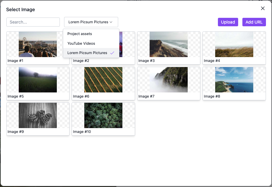
Here we configure an Asset Provider using images from Lorem Picsum:
- React
- JS
- 🍇 Demo
import StudioEditor from '@grapesjs/studio-sdk/react';
import '@grapesjs/studio-sdk/style';

// ...
<StudioEditor
  options={{
    project: {
      default: {
        pages: [{ name: "Home", component: '<div><p>Double click the image below to open the AssetManager</p><img id="picture"/></div>' }],
      }
    },
    assets: {
      // Select by default the Lorem Picsum provider when the asset manager opens
      providerId: "picsum-pictures",
      providers: [{
        id: "picsum-pictures",
        label: "Lorem Picsum pictures",
        types: "image",
        onLoad: async (props) => {
          return Array(30)
            .fill(0)
            .map((v, i) => ({
              src: `https://picsum.photos/seed/${i + 1}/300/300.jpg`,
              name: `Image #${i + 1}`
            }));
        }
      }]
    }
  }}
/>
import createStudioEditor from '@grapesjs/studio-sdk';
import '@grapesjs/studio-sdk/style';

// ...
createStudioEditor({
  project: {
    default: {
      pages: [{ name: "Home", component: '<div><p>Double click the image below to open the AssetManager</p><img id="picture"/></div>' }],
    }
  },
  assets: {
    // Select by default the Lorem Picsum provider when the asset manager opens
    providerId: "picsum-pictures",
    providers: [{
      id: "picsum-pictures",
      label: "Lorem Picsum pictures",
      types: "image",
      onLoad: async (props) => {
        return Array(30)
          .fill(0)
          .map((v, i) => ({
            src: `https://picsum.photos/seed/${i + 1}/300/300.jpg`,
            name: `Image #${i + 1}`
          }));
      }
    }]
  }
})
If your assets are not images, you must define a custom item layout.
Each Asset Provider you define will show up as an option in the provider filter in the asset manager.
Endless scrolling pagination
To enable endless scrolling in an Asset Provider, instead of an array, return an object with an items prop from AssetProvider.onLoad().
We support both offset-based and token-based pagination.
Offset-based pagination
Here's an example for offset-based pagination, where you provide a page number and page size to an API to get a page.
- React
- JS
- 🍇 Demo
import StudioEditor from '@grapesjs/studio-sdk/react';
import '@grapesjs/studio-sdk/style';

const getPageFromFakeApi = async ({ pageNumber, pageSize }) => {
  const total = 100;
  const count = (pageNumber - 1) * pageSize;
  const itemsLeft = total - count;
  const actualPageSize = Math.min(pageSize, itemsLeft);
  return {
    total,
    items: Array(actualPageSize)
      .fill(0)
      .map((v, i) => ({
        src: `https://picsum.photos/seed/${i + 1 + count}/300/300.jpg`,
        name: `Page #${pageNumber} Image #${i + 1}`
      }))
  };
};
// ...
<StudioEditor
  options={{
    project: {
      default: {
        pages: [{ name: "Home", component: '<div><p>Double click the image below to open the AssetManager</p><img id="picture"/></div>' }],
      }
    },
    assets: {
      providerId: "picsum-pictures",
      providers: [{
        id: "picsum-pictures",
        label: "Lorem Picsum pictures",
        types: "image",
        onLoad: async ({ pageIndex }) => {
          const pageNumber = pageIndex + 1;
          const pageSize = 30;
          const page = await getPageFromFakeApi({ pageNumber, pageSize });
          const count = pageIndex * pageSize + page.items.length;
          return {
            items: page.items,
            isLastPage: count >= page.total
          };
        }
      }]
    }
  }}
/>
import createStudioEditor from '@grapesjs/studio-sdk';
import '@grapesjs/studio-sdk/style';

const getPageFromFakeApi = async ({ pageNumber, pageSize }) => {
  const total = 100;
  const count = (pageNumber - 1) * pageSize;
  const itemsLeft = total - count;
  const actualPageSize = Math.min(pageSize, itemsLeft);
  return {
    total,
    items: Array(actualPageSize)
      .fill(0)
      .map((v, i) => ({
        src: `https://picsum.photos/seed/${i + 1 + count}/300/300.jpg`,
        name: `Page #${pageNumber} Image #${i + 1}`
      }))
  };
};
// ...
createStudioEditor({
  project: {
    default: {
      pages: [{ name: "Home", component: '<div><p>Double click the image below to open the AssetManager</p><img id="picture"/></div>' }],
    }
  },
  assets: {
    providerId: "picsum-pictures",
    providers: [{
      id: "picsum-pictures",
      label: "Lorem Picsum pictures",
      types: "image",
      onLoad: async ({ pageIndex }) => {
        const pageNumber = pageIndex + 1;
        const pageSize = 30;
        const page = await getPageFromFakeApi({ pageNumber, pageSize });
        const count = pageIndex * pageSize + page.items.length;
        return {
          items: page.items,
          isLastPage: count >= page.total
        };
      }
    }]
  }
})
Token-based pagination
Here's we consume an API with token-based pagination, where each page returned by the API gives you a token you can use to request the next page.
- React
- JS
- 🍇 Demo
import StudioEditor from '@grapesjs/studio-sdk/react';
import '@grapesjs/studio-sdk/style';

const getPageFromFakeApi = async ({ pageToken: count = 0, pageSize }) => {
  const total = 100;
  const itemsLeft = total - count;
  const actualPageSize = Math.min(pageSize, itemsLeft);
  return {
    nextPageToken: itemsLeft < 1 ? undefined : count + actualPageSize,
    items: Array(actualPageSize)
      .fill(0)
      .map((v, i) => ({
        src: `https://picsum.photos/seed/${i + 1 + count}/300/300.jpg`,
        name: `Page token #${count} Image #${i + 1}`,
      }))
  };
};
// ...
<StudioEditor
  options={{
    project: {
      default: {
        pages: [{ name: "Home", component: '<div><p>Double click the image below to open the AssetManager</p><img id="picture"/></div>' }],
      }
    },
    assets: {
      providerId: "picsum-pictures",
      providers: [{
        id: "picsum-pictures",
        label: "Lorem Picsum pictures",
        types: "image",
        onLoad: async ({ pageCustomData }) => {
          const pageSize = 30;
          const page = await getPageFromFakeApi({ pageToken: pageCustomData?.token, pageSize });
          return {
            items: page.items,
            nextPageCustomData: { token: page.nextPageToken },
            isLastPage: !page.nextPageToken
          };
        }
      }]
    }
  }}
/>
import createStudioEditor from '@grapesjs/studio-sdk';
import '@grapesjs/studio-sdk/style';

const getPageFromFakeApi = async ({ pageToken: count = 0, pageSize }) => {
  const total = 100;
  const itemsLeft = total - count;
  const actualPageSize = Math.min(pageSize, itemsLeft);
  return {
    nextPageToken: itemsLeft < 1 ? undefined : count + actualPageSize,
    items: Array(actualPageSize)
      .fill(0)
      .map((v, i) => ({
        src: `https://picsum.photos/seed/${i + 1 + count}/300/300.jpg`,
        name: `Page token #${count} Image #${i + 1}`,
      }))
  };
};
// ...
createStudioEditor({
  project: {
    default: {
      pages: [{ name: "Home", component: '<div><p>Double click the image below to open the AssetManager</p><img id="picture"/></div>' }],
    }
  },
  assets: {
    providerId: "picsum-pictures",
    providers: [{
      id: "picsum-pictures",
      label: "Lorem Picsum pictures",
      types: "image",
      onLoad: async ({ pageCustomData }) => {
        const pageSize = 30;
        const page = await getPageFromFakeApi({ pageToken: pageCustomData?.token, pageSize });
        return {
          items: page.items,
          nextPageCustomData: { token: page.nextPageToken },
          isLastPage: !page.nextPageToken
        };
      }
    }]
  }
})
Custom item layout
You can define a custom layout for rendering your provider's assets.
- React
- JS
- 🍇 Demo
import StudioEditor from '@grapesjs/studio-sdk/react';
import '@grapesjs/studio-sdk/style';

// ...
<StudioEditor
  options={{
    project: {
      default: {
        pages: [{ name: "Home", component: '<div><p>Double click the image below to open the AssetManager</p><img id="picture"/></div>' }],
      }
    },
    assets: {
      providerId: "picsum-pictures",
      providers: [{
        // ...
        itemLayout: props => {
          const { assetProps, onSelect } = props;
          return {
            id: assetProps.id,
            type: 'column',
            style: { border: '2px solid black', borderRadius: 8, height: 150, position: 'relative', overflow: 'hidden' },
            onClick: () => onSelect(assetProps),
            children: [
              {
                type: 'custom',
                render: () => `<img src="${assetProps.src}" alt="${assetProps.name}" style="width: 100%; height: 100%; object-fit: cover">`
              },
              {
                type: 'text',
                style: { width: '100%', position: 'absolute', bottom: 0, zIndex: 1, background: '#fff', color: '#333', padding: 8 },
                content: assetProps.name ?? ''
              }
            ]
          };
        }
      }]
    }
  }}
/>
import createStudioEditor from '@grapesjs/studio-sdk';
import '@grapesjs/studio-sdk/style';

// ...
createStudioEditor({
  project: {
    default: {
      pages: [{ name: "Home", component: '<div><p>Double click the image below to open the AssetManager</p><img id="picture"/></div>' }],
    }
  },
  assets: {
    providerId: "picsum-pictures",
    providers: [{
      // ...
      itemLayout: props => {
        const { assetProps, onSelect } = props;
        return {
          id: assetProps.id,
          type: 'column',
          style: { border: '2px solid black', borderRadius: 8, height: 150, position: 'relative', overflow: 'hidden' },
          onClick: () => onSelect(assetProps),
          children: [
            {
              type: 'custom',
              render: () => `<img src="${assetProps.src}" alt="${assetProps.name}" style="width: 100%; height: 100%; object-fit: cover">`
            },
            {
              type: 'text',
              style: { width: '100%', position: 'absolute', bottom: 0, zIndex: 1, background: '#fff', color: '#333', padding: 8 },
              content: assetProps.name ?? ''
            }
          ]
        };
      }
    }]
  }
})
When you define a custom itemLayout, make sure all items have the same fixed height.
Commands
Here's a list of commands to update Asset Providers dynamically.
Get Asset Providers
Get a list of registered Asset Providers.
const providers = editor.runCommand(StudioCommands.assetProviderGet);
Add Asset Provider
Register a new Asset Provider. If an Asset Provider with the same id already exists, it will be removed.
You can use the index prop to specify its position in the list of providers.
editor.runCommand(StudioCommands.assetProviderAdd, { provider: { id: 'new-provider-id' }, index: 0 });
Remove Asset Provider
Remove a registered Asset Provider.
editor.runCommand(StudioCommands.assetProviderRemove, { id: 'new-provider-id' });
Properties
AssetProvider properties
Show properties
| Property | Type | Description |
|---|---|---|
id* | string | Asset Provider ID. Example |
types* | string | Asset types supported by this provider. Only providers that support the current asset type show up in the asset provider filter. Example |
label* | string | Label to display in the asset provider filter. You may use a function instead to translate this string. Example |
search | object | Search configuration. Example |
onLoad* | function | Define how to fetch these assets. Return an array of assets. You may return an array of Page objects to enable endless scrolling, you can rely on the pageIndex argument for this. Example |
itemLayout | function | Custom layout for rendering an asset item in the AssetManager. Example |