Component Properties
In this section, we'll explore the various properties that can be defined for a component. These properties control how the editor renders the component in the canvas, define its functionalities and behaviors, and determine how it is exported in the final HTML.
Table of Contents
Structural Properties
The core properties of a component define how it is structured, rendered, and exported. Most components, except for certain types like textnode or comment, are built using fundamental properties such as tagName, attributes, and optionally, nested components.
- React
- JS
- 🍇 Demo
import StudioEditor from '@grapesjs/studio-sdk/react';
import '@grapesjs/studio-sdk/style';

// ...
<StudioEditor
  options={{
    // ...
    plugins: [
      editor => {
        editor.Components.addType('customSpan', {
          isComponent: el => el.classList?.contains('cls-custom-span'),
          model: {
            defaults: {
              tagName: 'span',
              attributes: { class: 'cls-custom-span', style: 'color: red' },
              // If not provided, use these default nested components
              components: 'Custom <b>SPAN</b> with default content',
            }
          }
        });

       editor.Components.addType('customDiv', {
         isComponent: el => el.classList?.contains('cls-custom-div'),
         model: {
             defaults: {
               // tagName: 'div', // default is already 'div'
               attributes: { class: 'cls-custom-div', style: 'color: blue; padding: 10px 0', 'data-custom-prop': 'value' },
               // You can mix HTML strings with component defintions
               components: [
                 'Custom <b>DIV</b>, <span class="cls-custom-span">Custom <b>SPAN</b> with custom content</span> and ',
                 { type: 'customSpan' }
               ],
             }
         }
        });

        editor.onReady(() => {
          // ...
          // 'editor.getWrapper()' is the same as 'editor.Pages.getSelected().getMainComponent()'
          const rootComponent = editor.getWrapper();

          // Add new custom components
          rootComponent.append([
            { type: 'customDiv' },
            '<div class="cls-custom-div">Custom <b>DIV</b> with custom content</div>'
          ]);
        });
      }
    ],
    project: {
      // Empty project for our demo purpose
      default: { pages: [{ name: 'Home' }] }
    },
    // Custom editor layout for our demo purpose
    layout: {
      default: {
        type: 'column',
        style: { height: '100%' },
        children: [
          {
            type: 'row',
            style: { padding: 10, gap: 10 },
            children: [
                {
                    type: 'button',
                    variant: 'primary',
                    label: 'Show component HTML',
                    // Print the HTML of the root component
                    onClick: ({ editor }) => alert(editor.getWrapper().toHTML({ keepInlineStyle: true }))
                },
                {
                    type: 'button',
                    variant: 'outline',
                    label: 'Show component JSON',
                    // Print the JSON of the root component
                    onClick: ({ editor }) => alert(JSON.stringify(editor.getWrapper(), null, 2))
                }
            ]
          },
          { type: 'canvas' }
        ]
      }
    },
  }}
/>
import createStudioEditor from '@grapesjs/studio-sdk';
import '@grapesjs/studio-sdk/style';

// ...
createStudioEditor({
  // ...
  plugins: [
    editor => {
      editor.Components.addType('customSpan', {
        isComponent: el => el.classList?.contains('cls-custom-span'),
        model: {
          defaults: {
            tagName: 'span',
            attributes: { class: 'cls-custom-span', style: 'color: red' },
            // If not provided, use these default nested components
            components: 'Custom <b>SPAN</b> with default content',
          }
        }
      });

     editor.Components.addType('customDiv', {
       isComponent: el => el.classList?.contains('cls-custom-div'),
       model: {
           defaults: {
             // tagName: 'div', // default is already 'div'
             attributes: { class: 'cls-custom-div', style: 'color: blue; padding: 10px 0', 'data-custom-prop': 'value' },
             // You can mix HTML strings with component defintions
             components: [
               'Custom <b>DIV</b>, <span class="cls-custom-span">Custom <b>SPAN</b> with custom content</span> and ',
               { type: 'customSpan' }
             ],
           }
       }
      });

      editor.onReady(() => {
        // ...
        // 'editor.getWrapper()' is the same as 'editor.Pages.getSelected().getMainComponent()'
        const rootComponent = editor.getWrapper();

        // Add new custom components
        rootComponent.append([
          { type: 'customDiv' },
          '<div class="cls-custom-div">Custom <b>DIV</b> with custom content</div>'
        ]);
      });
    }
  ],
  project: {
    // Empty project for our demo purpose
    default: { pages: [{ name: 'Home' }] }
  },
  // Custom editor layout for our demo purpose
  layout: {
    default: {
      type: 'column',
      style: { height: '100%' },
      children: [
        {
          type: 'row',
          style: { padding: 10, gap: 10 },
          children: [
              {
                  type: 'button',
                  variant: 'primary',
                  label: 'Show component HTML',
                  // Print the HTML of the root component
                  onClick: ({ editor }) => alert(editor.getWrapper().toHTML({ keepInlineStyle: true }))
              },
              {
                  type: 'button',
                  variant: 'outline',
                  label: 'Show component JSON',
                  // Print the JSON of the root component
                  onClick: ({ editor }) => alert(JSON.stringify(editor.getWrapper(), null, 2))
              }
          ]
        },
        { type: 'canvas' }
      ]
    }
  },
})
Structural properties list
Show properties
| Property | Type | Description |
|---|---|---|
type | string | Indicates the component type. Default |
tagName | string | Specifies the HTML tag for the component. Default |
attributes | object | A key-value object defining the component's attributes. Example Default |
components | array, string, object | Defines child components. Can be an HTML string, a component definition object, or an array containing both. Example Default |
void | boolean | Indicates whether the component is a self-closing HTML element (e.g., <br/>, <hr/>). Default |
Behavior Properties
By default, most components do not have specific restrictions on how they behave inside the editor, aside from standard HTML rules (e.g., an image cannot contain child components). However, the editor allows you to customize component behavior using built-in properties.
The demo below showcases common customizations and how they impact component behavior within the editor.
- React
- JS
- 🍇 Demo
import StudioEditor from '@grapesjs/studio-sdk/react';
import '@grapesjs/studio-sdk/style';

// ...
<StudioEditor
  options={{
    // ...
    plugins: [
      editor => {
        editor.Components.addType('componentA', {
          isComponent: el => el.classList?.contains('component-a'),
          model: {
            defaults: {
              // Restrict this component to accept only the "componentA-item" inside
              droppable: '.component-a-item',
              // Disable dragging this component
              draggable: false,
              attributes: { class: 'component-a', style: 'width: 100%; background: darkred; padding: 20px; margin: 20px' },
            }
          }
        });

        editor.Components.addType('componentA-item', {
          isComponent: el => el.classList?.contains('component-a-item'),
          model: {
            defaults: {
              // Restrict this component to be dragged only inside the "componentA"
              draggable: '.component-a',
              // Avoid dropping anything inside this component
              droppable: false,
              attributes: { class: 'component-a-item', style: 'width: 100%; background: red; color: white; padding: 10px; margin: 10px 0' },
            }
          }
        });

        editor.Components.addType('componentB', {
          isComponent: el => el.classList?.contains('component-b'),
          model: {
            // ComponentB doesn't have any restrictions
            defaults: {
              attributes: { class: 'component-b', style: 'width: 100%; background: darkblue; padding: 20px; margin: 20px' },
            }
          }
        });

        editor.Components.addType('componentB-item', {
          isComponent: el => el.classList?.contains('component-b-item'),
          model: {
            defaults: {
              draggable: '.component-b',
              droppable: false,
              attributes: { class: 'component-b-item', style: 'width: 100%; background: blue; color: white; padding: 10px; margin: 10px 0' },
            }
          }
        });

        editor.Components.addType('componentC', {
          isComponent: el => el.classList?.contains('component-c'),
          model: {
            defaults: {
              removable: false, // Disable the remove
              copyable: false, // Disable the copy
              // For more advanced use cases, you can rely on functions
              draggable: (source, target, index) => {
                return target.is('wrapper') || (target.is('componentB') && index === 0);
              },
              attributes: { class: 'component-c', style: 'width: 100%; background: purple; color: white; padding: 10px; margin: 10px 0' },
              components: "Component C - you can't remove or copy me. You can only drag me around the main component or as the first one inside 'ComponentB'.",
            }
          }
        });

        editor.Components.addType('component-no-select', {
          isComponent: el => el.classList?.contains('component-no-select'),
          model: {
            defaults: {
              selectable: false,
              attributes: { class: 'component-no-select', style: 'width: 100%; background: gray; color: white; padding: 10px; margin: 10px 0' },
              components: "You can't select me",
            }
          }
        });

        editor.Components.addType('component-no-select-hover', {
          isComponent: el => el.classList?.contains('component-no-select-hover'),
          model: {
            defaults: {
              selectable: false,
              hoverable: false,
              attributes: { class: 'component-no-select-hover', style: 'width: 100%; background: gray; color: white; padding: 10px; margin: 10px 0' },
              components: "You can't select or hover me, <u>but you can with inner components</u>",
            }
          }
        });

        editor.Components.addType('component-locked', {
          isComponent: el => el.classList?.contains('component-locked'),
          model: {
            defaults: {
              locked: true,
              attributes: { class: 'component-locked', style: 'width: 100%; background: gray; color: white; padding: 10px; margin: 10px 0' },
              components: "I'm locked, you can't interact with me and this also affects <u>inner components</u>",
            }
          }
        });


        editor.onReady(() => {
          // ...
          rootComponent.append(`
            <div style="display: flex; gap: 20px">
                <div class="component-a">
                    <div class="component-a-item">Component A item 1</div>
                    <div class="component-a-item">Component A item 2</div>
                    <div class="component-a-item">Component A item 3</div>
                </div>
                <div class="component-b">
                    <div class="component-b-item">Component B item 1</div>
                    <div class="component-b-item">Component B item 2</div>
                    <div class="component-b-item">Component B item 3</div>
                </div>
            </div>
            <div class="component-c"></div>
            <div class="component-no-select"></div>
            <div class="component-no-select-hover"></div>
            <div class="component-locked"></div>
            <style>
              html {
                font-family: system-ui, sans-serif;
                font-size: 1.5rem;
              }
            </style>
          `);

        });
      }
    ],
  }}
/>
import createStudioEditor from '@grapesjs/studio-sdk';
import '@grapesjs/studio-sdk/style';

// ...
createStudioEditor({
  // ...
  plugins: [
    editor => {
      editor.Components.addType('componentA', {
        isComponent: el => el.classList?.contains('component-a'),
        model: {
          defaults: {
            // Restrict this component to accept only the "componentA-item" inside
            droppable: '.component-a-item',
            // Disable dragging this component
            draggable: false,
            attributes: { class: 'component-a', style: 'width: 100%; background: darkred; padding: 20px; margin: 20px' },
          }
        }
      });

      editor.Components.addType('componentA-item', {
        isComponent: el => el.classList?.contains('component-a-item'),
        model: {
          defaults: {
            // Restrict this component to be dragged only inside the "componentA"
            draggable: '.component-a',
            // Avoid dropping anything inside this component
            droppable: false,
            attributes: { class: 'component-a-item', style: 'width: 100%; background: red; color: white; padding: 10px; margin: 10px 0' },
          }
        }
      });

      editor.Components.addType('componentB', {
        isComponent: el => el.classList?.contains('component-b'),
        model: {
          // ComponentB doesn't have any restrictions
          defaults: {
            attributes: { class: 'component-b', style: 'width: 100%; background: darkblue; padding: 20px; margin: 20px' },
          }
        }
      });

      editor.Components.addType('componentB-item', {
        isComponent: el => el.classList?.contains('component-b-item'),
        model: {
          defaults: {
            draggable: '.component-b',
            droppable: false,
            attributes: { class: 'component-b-item', style: 'width: 100%; background: blue; color: white; padding: 10px; margin: 10px 0' },
          }
        }
      });

      editor.Components.addType('componentC', {
        isComponent: el => el.classList?.contains('component-c'),
        model: {
          defaults: {
            removable: false, // Disable the remove
            copyable: false, // Disable the copy
            // For more advanced use cases, you can rely on functions
            draggable: (source, target, index) => {
              return target.is('wrapper') || (target.is('componentB') && index === 0);
            },
            attributes: { class: 'component-c', style: 'width: 100%; background: purple; color: white; padding: 10px; margin: 10px 0' },
            components: "Component C - you can't remove or copy me. You can only drag me around the main component or as the first one inside 'ComponentB'.",
          }
        }
      });

      editor.Components.addType('component-no-select', {
        isComponent: el => el.classList?.contains('component-no-select'),
        model: {
          defaults: {
            selectable: false,
            attributes: { class: 'component-no-select', style: 'width: 100%; background: gray; color: white; padding: 10px; margin: 10px 0' },
            components: "You can't select me",
          }
        }
      });

      editor.Components.addType('component-no-select-hover', {
        isComponent: el => el.classList?.contains('component-no-select-hover'),
        model: {
          defaults: {
            selectable: false,
            hoverable: false,
            attributes: { class: 'component-no-select-hover', style: 'width: 100%; background: gray; color: white; padding: 10px; margin: 10px 0' },
            components: "You can't select or hover me, <u>but you can with inner components</u>",
          }
        }
      });

      editor.Components.addType('component-locked', {
        isComponent: el => el.classList?.contains('component-locked'),
        model: {
          defaults: {
            locked: true,
            attributes: { class: 'component-locked', style: 'width: 100%; background: gray; color: white; padding: 10px; margin: 10px 0' },
            components: "I'm locked, you can't interact with me and this also affects <u>inner components</u>",
          }
        }
      });


      editor.onReady(() => {
        // ...
        rootComponent.append(`
          <div style="display: flex; gap: 20px">
              <div class="component-a">
                  <div class="component-a-item">Component A item 1</div>
                  <div class="component-a-item">Component A item 2</div>
                  <div class="component-a-item">Component A item 3</div>
              </div>
              <div class="component-b">
                  <div class="component-b-item">Component B item 1</div>
                  <div class="component-b-item">Component B item 2</div>
                  <div class="component-b-item">Component B item 3</div>
              </div>
          </div>
          <div class="component-c"></div>
          <div class="component-no-select"></div>
          <div class="component-no-select-hover"></div>
          <div class="component-locked"></div>
          <style>
            html {
              font-family: system-ui, sans-serif;
              font-size: 1.5rem;
            }
          </style>
        `);

      });
    }
  ],
})
Behavior properties list
Show properties
| Property | Type | Description |
|---|---|---|
appendFallback | function | Provide fallback insertion logic for cases where a component cannot be appended through the normal selection-based flow. The function receives the resolved source content, the originating block when available, and the component Example |
copyable | boolean | Allow component to be clonable. Default |
draggable | string, boolean, function | Indicates whether the component can be dragged into other components. Accepts a boolean (false prevents dragging), a query selector string to specify allowed drop targets, or a function for advanced logic (returns true to allow dragging, false to prevent it). Example Default |
droppable | string, boolean, function | Indicates whether other components can be dropped inside this component. Accepts a boolean (false prevents dropping), a query selector string to define allowed child components, or a function for advanced logic (returns true to allow dropping, false to prevent it). Example Default |
dropTargets | function | Provide custom drop target components to highlight during drag and drop. The function receives the wrapper root and either the dragged block or the dragged component, and returns either an array of Example |
hoverable | boolean | Shows an outline border when hovering the element Default |
locked | boolean | Disable any interaction of the component and its children in the canvas. You can unlock inner children by setting its locked property to false. |
removable | boolean | Allow component to be removable. Default |
selectable | boolean | Allow to select the component. Default |
Visual Properties
Visual Properties define how components are presented within the editor's interface, ensuring a more intuitive and consistent editing experience.
- React
- JS
- 🍇 Demo
import StudioEditor from '@grapesjs/studio-sdk/react';
import '@grapesjs/studio-sdk/style';

// ...
<StudioEditor
  options={{
    // ...
    plugins: [
      editor => {
        editor.Components.addType('custom-name-icon', {
          model: {
            defaults: {
              name: 'Custom Name & Icon',
              icon: '<svg viewBox="0 0 24 24"><path d="M16 9h3l-5 7m-4-7h4l-2 8M5 9h3l2 7m5-12h2l2 3h-3m-5-3h2l1 3h-4M7 4h2L8 7H5m1-5L2 8l10 14L22 8l-4-6H6Z"/></svg>',
              attributes: { style: 'padding: 20px; color: red' },
              components: 'Component with custom name and icon',
            }
          }
        });

        editor.Components.addType('no-badge', {
          model: {
            defaults: {
              name: 'Without badge',
              badgable: false,
              attributes: { style: 'padding: 20px; color: blue' },
              components: "If you hover me, you won't see any badge",
            }
          }
        });

        editor.Components.addType('no-layer', {
          model: {
            defaults: {
              name: 'Without layer',
              layerable: false,
              attributes: { style: 'padding: 20px; color: green' },
              components: "You won't see me in Layers",
            }
          }
        });

        editor.Components.addType('no-highlightable', {
          model: {
            defaults: {
              name: 'Without outline',
              highlightable: false,
              attributes: { style: 'padding: 20px; color: green' },
              components: "Component without outline, when enabled",
            }
          }
        });

        editor.onReady(() => {
          editor.getWrapper().append([
            { type: 'custom-name-icon' },
            { type: 'no-badge' },
            { type: 'no-layer' },
            { type: 'no-highlightable' },
          ]);
        });
      }
    ],
    project: {
      // Empty project for our demo purpose
      default: { pages: [{ name: 'Home' }] }
    },
    layout: {
      default: {
        type: 'row',
        style: { height: '100%' },
        children: [
          { type: 'panelLayers', style: { width: 300 } },
          {
            type: 'canvasSidebarTop',
            sidebarTop: {
                leftContainer: { buttons: [] },
                rightContainer: {
                  buttons: ({ items }) => [{
                    ...items.find(item => item.id === 'componentOutline'),
                    label: 'Toggle outline'
                  }],
                },
            }
          },
        ]
      }
    }
  }}
/>
import createStudioEditor from '@grapesjs/studio-sdk';
import '@grapesjs/studio-sdk/style';

// ...
createStudioEditor({
  // ...
  plugins: [
    editor => {
      editor.Components.addType('custom-name-icon', {
        model: {
          defaults: {
            name: 'Custom Name & Icon',
            icon: '<svg viewBox="0 0 24 24"><path d="M16 9h3l-5 7m-4-7h4l-2 8M5 9h3l2 7m5-12h2l2 3h-3m-5-3h2l1 3h-4M7 4h2L8 7H5m1-5L2 8l10 14L22 8l-4-6H6Z"/></svg>',
            attributes: { style: 'padding: 20px; color: red' },
            components: 'Component with custom name and icon',
          }
        }
      });

      editor.Components.addType('no-badge', {
        model: {
          defaults: {
            name: 'Without badge',
            badgable: false,
            attributes: { style: 'padding: 20px; color: blue' },
            components: "If you hover me, you won't see any badge",
          }
        }
      });

      editor.Components.addType('no-layer', {
        model: {
          defaults: {
            name: 'Without layer',
            layerable: false,
            attributes: { style: 'padding: 20px; color: green' },
            components: "You won't see me in Layers",
          }
        }
      });

      editor.Components.addType('no-highlightable', {
        model: {
          defaults: {
            name: 'Without outline',
            highlightable: false,
            attributes: { style: 'padding: 20px; color: green' },
            components: "Component without outline, when enabled",
          }
        }
      });

      editor.onReady(() => {
        editor.getWrapper().append([
          { type: 'custom-name-icon' },
          { type: 'no-badge' },
          { type: 'no-layer' },
          { type: 'no-highlightable' },
        ]);
      });
    }
  ],
  project: {
    // Empty project for our demo purpose
    default: { pages: [{ name: 'Home' }] }
  },
  layout: {
    default: {
      type: 'row',
      style: { height: '100%' },
      children: [
        { type: 'panelLayers', style: { width: 300 } },
        {
          type: 'canvasSidebarTop',
          sidebarTop: {
              leftContainer: { buttons: [] },
              rightContainer: {
                buttons: ({ items }) => [{
                  ...items.find(item => item.id === 'componentOutline'),
                  label: 'Toggle outline'
                }],
              },
          }
        },
      ]
    }
  }
})
Visual properties list
Show properties
| Property | Type | Description |
|---|---|---|
name | string | Name of the component that will be displayed in the editor interface. Example |
icon | string | Icon of the component that will be displayed in the editor interface. Example |
badgable | boolean | Show the badge of the component name in the editor canvas. Default |
highlightable | boolean | Show component outline in the canvas when the outline command is enabled. Default |
layerable | boolean | Allow to show the component in the Layers panel. Default |
Styling Properties
Components support configurable styles and controlled styling options. You can define component-specific styles, CSS rules applied per component type, and specify which properties are editable in the Style Manager.
The demo below demonstrates how to apply and customize these style-related properties.
- React
- JS
- 🍇 Demo
import StudioEditor from '@grapesjs/studio-sdk/react';
import '@grapesjs/studio-sdk/style';

// ...
<StudioEditor
  options={{
    // ...
    plugins: [
      editor => {
        editor.Components.addType('component-style', {
          model: {
            defaults: {
              style: { color: 'red', padding: '20px' },
              components: 'Styles per component',
            }
          }
        });

        editor.Components.addType('component-style-class', {
          model: {
            defaults: {
              attributes: { class: 'component-style' },
              styles: '.component-style { color: green; padding: 20px }',
              components: 'Styles with class selector',
            }
          }
        });

        editor.Components.addType('component-only-color', {
          model: {
            defaults: {
              stylable: ['color'],
              style: { color: 'blue', padding: '20px' },
              components: 'Allow updating only the color change',
            }
          }
        });

        editor.Components.addType('component-skip-color', {
          model: {
            defaults: {
              unstylable: ['color'],
              style: { color: 'darkblue', padding: '20px' },
              components: 'Do not allow updating the color',
            }
          }
        });

        editor.onReady(() => {
          editor.getWrapper().append([
            { type: 'component-style' },
            { type: 'component-style-class' },
            { type: 'component-only-color' },
            { type: 'component-skip-color' },
          ]);
        });
      }
    ],
    project: {
      // Empty project for our demo purpose
      default: { pages: [{ name: 'Home' }] }
    },
    layout: {
      default: {
        type: 'row',
        style: { height: '100%' },
        children: [
          {
            type: 'canvasSidebarTop',
            sidebarTop: {
                leftContainer: { buttons: [] },
                rightContainer: {
                  buttons: ({ items }) => [{
                    ...items.find(item => item.id === 'showCode'),
                    variant: 'outline',
                    label: 'Show code'
                  }],
                },
            }
          },
          { type: 'panelSidebarTabs', style: { width: 300 } }
        ]
      }
    }
  }}
/>
import createStudioEditor from '@grapesjs/studio-sdk';
import '@grapesjs/studio-sdk/style';

// ...
createStudioEditor({
  // ...
  plugins: [
    editor => {
      editor.Components.addType('component-style', {
        model: {
          defaults: {
            style: { color: 'red', padding: '20px' },
            components: 'Styles per component',
          }
        }
      });

      editor.Components.addType('component-style-class', {
        model: {
          defaults: {
            attributes: { class: 'component-style' },
            styles: '.component-style { color: green; padding: 20px }',
            components: 'Styles with class selector',
          }
        }
      });

      editor.Components.addType('component-only-color', {
        model: {
          defaults: {
            stylable: ['color'],
            style: { color: 'blue', padding: '20px' },
            components: 'Allow updating only the color change',
          }
        }
      });

      editor.Components.addType('component-skip-color', {
        model: {
          defaults: {
            unstylable: ['color'],
            style: { color: 'darkblue', padding: '20px' },
            components: 'Do not allow updating the color',
          }
        }
      });

      editor.onReady(() => {
        editor.getWrapper().append([
          { type: 'component-style' },
          { type: 'component-style-class' },
          { type: 'component-only-color' },
          { type: 'component-skip-color' },
        ]);
      });
    }
  ],
  project: {
    // Empty project for our demo purpose
    default: { pages: [{ name: 'Home' }] }
  },
  layout: {
    default: {
      type: 'row',
      style: { height: '100%' },
      children: [
        {
          type: 'canvasSidebarTop',
          sidebarTop: {
              leftContainer: { buttons: [] },
              rightContainer: {
                buttons: ({ items }) => [{
                  ...items.find(item => item.id === 'showCode'),
                  variant: 'outline',
                  label: 'Show code'
                }],
              },
          }
        },
        { type: 'panelSidebarTabs', style: { width: 300 } }
      ]
    }
  }
})
Styling properties list
Show properties
| Property | Type | Description |
|---|---|---|
style | object | Styles to apply on a single component. Useful for styles that may vary per instance of a component. Does not support media queries or pseudo-selectors. Example |
styles | string | Styles applied at component type level. Can be useful when all the components of the type share the same styles. Supports all the CSS features like media queries or pseudo-selectors. Example |
stylable | boolean, array | Indicate if the component could be styled via the Style Manager. Can be a boolean or an array of specific CSS properties that are allowed to be modified, other properties will be hidden from the Style Manager. Example Default |
unstylable | array | Opposite of 'stylable', Specifies CSS properties that should be hidden from the Style Manager. Example Default |
Script Properties
Script properties allow you to attach custom JavaScript behavior to your components. These properties are useful for adding interactivity, dynamic functionality, or any custom logic. This enable you to export the scripts along with the HTML output of the component, ensuring only the script of components dropped in the page are included with the export.
This section explores how to define and use script-related properties for more advanced customization of your components.
- React
- JS
- 🍇 Demo
import StudioEditor from '@grapesjs/studio-sdk/react';
import '@grapesjs/studio-sdk/style';

// ...
<StudioEditor
  options={{
    // ...
    plugins: [
      editor => {
        editor.Components.addType('component-with-script', {
          model: {
            defaults: {
              style: { color: 'red', padding: '20px' },
              components: 'Component with script',
              customProp: 'defaultValue',
              'script-props': ['customProp'],
              script: function (props) {
                const el = this;
                setInterval(() => {
                  const time = new Date().toLocaleTimeString();
                  el.innerHTML = 'Prop value: "' + props.customProp + '" - time: ' + time;
                }, 1000)
              },
            }
          }
        });

        editor.Components.addType('component-custom-export', {
          // Extend the previous component but provide a custom script for the export
          extend: 'component-with-script',
          model: {
            defaults: {
              style: { color: 'blue', padding: '20px' },
              'script-export': function (props) {
                console.log('Custom export', props.customProp);
              },
            }
          }
        });

        editor.onReady(() => {
          editor.getWrapper().append([
            { type: 'component-with-script', customProp: 'customValue1' },
            { type: 'component-custom-export', customProp: 'customValue2' },
          ]);
        });
      }
    ],
    project: {
      // Empty project for our demo purpose
      default: { pages: [{ name: 'Home' }] }
    },
    layout: {
      default: {
        type: 'row',
        style: { height: '100%' },
        children: [
          {
            type: 'canvasSidebarTop',
            sidebarTop: {
                leftContainer: { buttons: [] },
                rightContainer: {
                  buttons: ({ items }) => [{
                    ...items.find(item => item.id === 'showCode'),
                    variant: 'outline',
                    label: 'Show code'
                  }],
                },
            }
          },
        ]
      }
    }
  }}
/>
import createStudioEditor from '@grapesjs/studio-sdk';
import '@grapesjs/studio-sdk/style';

// ...
createStudioEditor({
  // ...
  plugins: [
    editor => {
      editor.Components.addType('component-with-script', {
        model: {
          defaults: {
            style: { color: 'red', padding: '20px' },
            components: 'Component with script',
            customProp: 'defaultValue',
            'script-props': ['customProp'],
            script: function (props) {
              const el = this;
              setInterval(() => {
                const time = new Date().toLocaleTimeString();
                el.innerHTML = 'Prop value: "' + props.customProp + '" - time: ' + time;
              }, 1000)
            },
          }
        }
      });

      editor.Components.addType('component-custom-export', {
        // Extend the previous component but provide a custom script for the export
        extend: 'component-with-script',
        model: {
          defaults: {
            style: { color: 'blue', padding: '20px' },
            'script-export': function (props) {
              console.log('Custom export', props.customProp);
            },
          }
        }
      });

      editor.onReady(() => {
        editor.getWrapper().append([
          { type: 'component-with-script', customProp: 'customValue1' },
          { type: 'component-custom-export', customProp: 'customValue2' },
        ]);
      });
    }
  ],
  project: {
    // Empty project for our demo purpose
    default: { pages: [{ name: 'Home' }] }
  },
  layout: {
    default: {
      type: 'row',
      style: { height: '100%' },
      children: [
        {
          type: 'canvasSidebarTop',
          sidebarTop: {
              leftContainer: { buttons: [] },
              rightContainer: {
                buttons: ({ items }) => [{
                  ...items.find(item => item.id === 'showCode'),
                  variant: 'outline',
                  label: 'Show code'
                }],
              },
          }
        },
      ]
    }
  }
})
Script properties list
Show properties
| Property | Type | Description |
|---|---|---|
script | function | Script to attach to the component Example |
script-props | array | Component properties to pass to the script Example |
script-export | function | Custom script to use in the export Example |
Traits
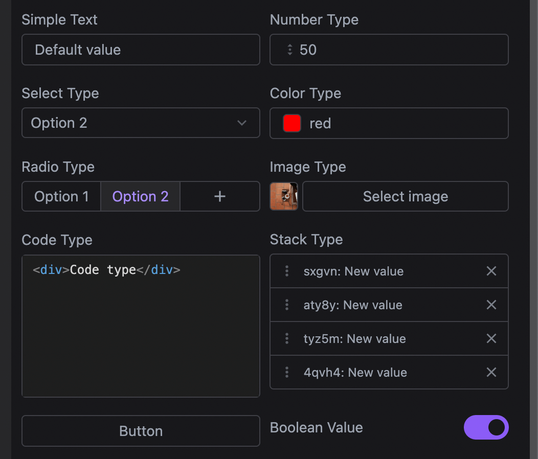
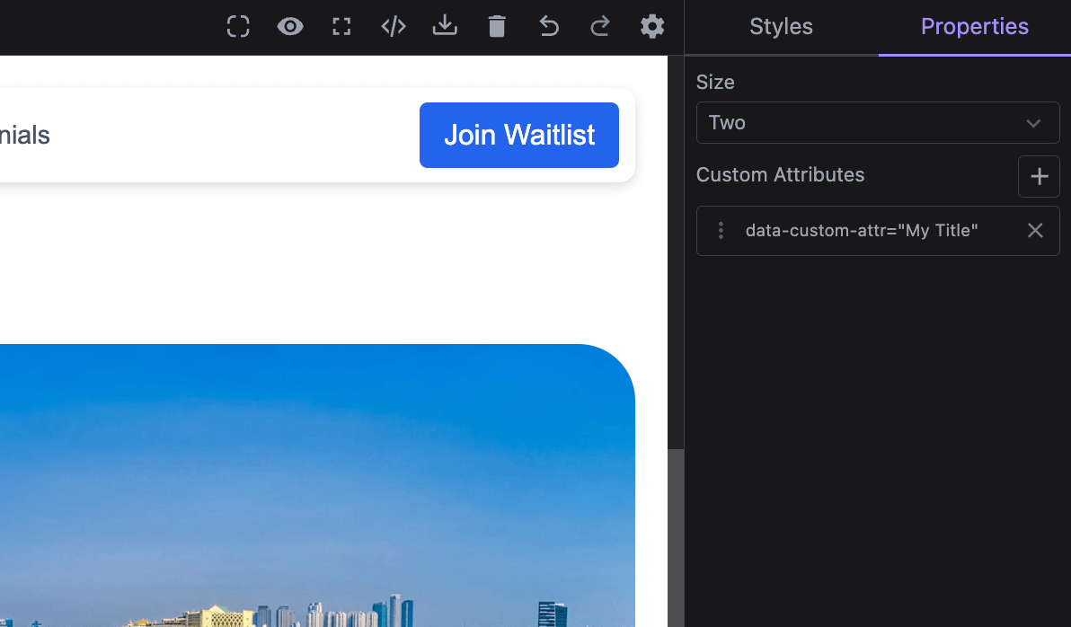
Traits are used to allow end-users to interact with and modify the state of components, such as their HTML attributes or any other component properties. Traits can be thought of as form fields or controls that provide a user-friendly way to adjust component configurations directly within the editor.
You can create custom traits or use built-in ones to make your components more configurable. Traits can be linked to specific component properties, and their values can be easily adjusted from the Traits Manager, which is part of the editor UI.
In Studio, Traits are referred to as Properties by default, following a more commonly used naming convention. They are available in the built-in right sidebar tabs, but you can customize the label for your end-users (e.g., renaming it to Settings).
If you need to modify the layout, including where Traits appear, refer to the Layout Configuration page.
In the demo below, we showcase some of the built-in traits and their uses.
- React
- JS
- 🍇 Demo
import StudioEditor from '@grapesjs/studio-sdk/react';
import '@grapesjs/studio-sdk/style';

// ...
<StudioEditor
  options={{
    // ...
    plugins: [
      editor => {
        editor.Components.addType('cmp-with-traits', {
          model: {
            defaults: {
              components: 'Component with Traits',
              attributes: { 'data-simple-text': 'Default attribute value' },
              traitCustomProp: 'Default property value',
              traits: [
                {
                  name: 'data-simple-text',
                  label: 'Trait on attribute',
                },
                {
                  name: 'traitCustomProp',
                  label: 'Trait on property',
                  changeProp: true, // Read/write to component properties instead of attributes
                },
                {
                  type: 'number',
                  name: 'number-type',
                  min: 0,
                  value: 50,
                  max: 1000,
                  step: 100,
                },
                {
                  type: 'select',
                  name: 'select-type',
                  value: 'opt2',
                  options: [
                    { id: 'opt1', label: 'Option 1' },
                    { id: 'opt2', label: 'Option 2' },
                  ],
                },
                {
                  type: 'checkbox',
                  name: 'checkbox-type',
                  label: 'Boolean value',
                  value: true,
                },
                {
                  type: 'color',
                  name: 'color-type',
                  value: 'red',
                },
                {
                  type: 'button',
                  label: 'Click me',
                  command: (editor) => alert(editor.getSelected()?.getName()),
                },
                {
                  type: 'radio',
                  name: 'radio-type',
                  value: 'opt2',
                  options: [
                    { id: 'opt1', label: 'Option 1' },
                    { id: 'opt2', label: 'Option 2' },
                    {
                      id: 'opt3',
                      icon: '<svg viewBox="0 0 24 24"><path d="M19 13h-6v6h-2v-6H5v-2h6V5h2v6h6v2Z"/></svg>',
                      title: 'Custom icon',
                    },
                  ],
                },
                // Studio built-in traits
                {
                  type: 'image',
                  name: 'image-type',
                  value: 'https://picsum.photos/seed/image/300/300',
                },
                {
                  type: 'code',
                  name: 'code-type',
                  value: '<div>Code type</div>',
                  typeProps: { language: 'html', clean: true, padding: 5 },
                },
                {
                  type: 'stack',
                  name: 'customStackValue',
                  label: 'Stack type',
                  addItem: () => ({
                    id: Math.random().toString(36).substring(2, 7),
                    itemValue: 'New value',
                  }),
                  labelItem: (item) => `${item.id}: ${item.itemValue}`,
                  getValue({ component, trait }) {
                    return component.get(trait.getName()) || [];
                  },
                  setValue: ({ component, emitUpdate, trait, value }) => {
                    component.set({ [trait.getName()]: value });
                    emitUpdate();
                  },
                  properties: [
                    { name: 'id', label: 'Key' },
                    { name: 'itemValue', label: 'Value' },
                  ],
                },
                {
                  type: 'custom',
                  name: 'from-custom',
                  label: 'Custom React Component',
                  value: 'Default value',
                  // Use categories to group traits
                  category: {
                    id: 'my-category',
                    label: 'Custom Traits',
                    icon: '<svg viewBox="0 0 24 24"><path d="M12 2A10 10 0 0 0 2 12a10 10 0 0 0 10 10 10 10 0 0 0 10-10A10 10 0 0 0 12 2m3.5 6A1.5 1.5 0 0 1 17 9.5a1.5 1.5 0 0 1-1.5 1.5A1.5 1.5 0 0 1 14 9.5 1.5 1.5 0 0 1 15.5 8m-7 0A1.5 1.5 0 0 1 10 9.5 1.5 1.5 0 0 1 8.5 11 1.5 1.5 0 0 1 7 9.5 1.5 1.5 0 0 1 8.5 8m3.5 9.5A5.5 5.5 0 0 1 6.9 14H17c-.8 2-2.8 3.5-5.1 3.5Z"/></svg>',
                    open: false,
                  },
                  component: ({ trait }) => <div>
                      <label>{trait.getLabel()}</label>
                      <input type="text" value={trait.getValue()} onChange={(ev) => trait.setValue(ev.target.value)} />
                  </div>,
                },
                {
                  type: 'custom',
                  name: 'from-custom-js',
                  label: 'Custom JS Component',
                  value: 'Default JS value',
                  // Use a category declared before
                  category: { id: 'my-category' },
                  render({ trait, addEl, removeEl, onUpdate }) {
                    const rootEl = document.createElement('div');
                    rootEl.innerHTML = `<label>${trait.getLabel()}</label><input type="text"/>`;
                    const input = rootEl.querySelector('input');
                    input.value = trait.getValue();
                    input.addEventListener('change', (ev: any) => trait.setValue(ev.target.value));
                    addEl(rootEl);
                    onUpdate(() => { input.value = trait.getValue() });
                    return () => removeEl(rootEl);
                  }
              }
              ],
            },
          },
        });

        editor.onReady(() => {
          const cmp = editor.getWrapper().append({ type: 'cmp-with-traits' })[0];
          editor.select(cmp);
        });
      }
    ],
    project: {
      // Empty project for our demo purpose
      default: { pages: [{ name: 'Home' }] }
    },
    layout: {
      default: {
        type: 'row',
        style: { height: '100%' },
        children: [
          {
            type: 'canvasSidebarTop',
            sidebarTop: {
              rightContainer: {
                buttons: [
                  {
                    type: 'button',
                    variant: 'primary',
                    size: 'm',
                    icon: 'codeBraces',
                    label: 'Show component JSON',
                    onClick: ({ editor }) => alert(JSON.stringify(editor.getSelected() || {}, null, 2))
                  }
                ],
              },
            }
          },
          { type: 'panelProperties', style: { padding: '10px 10px 100px', width: 300 } },
        ],
      },
    },
  }}
/>
import createStudioEditor from '@grapesjs/studio-sdk';
import '@grapesjs/studio-sdk/style';

// ...
createStudioEditor({
  // ...
  plugins: [
    editor => {
      editor.Components.addType('cmp-with-traits', {
        model: {
          defaults: {
            components: 'Component with Traits',
            attributes: { 'data-simple-text': 'Default attribute value' },
            traitCustomProp: 'Default property value',
            traits: [
              {
                name: 'data-simple-text',
                label: 'Trait on attribute',
              },
              {
                name: 'traitCustomProp',
                label: 'Trait on property',
                changeProp: true, // Read/write to component properties instead of attributes
              },
              {
                type: 'number',
                name: 'number-type',
                min: 0,
                value: 50,
                max: 1000,
                step: 100,
              },
              {
                type: 'select',
                name: 'select-type',
                value: 'opt2',
                options: [
                  { id: 'opt1', label: 'Option 1' },
                  { id: 'opt2', label: 'Option 2' },
                ],
              },
              {
                type: 'checkbox',
                name: 'checkbox-type',
                label: 'Boolean value',
                value: true,
              },
              {
                type: 'color',
                name: 'color-type',
                value: 'red',
              },
              {
                type: 'button',
                label: 'Click me',
                command: (editor) => alert(editor.getSelected()?.getName()),
              },
              {
                type: 'radio',
                name: 'radio-type',
                value: 'opt2',
                options: [
                  { id: 'opt1', label: 'Option 1' },
                  { id: 'opt2', label: 'Option 2' },
                  {
                    id: 'opt3',
                    icon: '<svg viewBox="0 0 24 24"><path d="M19 13h-6v6h-2v-6H5v-2h6V5h2v6h6v2Z"/></svg>',
                    title: 'Custom icon',
                  },
                ],
              },
              // Studio built-in traits
              {
                type: 'image',
                name: 'image-type',
                value: 'https://picsum.photos/seed/image/300/300',
              },
              {
                type: 'code',
                name: 'code-type',
                value: '<div>Code type</div>',
                typeProps: { language: 'html', clean: true, padding: 5 },
              },
              {
                type: 'stack',
                name: 'customStackValue',
                label: 'Stack type',
                addItem: () => ({
                  id: Math.random().toString(36).substring(2, 7),
                  itemValue: 'New value',
                }),
                labelItem: (item) => `${item.id}: ${item.itemValue}`,
                getValue({ component, trait }) {
                  return component.get(trait.getName()) || [];
                },
                setValue: ({ component, emitUpdate, trait, value }) => {
                  component.set({ [trait.getName()]: value });
                  emitUpdate();
                },
                properties: [
                  { name: 'id', label: 'Key' },
                  { name: 'itemValue', label: 'Value' },
                ],
              },
              {
                type: 'custom',
                name: 'from-custom',
                label: 'Custom React Component',
                value: 'Default value',
                // Use categories to group traits
                category: {
                  id: 'my-category',
                  label: 'Custom Traits',
                  icon: '<svg viewBox="0 0 24 24"><path d="M12 2A10 10 0 0 0 2 12a10 10 0 0 0 10 10 10 10 0 0 0 10-10A10 10 0 0 0 12 2m3.5 6A1.5 1.5 0 0 1 17 9.5a1.5 1.5 0 0 1-1.5 1.5A1.5 1.5 0 0 1 14 9.5 1.5 1.5 0 0 1 15.5 8m-7 0A1.5 1.5 0 0 1 10 9.5 1.5 1.5 0 0 1 8.5 11 1.5 1.5 0 0 1 7 9.5 1.5 1.5 0 0 1 8.5 8m3.5 9.5A5.5 5.5 0 0 1 6.9 14H17c-.8 2-2.8 3.5-5.1 3.5Z"/></svg>',
                  open: false,
                },
                component: ({ trait }) => <div>
                    <label>{trait.getLabel()}</label>
                    <input type="text" value={trait.getValue()} onChange={(ev) => trait.setValue(ev.target.value)} />
                </div>,
              },
              {
                type: 'custom',
                name: 'from-custom-js',
                label: 'Custom JS Component',
                value: 'Default JS value',
                // Use a category declared before
                category: { id: 'my-category' },
                render({ trait, addEl, removeEl, onUpdate }) {
                  const rootEl = document.createElement('div');
                  rootEl.innerHTML = `<label>${trait.getLabel()}</label><input type="text"/>`;
                  const input = rootEl.querySelector('input');
                  input.value = trait.getValue();
                  input.addEventListener('change', (ev: any) => trait.setValue(ev.target.value));
                  addEl(rootEl);
                  onUpdate(() => { input.value = trait.getValue() });
                  return () => removeEl(rootEl);
                }
            }
            ],
          },
        },
      });

      editor.onReady(() => {
        const cmp = editor.getWrapper().append({ type: 'cmp-with-traits' })[0];
        editor.select(cmp);
      });
    }
  ],
  project: {
    // Empty project for our demo purpose
    default: { pages: [{ name: 'Home' }] }
  },
  layout: {
    default: {
      type: 'row',
      style: { height: '100%' },
      children: [
        {
          type: 'canvasSidebarTop',
          sidebarTop: {
            rightContainer: {
              buttons: [
                {
                  type: 'button',
                  variant: 'primary',
                  size: 'm',
                  icon: 'codeBraces',
                  label: 'Show component JSON',
                  onClick: ({ editor }) => alert(JSON.stringify(editor.getSelected() || {}, null, 2))
                }
              ],
            },
          }
        },
        { type: 'panelProperties', style: { padding: '10px 10px 100px', width: 300 } },
      ],
    },
  },
})
Toolbar
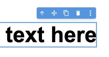
The Toolbar is a component-related set of actions/commands that appear in the canvas near the selected component.
You can customize the toolbar content globally through the components.toolbar option or on a per-component basis with the toolbarItems property.
Below is an example showing how to configure the toolbar both globally and for individual components.
- React
- JS
- 🍇 Demo
import StudioEditor from '@grapesjs/studio-sdk/react';
import '@grapesjs/studio-sdk/style';

// ...
<StudioEditor
  options={{
    // ...
    project: {
      default: {
        pages: [
          {
            name: 'Home',
            component: `
              <div style="padding: 20px; max-width: 400px; margin: 0 auto; display: flex; flex-direction: column;">
                <h1 style="font-size: 3rem">Heading component</h1>
                <div style="margin: 20px 0; font-size: 2rem">Text component</div>
                <img src="https://picsum.photos/seed/image1/300/300"/>
              <div>
            `
          }
        ]
      }
    },
    plugins: [
      editor => {
        // Update toolbar for the Heading components
        editor.Components.addType('heading', {
          model: {
            defaults: {
              toolbarItems: ({ items, component }) => [
                ...items, // default component items
                {
                  id: 'component-update',
                  label:
                    '<svg viewBox="0 0 24 24"><path d="M21,10.12H14.22L16.96,7.3C14.23,4.6 9.81,4.5 7.08,7.2C4.35,9.91 4.35,14.28 7.08,17C9.81,19.7 14.23,19.7 16.96,17C18.32,15.65 19,14.08 19,12.1H21C21,14.08 20.12,16.65 18.36,18.39C14.85,21.87 9.15,21.87 5.64,18.39C2.14,14.92 2.11,9.28 5.62,5.81C9.13,2.34 14.76,2.34 18.27,5.81L21,3V10.12M12.5,8V12.25L16,14.33L15.28,15.54L11,13V8H12.5Z" /></svg>',
                  command: () => {
                    component.components('Updated heading: ' + new Date().toLocaleTimeString());
                  }
                }
              ]
            }
          }
        });
        // Update toolbar for the Image components
        editor.Components.addType('image', {
          model: {
            defaults: {
              toolbarItems: ({ component }) => [
                // skipping default items
                {
                  id: 'component-copy-html',
                  label:
                    '<svg viewBox="0 0 24 24"><path d="M12.89,3L14.85,3.4L11.11,21L9.15,20.6L12.89,3M19.59,12L16,8.41V5.58L22.42,12L16,18.41V15.58L19.59,12M1.58,12L8,5.58V8.41L4.41,12L8,15.58V18.41L1.58,12Z" /></svg>',
                  command: () => {
                    navigator.clipboard.writeText(component.toHTML());
                    alert('Image HTML copied to clipboard');
                  }
                },
                {
                  id: 'component-fetch-image',
                  label:
                    '<svg viewBox="0 0 24 24"><path d="M8.5 13.5L5 18H13.03C13.11 19.1 13.47 20.12 14.03 21H5C3.9 21 3 20.11 3 19V5C3 3.9 3.9 3 5 3H19C20.1 3 21 3.89 21 5V11.18C20.5 11.07 20 11 19.5 11C17.78 11 16.23 11.67 15.07 12.76L14.5 12L11 16.5L8.5 13.5M19 20C17.62 20 16.5 18.88 16.5 17.5C16.5 17.1 16.59 16.72 16.76 16.38L15.67 15.29C15.25 15.92 15 16.68 15 17.5C15 19.71 16.79 21.5 19 21.5V23L21.25 20.75L19 18.5V20M19 13.5V12L16.75 14.25L19 16.5V15C20.38 15 21.5 16.12 21.5 17.5C21.5 17.9 21.41 18.28 21.24 18.62L22.33 19.71C22.75 19.08 23 18.32 23 17.5C23 15.29 21.21 13.5 19 13.5Z" /></svg>',
                  command: async () => {
                    await fetch('https://picsum.photos/200').then(async ({ url }) => {
                      component.setAttributes({ src: url });
                    });
                  }
                }
              ]
            }
          }
        });
      }
    ],
    components: {
      toolbar: ({ items, component }) => {
        return [
          {
            id: 'global-preview',
            label:
              '<svg viewBox="0 0 24 24"><path d="M12,9A3,3 0 0,0 9,12A3,3 0 0,0 12,15A3,3 0 0,0 15,12A3,3 0 0,0 12,9M12,17A5,5 0 0,1 7,12A5,5 0 0,1 12,7A5,5 0 0,1 17,12A5,5 0 0,1 12,17M12,4.5C7,4.5 2.73,7.61 1,12C2.73,16.39 7,19.5 12,19.5C17,19.5 21.27,16.39 23,12C21.27,7.61 17,4.5 12,4.5Z" /></svg>',
            command: 'core:preview'
          },
          // default items that you can 'map' and filter'
          ...items,
          {
            id: 'global-info',
            label:
              '<svg viewBox="0 0 24 24"><path d="M13,9H11V7H13M13,17H11V11H13M12,2A10,10 0 0,0 2,12A10,10 0 0,0 12,22A10,10 0 0,0 22,12A10,10 0 0,0 12,2Z" /></svg>',
            command: () => {
              alert('Component name: ' + component.getName());
            }
          }
        ];
      }
    },

  }}
/>
import createStudioEditor from '@grapesjs/studio-sdk';
import '@grapesjs/studio-sdk/style';

// ...
createStudioEditor({
  // ...
  project: {
    default: {
      pages: [
        {
          name: 'Home',
          component: `
            <div style="padding: 20px; max-width: 400px; margin: 0 auto; display: flex; flex-direction: column;">
              <h1 style="font-size: 3rem">Heading component</h1>
              <div style="margin: 20px 0; font-size: 2rem">Text component</div>
              <img src="https://picsum.photos/seed/image1/300/300"/>
            <div>
          `
        }
      ]
    }
  },
  plugins: [
    editor => {
      // Update toolbar for the Heading components
      editor.Components.addType('heading', {
        model: {
          defaults: {
            toolbarItems: ({ items, component }) => [
              ...items, // default component items
              {
                id: 'component-update',
                label:
                  '<svg viewBox="0 0 24 24"><path d="M21,10.12H14.22L16.96,7.3C14.23,4.6 9.81,4.5 7.08,7.2C4.35,9.91 4.35,14.28 7.08,17C9.81,19.7 14.23,19.7 16.96,17C18.32,15.65 19,14.08 19,12.1H21C21,14.08 20.12,16.65 18.36,18.39C14.85,21.87 9.15,21.87 5.64,18.39C2.14,14.92 2.11,9.28 5.62,5.81C9.13,2.34 14.76,2.34 18.27,5.81L21,3V10.12M12.5,8V12.25L16,14.33L15.28,15.54L11,13V8H12.5Z" /></svg>',
                command: () => {
                  component.components('Updated heading: ' + new Date().toLocaleTimeString());
                }
              }
            ]
          }
        }
      });
      // Update toolbar for the Image components
      editor.Components.addType('image', {
        model: {
          defaults: {
            toolbarItems: ({ component }) => [
              // skipping default items
              {
                id: 'component-copy-html',
                label:
                  '<svg viewBox="0 0 24 24"><path d="M12.89,3L14.85,3.4L11.11,21L9.15,20.6L12.89,3M19.59,12L16,8.41V5.58L22.42,12L16,18.41V15.58L19.59,12M1.58,12L8,5.58V8.41L4.41,12L8,15.58V18.41L1.58,12Z" /></svg>',
                command: () => {
                  navigator.clipboard.writeText(component.toHTML());
                  alert('Image HTML copied to clipboard');
                }
              },
              {
                id: 'component-fetch-image',
                label:
                  '<svg viewBox="0 0 24 24"><path d="M8.5 13.5L5 18H13.03C13.11 19.1 13.47 20.12 14.03 21H5C3.9 21 3 20.11 3 19V5C3 3.9 3.9 3 5 3H19C20.1 3 21 3.89 21 5V11.18C20.5 11.07 20 11 19.5 11C17.78 11 16.23 11.67 15.07 12.76L14.5 12L11 16.5L8.5 13.5M19 20C17.62 20 16.5 18.88 16.5 17.5C16.5 17.1 16.59 16.72 16.76 16.38L15.67 15.29C15.25 15.92 15 16.68 15 17.5C15 19.71 16.79 21.5 19 21.5V23L21.25 20.75L19 18.5V20M19 13.5V12L16.75 14.25L19 16.5V15C20.38 15 21.5 16.12 21.5 17.5C21.5 17.9 21.41 18.28 21.24 18.62L22.33 19.71C22.75 19.08 23 18.32 23 17.5C23 15.29 21.21 13.5 19 13.5Z" /></svg>',
                command: async () => {
                  await fetch('https://picsum.photos/200').then(async ({ url }) => {
                    component.setAttributes({ src: url });
                  });
                }
              }
            ]
          }
        }
      });
    }
  ],
  components: {
    toolbar: ({ items, component }) => {
      return [
        {
          id: 'global-preview',
          label:
            '<svg viewBox="0 0 24 24"><path d="M12,9A3,3 0 0,0 9,12A3,3 0 0,0 12,15A3,3 0 0,0 15,12A3,3 0 0,0 12,9M12,17A5,5 0 0,1 7,12A5,5 0 0,1 12,7A5,5 0 0,1 17,12A5,5 0 0,1 12,17M12,4.5C7,4.5 2.73,7.61 1,12C2.73,16.39 7,19.5 12,19.5C17,19.5 21.27,16.39 23,12C21.27,7.61 17,4.5 12,4.5Z" /></svg>',
          command: 'core:preview'
        },
        // default items that you can 'map' and filter'
        ...items,
        {
          id: 'global-info',
          label:
            '<svg viewBox="0 0 24 24"><path d="M13,9H11V7H13M13,17H11V11H13M12,2A10,10 0 0,0 2,12A10,10 0 0,0 12,22A10,10 0 0,0 22,12A10,10 0 0,0 12,2Z" /></svg>',
          command: () => {
            alert('Component name: ' + component.getName());
          }
        }
      ];
    }
  },

})
The components.toolbar function (global) and the toolbarItems property (component-specific) both receive the same arguments:
items: An array of default items that you can modify or filter (e.g., viaitems.maporitems.filter).component: The component instance the menu is being called for.editor: The studio editor instance.
The toolbar function should return an array of toolbar items. The default items array is first passed to any component-specific configuration, then to the global one. If the final result is an empty array, the toolbar won't be displayed.
You can execute an action by providing a string value to the command property. The command should be registered in the editor instance (see default commands). You can also provide a function to the command property to execute custom logic, including asynchronous operations.
Context Menu
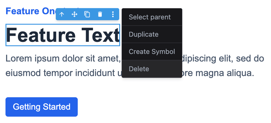
The Context Menu is a dropdown that appears when you right-click on a component in either the canvas or the layers panel. It's also accessible via the component toolbar, which is especially useful on devices without right-click capability.
You can customize the context menu content globally through the components.contextMenu option or on a per-component basis with the contextMenu property.
Below is an example showing how to configure the context menu both globally and for individual components.
- React
- JS
- 🍇 Demo
import StudioEditor from '@grapesjs/studio-sdk/react';
import '@grapesjs/studio-sdk/style';

// ...
<StudioEditor
  options={{
    // ...
    project: {
      default: {
        pages: [
          {
            name: 'Home',
            component: `
              <div style="padding: 20px; max-width: 400px; margin: 0 auto; display: flex; flex-direction: column;">
                <h1 style="font-size: 3rem">Heading component</h1>
                <div style="margin: 20px 0; font-size: 2rem">Text component</div>
                <img src="https://picsum.photos/seed/image1/300/300"/>
              <div>
            `
          }
        ]
      }
    },
    plugins: [
      editor => {
        // Update context menu for the Heading components
        editor.Components.addType('heading', {
          model: {
            defaults: {
              contextMenu: ({ items, component }) => [
                ...items, // default component items
                {
                  id: 'headingHTML',
                  label: 'Heading HTML',
                  icon: '<svg viewBox="0 0 24 24"><path d="m14.6 16.6 4.6-4.6-4.6-4.6L16 6l6 6-6 6-1.4-1.4m-5.2 0L4.8 12l4.6-4.6L8 6l-6 6 6 6 1.4-1.4Z"/></svg>',
                  onClick: () => alert('Heading HTML: ' + component.toHTML())
                }
              ]
            }
          }
        });
        // Update context menu for the Image components
        editor.Components.addType('image', {
          model: {
            defaults: {
              contextMenu: ({ component }) => [
                // skipping default items
                {
                  id: 'imageItems',
                  label: 'Image items',
                  icon: 'image',
                  items: [
                    { id: 'i1', label: 'Item 1', icon: 'check' },
                    { id: 'i2', label: 'Item 2', onClick: () => alert('Item 2') },
                    {
                      id: 'i3',
                      label: 'Item 3',
                      items: [
                        {
                          id: 'i3-1',
                          label: 'Replace image',
                          icon: 'refresh',
                          onClick: () =>
                            component.set({ src: `https://picsum.photos/seed/${Math.random()}/300/300` })
                        }
                      ]
                    }
                  ]
                }
              ]
            }
          }
        });
      }
    ],
    components: {
      contextMenu: ({ items, component, type, source }) => {
        return [
          {
            id: 'globalBefore',
            label: 'Global: Disabled',
            disabled: true
          },
          // default items that you can 'map' and filter'
          ...items,
          {
            id: 'globalAfter',
            label: 'Global: Info',
            onClick: () => alert(`Type: ${type} \nSource: ${source} \nHTML: ${component.toHTML()}`)
          }
        ];
      }
    },
  }}
/>
import createStudioEditor from '@grapesjs/studio-sdk';
import '@grapesjs/studio-sdk/style';

// ...
createStudioEditor({
  // ...
  project: {
    default: {
      pages: [
        {
          name: 'Home',
          component: `
            <div style="padding: 20px; max-width: 400px; margin: 0 auto; display: flex; flex-direction: column;">
              <h1 style="font-size: 3rem">Heading component</h1>
              <div style="margin: 20px 0; font-size: 2rem">Text component</div>
              <img src="https://picsum.photos/seed/image1/300/300"/>
            <div>
          `
        }
      ]
    }
  },
  plugins: [
    editor => {
      // Update context menu for the Heading components
      editor.Components.addType('heading', {
        model: {
          defaults: {
            contextMenu: ({ items, component }) => [
              ...items, // default component items
              {
                id: 'headingHTML',
                label: 'Heading HTML',
                icon: '<svg viewBox="0 0 24 24"><path d="m14.6 16.6 4.6-4.6-4.6-4.6L16 6l6 6-6 6-1.4-1.4m-5.2 0L4.8 12l4.6-4.6L8 6l-6 6 6 6 1.4-1.4Z"/></svg>',
                onClick: () => alert('Heading HTML: ' + component.toHTML())
              }
            ]
          }
        }
      });
      // Update context menu for the Image components
      editor.Components.addType('image', {
        model: {
          defaults: {
            contextMenu: ({ component }) => [
              // skipping default items
              {
                id: 'imageItems',
                label: 'Image items',
                icon: 'image',
                items: [
                  { id: 'i1', label: 'Item 1', icon: 'check' },
                  { id: 'i2', label: 'Item 2', onClick: () => alert('Item 2') },
                  {
                    id: 'i3',
                    label: 'Item 3',
                    items: [
                      {
                        id: 'i3-1',
                        label: 'Replace image',
                        icon: 'refresh',
                        onClick: () =>
                          component.set({ src: `https://picsum.photos/seed/${Math.random()}/300/300` })
                      }
                    ]
                  }
                ]
              }
            ]
          }
        }
      });
    }
  ],
  components: {
    contextMenu: ({ items, component, type, source }) => {
      return [
        {
          id: 'globalBefore',
          label: 'Global: Disabled',
          disabled: true
        },
        // default items that you can 'map' and filter'
        ...items,
        {
          id: 'globalAfter',
          label: 'Global: Info',
          onClick: () => alert(`Type: ${type} \nSource: ${source} \nHTML: ${component.toHTML()}`)
        }
      ];
    }
  },
})
The components.contextMenu function (global) and the contextMenu property (component-specific) both receive the same arguments:
items: An array of default items that you can modify or filter (e.g., viaitems.maporitems.filter).component: The component instance the menu is being called for.type: The type of the component.source: Indicates where the context menu was called from (canvasorlayers).
The contextMenu function should return an array of context menu items. The default items array is first passed to any component-specific configuration, then to the global one. If the final result is an empty array, the context menu won't be displayed.
Drop targets
Use dropTargets to highlight the components where another component can be dropped during drag and drop.
- The component-level
dropTargetsfunction receivesroot,editor, and eitherblockorcomponent, depending on where the drag started. - It can return an array of
DropTargetitems directly, or an object withitemsandnotFound. - Returned items are rendered as
dropTargetcanvas spots. - If no items are returned, Studio uses
notFoundfirst and then falls back to thedomComponents.dropTargets.notFound.${type}i18n key when available.
The example below defines two custom components, Row and Column. The Column component advertises Row components as its only valid custom drop targets.
- React
- JS
- 🍇 Demo
import StudioEditor from '@grapesjs/studio-sdk/react';
import '@grapesjs/studio-sdk/style';

// ...
<StudioEditor
  options={{
    // ...
    plugins: [
      editor => {
        editor.Components.addType('custom-row', {
          model: {
            defaults: {
              name: 'Row',
              draggable: (src, trg) => trg.getType() === 'wrapper',
              style: 'display: flex; gap: 16px; min-height: 140px; padding: 18px; border: 2px dashed #7c8aa5; background: #f8fafc;'
            }
          }
        });

        editor.Components.addType('custom-column', {
          model: {
            defaults: {
              name: 'Column',
              draggable: (src, trg) => trg.getType() === 'custom-row',
              style: 'flex: 1; min-height: 90px; padding: 16px; border: 1px solid #9fb0ca; background: white;',
              dropTargets: ({ root }) => {
                const items = root.findType('custom-row').map(component => ({ component }));
                return {
                  items,
                  notFound: 'This component can only be dropped inside a Row, and none was found.'
                };
              }
            }
          }
        });

        editor.Blocks.clear();

        editor.Blocks.add('row', {
          label: 'Row',
          content: { type: 'custom-row' },
        });
        editor.Blocks.add('column', {
          label: 'Column',
          content: { type: 'custom-column' },
        });


        editor.onReady(() => {
          editor.getWrapper().append([
            {
              type: 'custom-row',
              components: [
                { type: 'custom-column', components: 'Column A' },
                { type: 'custom-column', components: 'Column B' },
              ]
            },
          ]);
        });
      }
    ],
    layout: {
      default: {
        type: 'row',
        style: { height: '100%' },
        children: [
          {
            type: 'panelBlocks',
            header: { label: 'Blocks', collapsible: false, style: { width: '300px' } },
            symbols: false,
          },
          { type: 'canvas' }
        ]
      }
    },
    project: {
      // Empty project for our demo purpose
      default: { pages: [{ name: 'Home' }] }
    },

  }}
/>
import createStudioEditor from '@grapesjs/studio-sdk';
import '@grapesjs/studio-sdk/style';

// ...
createStudioEditor({
  // ...
  plugins: [
    editor => {
      editor.Components.addType('custom-row', {
        model: {
          defaults: {
            name: 'Row',
            draggable: (src, trg) => trg.getType() === 'wrapper',
            style: 'display: flex; gap: 16px; min-height: 140px; padding: 18px; border: 2px dashed #7c8aa5; background: #f8fafc;'
          }
        }
      });

      editor.Components.addType('custom-column', {
        model: {
          defaults: {
            name: 'Column',
            draggable: (src, trg) => trg.getType() === 'custom-row',
            style: 'flex: 1; min-height: 90px; padding: 16px; border: 1px solid #9fb0ca; background: white;',
            dropTargets: ({ root }) => {
              const items = root.findType('custom-row').map(component => ({ component }));
              return {
                items,
                notFound: 'This component can only be dropped inside a Row, and none was found.'
              };
            }
          }
        }
      });

      editor.Blocks.clear();

      editor.Blocks.add('row', {
        label: 'Row',
        content: { type: 'custom-row' },
      });
      editor.Blocks.add('column', {
        label: 'Column',
        content: { type: 'custom-column' },
      });


      editor.onReady(() => {
        editor.getWrapper().append([
          {
            type: 'custom-row',
            components: [
              { type: 'custom-column', components: 'Column A' },
              { type: 'custom-column', components: 'Column B' },
            ]
          },
        ]);
      });
    }
  ],
  layout: {
    default: {
      type: 'row',
      style: { height: '100%' },
      children: [
        {
          type: 'panelBlocks',
          header: { label: 'Blocks', collapsible: false, style: { width: '300px' } },
          symbols: false,
        },
        { type: 'canvas' }
      ]
    }
  },
  project: {
    // Empty project for our demo purpose
    default: { pages: [{ name: 'Home' }] }
  },

})
Global drop targets
You can also control the feature globally via canvas.dropTargets. The global function receives the same props and can:
- return
falseto disable custom drop targets for the current drag - return an array or
{ items, notFound }to override the component-level result - return
trueto continue with the component-leveldropTargetslogic
canvas: {
  dropTargets: ({ root, block, component }) => {
    // Disable drop targets when dragging from the canvas
    if (component) return false;

    // Provide a custom global override for a specific case
    if (block?.getId() === 'special-column') {
      return root.findType('custom-row').map(component => ({ component }));
    }

    // Fall back to the component-level dropTargets
    return true;
  }
}
Append fallback
Use appendFallback to customize what happens when a component is attempted to be appended, for example from a Block click or via StudioCommands.appendComponent, but there is no valid target where it can be dropped.
- Studio first tries the default insertion flow: append after the selected component, append inside the selected component, or append to the root if possible.
- If none of those targets accept the content, Studio resolves the source component type and runs its
appendFallback. - The function receives
editor,content, the sourceblockwhen available, and the resolveddropTargets.
The example below defines a Column component that can only live inside a Row. When clicked from the Block Manager, Studio first looks for existing Row components; if none are found, it creates a new Row > Column chain automatically.
- React
- JS
- 🍇 Demo
import StudioEditor from '@grapesjs/studio-sdk/react';
import '@grapesjs/studio-sdk/style';

// ...
<StudioEditor
  options={{
    // ...
    plugins: [
      editor => {
        editor.Components.addType('custom-row', {
          model: {
            defaults: {
              name: 'Row',
              draggable: (src, trg) => trg.getType() === 'wrapper',
              droppable: src => src.getType() === 'custom-column',
              style: 'display: flex; gap: 16px; min-height: 140px; padding: 18px; border: 2px dashed #7c8aa5; background: #f8fafc;'
            }
          }
        });

        editor.Components.addType('custom-column', {
          model: {
            defaults: {
              name: 'Column',
              draggable: (src, trg) => trg.getType() === 'custom-row',
              droppable: false,
              style: 'flex: 1; min-height: 90px; padding: 16px; border: 1px solid #9fb0ca; background: white;',
              components: 'Column content',
              dropTargets: ({ root }) => ({
                items: root.findType('custom-row').map(component => ({ component })),
                notFound: 'This component can only be inserted inside a Row, and none was found.'
              }),
              appendFallback: ({ content, dropTargets, editor }) => ({
                target: dropTargets[0]?.component || editor.getWrapper(),
                content: dropTargets.length
                  ? content
                  : {
                      type: 'custom-row',
                      components: content
                    }
              })
            }
          }
        });

        editor.Blocks.clear();

        editor.Blocks.add('row', {
          label: 'Row',
          content: { type: 'custom-row' },
        });
        editor.Blocks.add('column', {
          label: 'Column',
          content: { type: 'custom-column' },
        });

        editor.onReady(() => {
          editor.getWrapper()?.append({
            type: 'custom-row',
            components: [
              { type: 'custom-column', components: 'Column A' },
              { type: 'custom-column', components: 'Column B' },
            ]
          });
        });
      }
    ],
    layout: {
      default: {
        type: 'row',
        style: { height: '100%' },
        children: [
          {
            type: 'panelBlocks',
            header: { label: 'Blocks', collapsible: false, style: { width: '300px' } },
            symbols: false,
          },
          { type: 'canvas' }
        ]
      }
    },
    project: {
      // Empty project for our demo purpose
      default: { pages: [{ name: 'Home' }] }
    },

  }}
/>
import createStudioEditor from '@grapesjs/studio-sdk';
import '@grapesjs/studio-sdk/style';

// ...
createStudioEditor({
  // ...
  plugins: [
    editor => {
      editor.Components.addType('custom-row', {
        model: {
          defaults: {
            name: 'Row',
            draggable: (src, trg) => trg.getType() === 'wrapper',
            droppable: src => src.getType() === 'custom-column',
            style: 'display: flex; gap: 16px; min-height: 140px; padding: 18px; border: 2px dashed #7c8aa5; background: #f8fafc;'
          }
        }
      });

      editor.Components.addType('custom-column', {
        model: {
          defaults: {
            name: 'Column',
            draggable: (src, trg) => trg.getType() === 'custom-row',
            droppable: false,
            style: 'flex: 1; min-height: 90px; padding: 16px; border: 1px solid #9fb0ca; background: white;',
            components: 'Column content',
            dropTargets: ({ root }) => ({
              items: root.findType('custom-row').map(component => ({ component })),
              notFound: 'This component can only be inserted inside a Row, and none was found.'
            }),
            appendFallback: ({ content, dropTargets, editor }) => ({
              target: dropTargets[0]?.component || editor.getWrapper(),
              content: dropTargets.length
                ? content
                : {
                    type: 'custom-row',
                    components: content
                  }
            })
          }
        }
      });

      editor.Blocks.clear();

      editor.Blocks.add('row', {
        label: 'Row',
        content: { type: 'custom-row' },
      });
      editor.Blocks.add('column', {
        label: 'Column',
        content: { type: 'custom-column' },
      });

      editor.onReady(() => {
        editor.getWrapper()?.append({
          type: 'custom-row',
          components: [
            { type: 'custom-column', components: 'Column A' },
            { type: 'custom-column', components: 'Column B' },
          ]
        });
      });
    }
  ],
  layout: {
    default: {
      type: 'row',
      style: { height: '100%' },
      children: [
        {
          type: 'panelBlocks',
          header: { label: 'Blocks', collapsible: false, style: { width: '300px' } },
          symbols: false,
        },
        { type: 'canvas' }
      ]
    }
  },
  project: {
    // Empty project for our demo purpose
    default: { pages: [{ name: 'Home' }] }
  },

})
Properties from HTML
GrapesJS allows you to define component properties directly through HTML using the data-gjs-PROPERTY_NAME="VALUE" attributes. This enables you to pass properties when importing components via HTML strings.
The editor also automatically converts certain string values into appropriate JavaScript data types:
- Booleans: Strings like
"true"and"false"will be automatically converted to their respective booleantrue/falsevalues. - Arrays: Strings formatted like
"[1,2,3]"will be parsed to arrays[1, 2, 3]. - Objects: Strings that resemble object notation, like
{"key": "value"}, will be transformed into JavaScript objects{key: "value"}.
In the demo below, you'll see how properties are passed through HTML attributes and how they are processed by the editor.
- React
- JS
- 🍇 Demo
import StudioEditor from '@grapesjs/studio-sdk/react';
import '@grapesjs/studio-sdk/style';

// ...
<StudioEditor
  options={{
    // ...
    plugins: [
      editor => {
        editor.onReady(() => {
          editor.getWrapper().append(`
            <div
              style="color: red; padding: 20px"
              data-gjs-value="Simple value"
              data-gjs-array='["value1",2]'
              data-gjs-object='{"key1": "value", "key2": 2}'
            >Component imported from HTML</div>
          `);
        });
      }
    ],
    project: {
      // Empty project for our demo purpose
      default: { pages: [{ name: 'Home' }] }
    },
    layout: {
      default: {
        type: 'row',
        style: { height: '100%' },
        children: {
          type: 'canvasSidebarTop',
          sidebarTop: {
            rightContainer: {
              buttons: [
                {
                  type: 'button',
                  variant: 'outline',
                  label: 'Show component JSON',
                  onClick: ({ editor }) => alert(JSON.stringify(editor.getWrapper(), null, 2))
                }
              ],
            },
          }
        },
      }
    }
  }}
/>
import createStudioEditor from '@grapesjs/studio-sdk';
import '@grapesjs/studio-sdk/style';

// ...
createStudioEditor({
  // ...
  plugins: [
    editor => {
      editor.onReady(() => {
        editor.getWrapper().append(`
          <div
            style="color: red; padding: 20px"
            data-gjs-value="Simple value"
            data-gjs-array='["value1",2]'
            data-gjs-object='{"key1": "value", "key2": 2}'
          >Component imported from HTML</div>
        `);
      });
    }
  ],
  project: {
    // Empty project for our demo purpose
    default: { pages: [{ name: 'Home' }] }
  },
  layout: {
    default: {
      type: 'row',
      style: { height: '100%' },
      children: {
        type: 'canvasSidebarTop',
        sidebarTop: {
          rightContainer: {
            buttons: [
              {
                type: 'button',
                variant: 'outline',
                label: 'Show component JSON',
                onClick: ({ editor }) => alert(JSON.stringify(editor.getWrapper(), null, 2))
              }
            ],
          },
        }
      },
    }
  }
})