Grid Mode
Project types | web |
Plan | Startup plan |
Visually manage CSS Grid layouts right inside the editor. This plugin lets users drag grid elements on the canvas and update grid-related CSS properties from the Style Manager.
Install the Studio SDK plugins package:
- npm
- pnpm
- yarn
- CDN
npm i @grapesjs/studio-sdk-plugins
pnpm add @grapesjs/studio-sdk-plugins
yarn add @grapesjs/studio-sdk-plugins
// It's recommended to replace the `latest` tag with the specific latest version to avoid any potential breaking changes.
// The loaded plugin is globally available via `globalThis.StudioSdkPlugins_canvasGridMode`.
"https://unpkg.com/@grapesjs/studio-sdk-plugins@latest/dist/canvasGridMode/index.umd.js"
Import and use the plugin in your project:
- React
- JS
- 🍇 Demo
import StudioEditor from '@grapesjs/studio-sdk/react';
import '@grapesjs/studio-sdk/style';
import { canvasGridMode } from '@grapesjs/studio-sdk-plugins';
// ...
<StudioEditor
options={{
// ...
plugins: [
canvasGridMode?.init({
styleableGrid: true,
})
],
project: {
default: {
pages: [
{
name: 'Home',
component: `
<h1>Grid Row</h1>
<div class="grid-row">
<div class="grid-item" style="grid-column: 1 / 5;">
First container
</div>
<div class="grid-item" style="grid-column: 9 / 13;">
Second container
</div>
</div>
<h1>Grid section</h1>
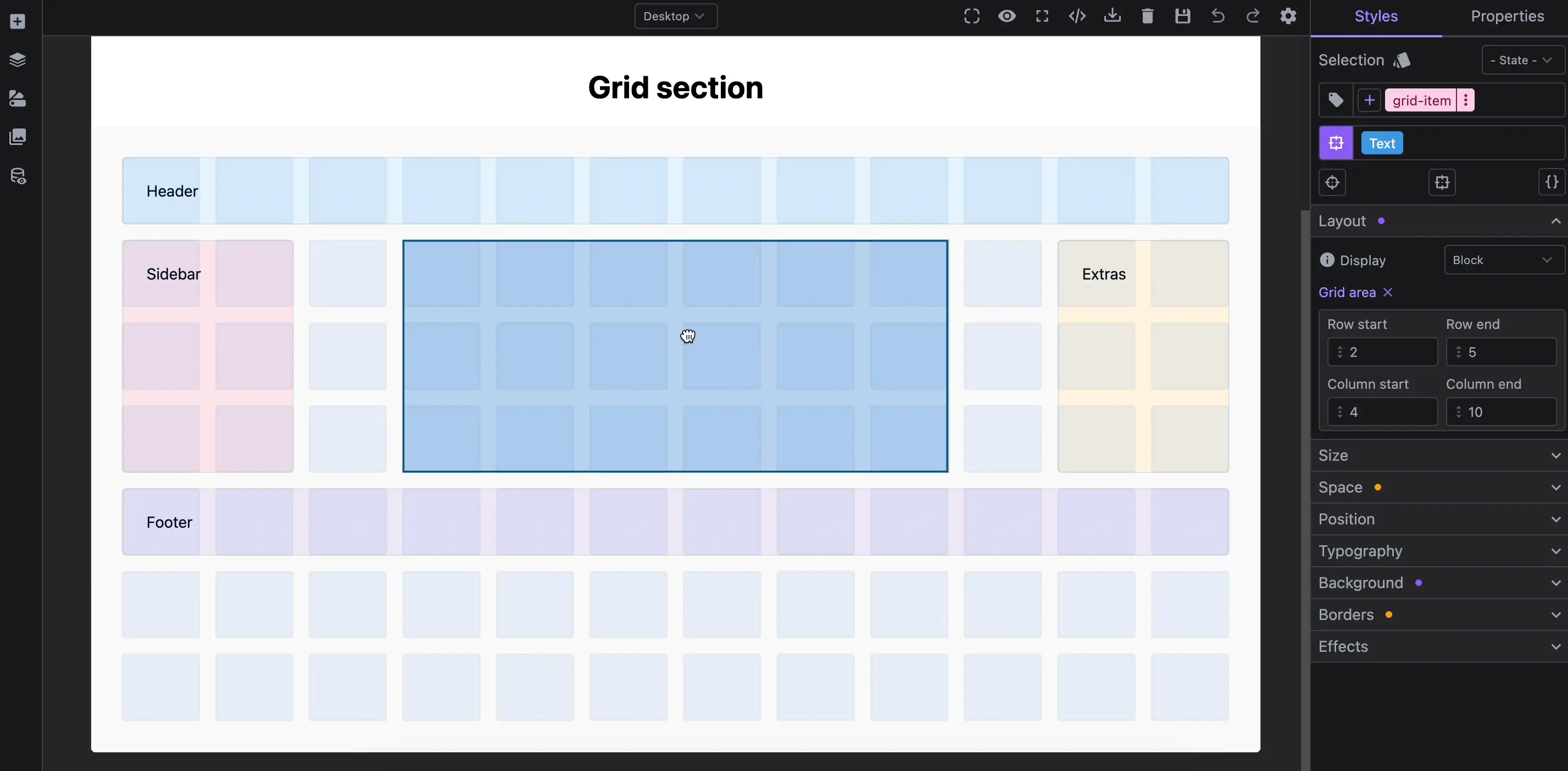
<section class="grid-section">
<div class="grid-item" style="grid-area: 1 / 1 / 2 / 13; background-color: #e3f2fd">
Header
</div>
<div class="grid-item" style="grid-area: 2 / 1 / 5 / 3; background-color: #fce4ec">
Sidebar
</div>
<div class="grid-item" style="grid-area: 2 / 4 / 5 / 10; background-color: #e8f5e9">
Main Content
</div>
<div class="grid-item" style="grid-area: 2 / 11 / 5 / 13; background-color: #fff3e0">
Extras
</div>
<div class="grid-item" style="grid-area: 5 / 1 / 6 / 13; background: #ede7f6;">Footer</div>
</section>
<style>
body { font-family: system-ui; }
h1 { text-align: center; }
.grid-row {
display: grid;
grid-template-columns: repeat(12, 1fr);
gap: 10px;
padding: 2rem;
}
.grid-item {
border: 1px solid #ddd;
padding: 1.5rem;
border-radius: 5px;
}
.grid-section {
display: grid;
grid-template-columns: repeat(12, 1fr);
grid-template-rows: repeat(7, minmax(50px, 1fr));
gap: 1rem;
padding: 2rem;
background-color: #f9f9f9;
}
@media (max-width: 992px) {
.grid-row {
grid-template-rows: repeat(2, 1fr);
}
}
</style>
`,
}
]
}
}
}}
/>
import createStudioEditor from '@grapesjs/studio-sdk';
import '@grapesjs/studio-sdk/style';
import { canvasGridMode } from '@grapesjs/studio-sdk-plugins';
// ...
createStudioEditor({
    // ...
    plugins: [
      canvasGridMode?.init({
        styleableGrid: true,
      })
    ],
    project: {
      default: {
        pages: [
          {
            name: 'Home',
            component: `
            <h1>Grid Row</h1>
            <div class="grid-row">
              <div class="grid-item" style="grid-column: 1 / 5;">
                First container
              </div>
              <div class="grid-item" style="grid-column: 9 / 13;">
                Second container
              </div>
            </div>

            <h1>Grid section</h1>
            <section class="grid-section">
              <div class="grid-item" style="grid-area: 1 / 1 / 2 / 13; background-color: #e3f2fd">
                Header
              </div>
              <div class="grid-item" style="grid-area: 2 / 1 / 5 / 3; background-color: #fce4ec">
                Sidebar
              </div>
              <div class="grid-item" style="grid-area: 2 / 4 / 5 / 10; background-color: #e8f5e9">
                Main Content
              </div>
              <div class="grid-item" style="grid-area: 2 / 11 / 5 / 13; background-color: #fff3e0">
                Extras
              </div>
              <div class="grid-item" style="grid-area: 5 / 1 / 6 / 13; background: #ede7f6;">Footer</div>
            </section>

            <style>
              body { font-family: system-ui; }
              h1 { text-align: center; }

              .grid-row {
                display: grid;
                grid-template-columns: repeat(12, 1fr);
                gap: 10px;
                padding: 2rem;
              }

              .grid-item {
                border: 1px solid #ddd;
                padding: 1.5rem;
                border-radius: 5px;
              }

              .grid-section {
                display: grid;
                grid-template-columns: repeat(12, 1fr);
                grid-template-rows: repeat(7, minmax(50px, 1fr));
                gap: 1rem;
                padding: 2rem;
                background-color: #f9f9f9;
              }

              @media (max-width: 992px) {
                .grid-row {
                  grid-template-rows: repeat(2, 1fr);
                }
              }
            </style>
            `,
          }
        ]
      }
    }


})
Plugin options
| Property | Type | Description |
|---|---|---|
licenseKey | string | The license key for the plugin. This is optional, only required if the plugin is used outside of Studio SDK. Example |
enableGrid | function | Provide a custom logic to enable the grid mode. Example |
itemResizable | object | Make grid items resizable when selected. Could also be a function for custom logic. Example Default |
styleableGrid | boolean | Allow to edit grid properties in Style Manager. Default |